CSS入门详解
回顾前端三要素
HTML + CSS + JavaScript
结构 + 表现 + 交互
学习CSS
什么是CSS
Cascading Style Sheet 层叠级联样式表
CSS 表现(美化网页)
字体、颜色、边距、高度、宽度、背景图片、网页定位、网页浮动
CSS发展史

- CSS1.0
- CSS2.0 DIV(块)+ CSS,HTML与CSS结构分离的思想,网页变得简单,SEO
- CSS2.1 浮动,定位
- CSS3.0 圆角,阴影,动画... 浏览器兼容性
快速入门
- 保持项目目录格式
- project
    - css
    - js
    index.html
- 入门
<!DOCTYPE html>
<html lang="en">
<head>
    <meta charset="UTF-8">
    <title>我的第一个CSS程序</title>

    <!--规范 <style> 可以编写CSS代码,每一个声明,最好使用分号结尾
    语法:
        选择器{
            声明1;
            声明2;
            声明3;
        }
    -->
    <style>
        h1{
            color: red;
        }
    </style>
</head>
<body>

<h1>我是标题h1</h1>
</body>
</html>
- css和html分离
<!DOCTYPE html>
<html lang="en">
<head>
    <meta charset="UTF-8">
    <title>我的第一个CSS程序</title>

    <!--规范 css 和 html分离规范
    css 用link标签引用
    <link rel="stylesheet" href="./css/style.css">
    -->
    <link rel="stylesheet" href="./css/style.css">
</head>
<body>

<h1>我是标题h1</h1>
</body>
</html>
style.css
h1{
    color: red;
}
CSS优势
- 内容和表现分离
- 网页表现结构统一,可以实现复用
- 样式十分丰富
- 建议使用独立于html的css文件
- 利用SEO,容易被搜索引擎收录!
四种css导入方式
行内样式
<!--1、行内样式:在标签元素中,编写一个style属性,编写样式即可 -->
<h1 style="color: red;">我是标题</h1>
内部样式
<!--2、内部样式-->
    <style>
        h1{
            color: green;
        }
    </style>
外部样式两种写法
- 链接式
<!--3、外部样式-链接式-->
<link rel="stylesheet" href="./css/style.css">
- 导入式(了解即可)
<!--4、外部样式-导入式-->
    <style>
        @import url("./css/style.css");
    </style>
优先级
- 就近原则,谁最近就优先
基本选择器
作用:选择页面上的某一个或某一类元素
- 标签选择器 选择一类标签 标签{}
    <style>
        /*标签选择器 会选择到页面上所有的这个标签元素*/
        h1{
            color: #00fd3f;
            background: #3cbda6;
            border-radius: 10px;
        }
        p{
            font-size: 40px;
        }
    </style>
- 类选择器 选择所有class属性一致的标签,跨标签 .类名{}
<!DOCTYPE html>
<html lang="en">
<head>
    <meta charset="UTF-8">
    <title>Title</title>

    <style>
        /*类选择器的格式 .class的名称{}
        好处:可以多个标签归类,是同一个class,可以复用
        */
        .title1{
            color: blue;
        }
        .title2{
            color: green;
        }
    </style>
</head>
<body>

<h1 class="title1">标题1</h1>
<h1 class="title2">标题2</h1>
<h1 class="title1">标题3</h1>

<p class="title2">p标签</p>

</body>
</html>
- id选择器 全局唯一 #id名{}
<!DOCTYPE html>
<html lang="en">
<head>
    <meta charset="UTF-8">
    <title>Title</title>

    <style>
        /*id 选择器 : id必须保证全局唯一!
            #id名称{}
            不遵循就近原则,固定的
            优先级:
                id > class > 标签选择器
        */
        #qiqin{
            color: brown;
        }
        .style1{
            color: coral;
        }
        h1{
            color: deeppink;
        }
    </style>
</head>
<body>

<h1 class="style1" id="qiqin">标题1</h1>
<h1 class="style1">标题2</h1>
<h1 class="style1">标题3</h1>
<h1>标题4</h1>
<h1>标题5</h1>

</body>
</html>
优先级: id > class > 标签
高级选择器
层次选择器
- 后代选择器 在某个元素后面
        /*后代选择器*/
        body p{
            background: coral;
        }
- 之选择器 一代,儿子
        /*子选择器*/
        body>p{
            background: blue;
        }
- 相邻兄弟选择器 同辈
        /*相邻兄弟选择器 只有一个
        对下不对上
        */
        .active + p{
            background: blueviolet;
        }
- 通用选择器
        /*通用兄弟选择器  当前选中元素的向下的所有兄弟元素
        对下不对上,多个
        */
        .active~p{
            background: olivedrab;
        }
综合
<!DOCTYPE html>
<html lang="en">
<head>
<meta charset="UTF-8">
<title>Title</title>
<style>
/*p{*/
/* background: coral;*/
/*}*/
/*后代选择器*/
/*body p{*/
/* background: coral;*/
/*}*/
/*子选择器*/
/*body>p{*/
/* background: blue;*/
/*}*/
/*相邻兄弟选择器 只有一个
对下不对上
*/
/*.active + p{*/
/* background: blueviolet;*/
/*}*/
/*通用选择器
对下不对上,多个
*/
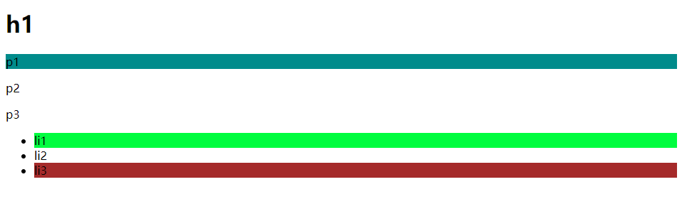
.active~p{
background: olivedrab;
}
</style>
</head>
<body>
<p>p0</p>
<p class="active">p1</p>
<p>p2</p>
<p>p3</p>
<ul>
<li>
<p>p4</p>
</li>
<li>
<p>p5</p>
</li>
<li>
<p>p6</p>
</li>
<li>
<p class="active">p7</p>
<p>p8</p>
<p>p9</p>
</li>
</ul>
</body>
</html>
结构类选择器
/* ul的第一个子元素*/
        ul li:first-child{
            background: #00fd3f;
        }

        /* ul的最后一个子元素*/
        ul li:last-child{
            background: brown;
        }

        /* 选中p1: 定位到父元素,选中当前的第一个元素
        选中当前p元素的父元素,选中父级元素的第一个,并且是当前元素才生效!
        */
        p:nth-child(1){
            background: blueviolet;
        }

        <!--选中父元素,下的p元素的第二个,类型-->
        p:nth-of-type(1){
            background: darkcyan;
        }
属性选择器☆重点
<!DOCTYPE html>
<html lang="en">
<head>
   <meta charset="UTF-8">
   <title>Title</title>
   <style>
       .demo a{
           float: left;
           display: block;
           width: 50px;
           height: 50px;
           border-radius: 5px;
           background: darkcyan;
           text-align: center;
           color: gainsboro;
           text-decoration: none;
           margin-right: 5px;
           font: bold 20px/50px Arial;
       }
       /* 存在id属性的元素     a[]{} */
       a[id=first]{
           background: chocolate;
       }
       /*选择class中有links的元素 */
       a[class*="links"]{
           background: darkorchid;
       }

       /*选中href中以http开头的元素*/
       a[href^=http]{
           background: cornflowerblue;
       }

       /*选中href中以pdf结尾的元素*/
       a[href$=pdf]{
           background: forestgreen;
       }


   </style>

</head>
<body>
<p class="demo">
   <a href="http://www.baidu.com" class="links item first" id="first">1</a>
   <a href="http://blog.zibin.com" class="links item active" target="_blank" title="test">2</a>
   <a href="images/123.html" class="links item">3</a>
   <a href="images/123.png" class="links item">4</a>
   <a href="images/123.jpg" class="links item">5</a>
   <a href="abc" class="links item">6</a>
   <a href="/a.pdf" class="links item">7</a>
   <a href="/abc.pdf" class="links item">8</a>
   <a href="abc.doc" class="links item">9</a>
   <a href="abcd.doc" class="links item last">10</a>
</p>

</body>
</html>
美化网页元素
为什么要美化网站
- 有效传递页面信息
- 美化网页,页面漂亮,才能吸引用户
- 凸显页面的主题
- 提高用户的体验
span标签:重点要突出的字用span标记起来
<!DOCTYPE html>
<html lang="en">
<head>
    <meta charset="UTF-8">
    <title>Title</title>

  <style>
    #title{
      font-size: 50px;
    }
  </style>
</head>
<body>

欢迎学习 <span id="title">HTML5</span>

</body>
</html>
字体样式
font-family: 字体
font-size: 字体大小
font-weight: 字体粗细
color: 字体颜色
<!DOCTYPE html>
<html lang="en">
<head>
<meta charset="UTF-8">
<title>Title</title>
<style>
body{
font-family: "Microsoft YaHei UI","Arial Black";
color: #1c1c1b;
}
img{
width: 800px;
}
#title{
font-size: 40px;
}
#sub-title{
font-size: 20px;
font-weight: bold;
}
</style>
</head>
<body>
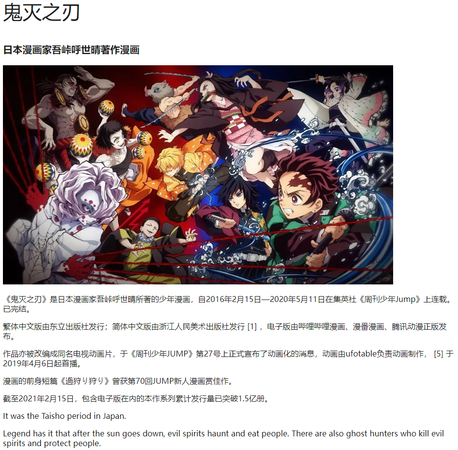
<p id="title">鬼灭之刃</p>
<p id="sub-title">日本漫画家吾峠呼世晴著作漫画</p>
<img src="https://gimg2.baidu.com/image_search/src=http%3A%2F%2Fpic2.zhimg.com%2Fv2-c544281c52cf60f3eefe26902e0c0abd_r.jpg&refer=http%3A%2F%2Fpic2.zhimg.com&app=2002&size=f9999,10000&q=a80&n=0&g=0n&fmt=auto?sec=1661134338&t=c7a9ad6e9bc7f1c5e0e988f0aceef9a4" alt="">
<p>《鬼灭之刃》是日本漫画家吾峠呼世晴所著的少年漫画,自2016年2月15日—2020年5月11日在集英社《周刊少年Jump》上连载。已完结。</p>
<p>繁体中文版由东立出版社发行;简体中文版由浙江人民美术出版社发行 [1] ,电子版由哔哩哔哩漫画、漫番漫画、腾讯动漫正版发布。</p>
<p>作品亦被改编成同名电视动画片,于《周刊少年JUMP》第27号上正式宣布了动画化的消息,动画由ufotable负责动画制作, [5] 于2019年4月6日起首播。</p>
<p>漫画的前身短篇《過狩り狩り》曾获第70回JUMP新人漫画赏佳作。</p>
<p>截至2021年2月15日,包含电子版在内的本作系列累计发行量已突破1.5亿册。</p>
<p>It was the Taisho period in Japan.</p>
<p>Legend has it that after the sun goes down, evil spirits haunt and eat people. There are also ghost hunters who kill evil spirits and protect people.</p>
</body>
</html>
文本样式
- 颜色 color rgb rgba
- 文本对齐的方式 text-align = center
- 首行缩进 text-indent: 2em
- 行高 line-height:
- 下划线 text-decoration
- 文本图片水平对齐 vertical-align: middle
a标签去下划线
a{
    text-decoration: none
}
<!DOCTYPE html>
<html lang="en">
<head>
<meta charset="UTF-8">
<title>Title</title>
<!--颜色:
单词
RGB 0~F
RGBA A:0~1
text-align: 排版
text-indent: 2em; 段落首行缩进
行高和块的高度一致,就可以实现上下居中
-->
<style>
h1{
color: rgba(0,255,255,0.5);
text-align: center;
}
#p1{
text-indent: 2em;
}
#p2{
background: cornsilk;
height: 50px;
line-height: 25px;
}
/*下划线*/
.l1{
text-decoration: underline;
}
/*中划线*/
.l2{
text-decoration: line-through;
}
/*上划线*/
.l3{
text-decoration: overline;
}
</style>
</head>
<body>
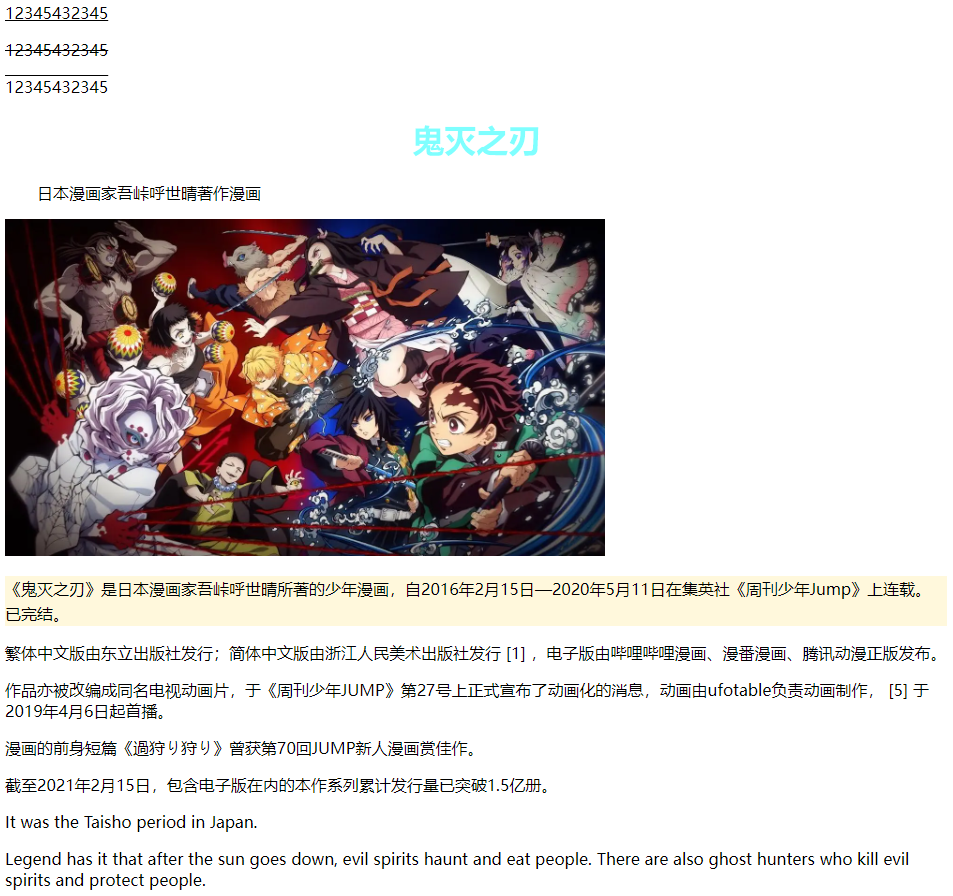
<p class="l1">12345432345</p>
<p class="l2">12345432345</p>
<p class="l3">12345432345</p>
<h1>鬼灭之刃</h1>
<p id="p1">日本漫画家吾峠呼世晴著作漫画</p>
<img src="https://gimg2.baidu.com/image_search/src=http%3A%2F%2Fpic2.zhimg.com%2Fv2-c544281c52cf60f3eefe26902e0c0abd_r.jpg&refer=http%3A%2F%2Fpic2.zhimg.com&app=2002&size=f9999,10000&q=a80&n=0&g=0n&fmt=auto?sec=1661134338&t=c7a9ad6e9bc7f1c5e0e988f0aceef9a4" alt="">
<p id="p2">《鬼灭之刃》是日本漫画家吾峠呼世晴所著的少年漫画,自2016年2月15日—2020年5月11日在集英社《周刊少年Jump》上连载。已完结。</p>
<p>繁体中文版由东立出版社发行;简体中文版由浙江人民美术出版社发行 [1] ,电子版由哔哩哔哩漫画、漫番漫画、腾讯动漫正版发布。</p>
<p>作品亦被改编成同名电视动画片,于《周刊少年JUMP》第27号上正式宣布了动画化的消息,动画由ufotable负责动画制作, [5] 于2019年4月6日起首播。</p>
<p>漫画的前身短篇《過狩り狩り》曾获第70回JUMP新人漫画赏佳作。</p>
<p>截至2021年2月15日,包含电子版在内的本作系列累计发行量已突破1.5亿册。</p>
<p>It was the Taisho period in Japan.</p>
<p>Legend has it that after the sun goes down, evil spirits haunt and eat people. There are also ghost hunters who kill evil spirits and protect people.</p>
</body>
</html>
<!DOCTYPE html>
<html lang="en">
<head>
<meta charset="UTF-8">
<title>Title</title>
<!--
水平对齐 参照物
-->
<style>
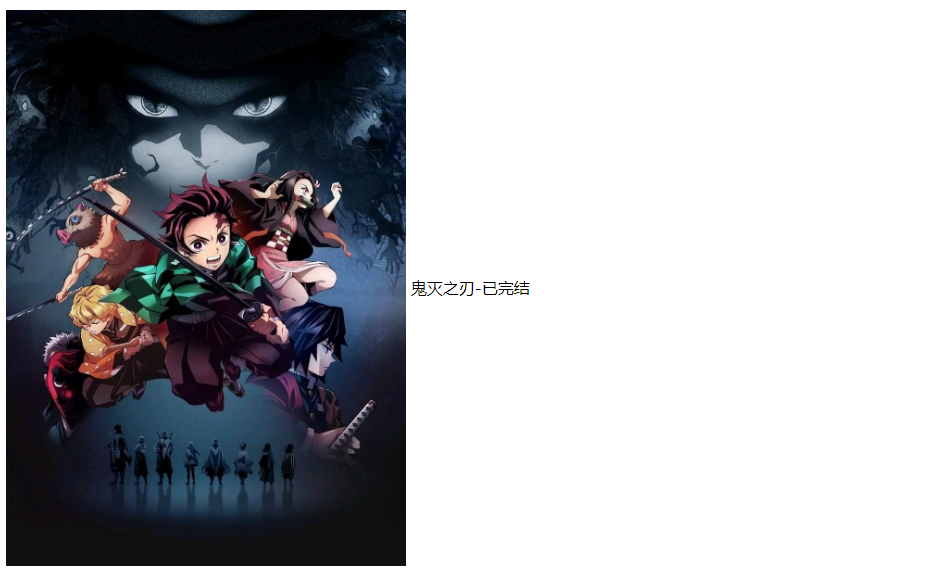
img{
width: 400px;
vertical-align: middle;
}
span{
vertical-align: middle;
}
</style>
</head>
<body>
<p>
<img src="https://gimg2.baidu.com/image_search/src=http%3A%2F%2Fi0.hdslb.com%2Fbfs%2Farticle%2F369e38f8fa4bef9ed7889aed812cede563dce647.jpg&refer=http%3A%2F%2Fi0.hdslb.com&app=2002&size=f9999,10000&q=a80&n=0&g=0n&fmt=auto?sec=1661173724&t=80a391ffbdf3431488ddf9771efbf0c6" alt="">
<span>鬼灭之刃-已完结</span>
</p>
</body>
</html>
文本阴影
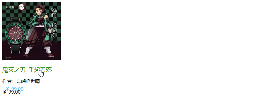
/*text-shadow 阴影颜色,水平偏移,垂直偏移,阴影半径*/
    #price{
      text-shadow: #2baef5 10px -10px 1px;
    }
<!DOCTYPE html>
<html lang="en">
<head>
    <meta charset="UTF-8">
    <title>Title</title>

  <style>
    /*默认的颜色*/
    a{
      text-decoration: none;
      color: #000000;
    }
    /*鼠标悬浮的颜色 ☆重点*/
    a:hover{
      color: orange;
    }
    /*鼠标按住未释放的状态*/
    a:active{
      color: green;
      font-size: 20px;
    }
    /*text-shadow 阴影颜色,水平偏移,垂直偏移,阴影半径*/
    #price{
      text-shadow: #2baef5 10px -10px 1px;
    }
  </style>
</head>
<body>

<a href="#">
  <img src="https://gimg2.baidu.com/image_search/src=http%3A%2F%2Fimgservice.suning.cn%2Fuimg1%2Fb2c%2Fimage%2FWD5NdfClleKUeRroPvuoBg.jpg_200w_200h_4e&refer=http%3A%2F%2Fimgservice.suning.cn&app=2002&size=f9999,10000&q=a80&n=0&g=0n&fmt=auto?sec=1661180224&t=da17daee6479fe85d8e390a5c8904570" alt="">
</a>
<p>
  <a href="#">鬼灭之刃-手起刀落</a>
</p>
<p>
  <a href="">作者:吾峠呼世晴</a>
</p>
<p id="price">
  ¥ 99.00
</p>

</body>
</html>
列表样式练习
<!DOCTYPE html>
<html lang="en">
<head>
<meta charset="UTF-8">
<title>列表样式</title>
<link rel="stylesheet" href="css/style.css" type="text/css">
</head>
<body>
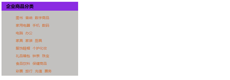
<div id="nav">
<h2 class="title">企业商品分类</h2>
<ul>
<li><a href="#">图书</a> <a href="#">音响</a> <a href="#">数字商品</a></li>
<li><a href="#">家用电器</a> <a href="#">手机</a> <a href="#">数码</a></li>
<li><a href="#">电脑</a> <a href="#">办公</a></li>
<li><a href="#">家具</a> <a href="#">家装</a> <a href="#">厨具</a></li>
<li><a href="#">服饰鞋帽</a> <a href="#">个护化妆</a></li>
<li><a href="#">礼品箱包</a> <a href="#">钟表</a> <a href="#">珠宝</a></li>
<li><a href="#">食品饮料</a> <a href="#">保健商品</a></li>
<li><a href="#">彩票</a> <a href="#">旅行</a> <a href="#">充值</a> <a href="#">票务</a></li>
</ul>
</div>
</body>
</html>
style.css
#nav{
    width: 300px;
    background: #c2c1bf;
}

.title{
    font-size: 18px;
    font-weight: bold;
    text-indent: 1em;
    line-height: 35px;
    background: blueviolet;
}
/*
list-style:
    none 去掉原点
    circle  空心圆
    decimal 数字
    square 正方形
*/

/*ul{*/
/*    background: #c2c1bf;*/
/*}*/

ul li{
    height: 30px;
    list-style: none;
    text-indent: 1em;
}

a{
    text-decoration: none;
    font-size: 14px;
    color: chocolate;
}
a:hover{
    color: blue;
    text-decoration: underline;
}
背景
- 背景颜色
- 背景图片
<!DOCTYPE html>
<html lang="en">
<head>
    <meta charset="UTF-8">
    <title>Title</title>

  <style>
    div{
      width: 1000px;
      height: 700px;
      border: 1px solid red;
      background-image: url("https://s2.loli.net/2022/07/24/LWNFj6GDui48pKb.png");
      /*默认是全部平铺的*/
    }

    .div1{
      background-repeat: repeat-x;
    }
    .div2{
      background-repeat: repeat-y;
    }
    .div3{
      background-repeat: no-repeat;
    }

  </style>
</head>
<body>
<div class="div1"></div>
<div class="div2"></div>
<div class="div3"></div>

</body>
</html>
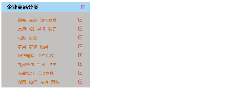
列表背景
style.css
#nav{
    width: 300px;
    background: #c2c1bf;
}

.title{
    font-size: 18px;
    font-weight: bold;
    text-indent: 1em;
    line-height: 35px;
    background: #a8d6f5 url("https://s2.loli.net/2022/07/24/4XLiVlF95jAkGuZ.png") 270px 10px no-repeat;
}

ul li{
    height: 30px;
    list-style: none;
    text-indent: 1em;
    background-image: url("https://s2.loli.net/2022/07/24/6U59mrn47Kow2pb.png");
    background-repeat: no-repeat;
    background-position: 220px 2px;
}

a{
    text-decoration: none;
    font-size: 14px;
    color: chocolate;
}
a:hover{
    color: blue;
    text-decoration: underline;
}
盒子模型
什么是盒子模型
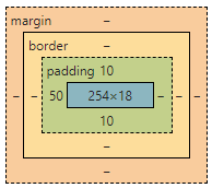
- margin: 外边距
- padding:内边距
- border:边框
边框
- 边框的粗细
- 边框的样式
- 边框的颜色
<!DOCTYPE html>
<html lang="en">
<head>
<meta charset="UTF-8">
<title>Title</title>
<style>
body{
margin: 0;
}
/*border: 粗细、样式、颜色*/
#app{
width: 300px;
border: 1px solid red;
}
h2{
font-size: 16px;
background-color: #3cbda6;
line-height: 30px;
color: white;
}
form{
background: #3cbda6;
}
div:nth-of-type(1) input{
border: 3px solid black;
}
div:nth-of-type(2) input{
border: 3px dashed yellow;
}
div:nth-of-type(3) input{
border: 3px dashed #ad65aa;
}
</style>
</head>
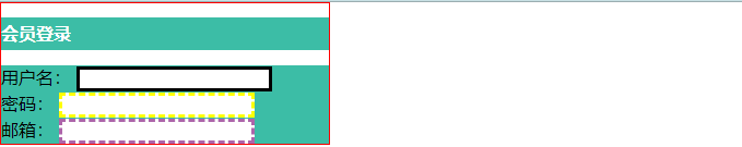
<body>
<div id="app">
<h2>会员登录</h2>
<form action="#">
<div>
<span>用户名:</span>
<input type="text">
</div>
<div>
<span>密码:</span>
<input type="text">
</div>
<div>
<span>邮箱:</span>
<input type="text">
</div>
</form>
</div>
</body>
</html>
内外边距
- margin 外边距
- padding 内边距
<!DOCTYPE html>
<html lang="en">
<head>
<meta charset="UTF-8">
<title>Title</title>
<!--外边距的妙用:居中元素
margin: 0 auto;
-->
<style>
#box{
width: 300px;
border: 1px solid red;
margin: 0 auto;
}
/* 外边距marging->上右下左
顺时针
margin: 0
margin: 0 1px
margin: 0 1px 2px 3px
*/
h2{
font-size: 16px;
background-color: #3cbda6;
line-height: 30px;
color: white;
margin: 0 1px 2px 3px;
}
form{
background: #3cbda6;
}
input{
border: 1px solid black;
}
div:nth-of-type(1){
padding: 10px 2px;
}
</style>
</head>
<body>
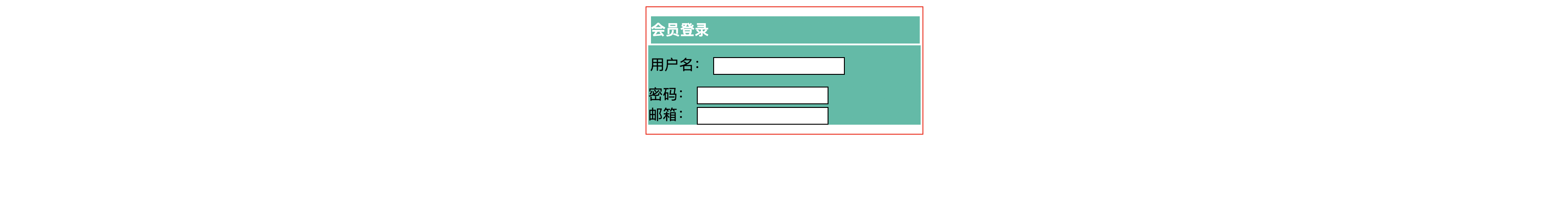
<div id="box">
<h2>会员登录</h2>
<form action="#">
<div>
<span>用户名:</span>
<input type="text">
</div>
<div>
<span>密码:</span>
<input type="text">
</div>
<div>
<span>邮箱:</span>
<input type="text">
</div>
</form>
</div>
</body>
</html>

圆角边框
<!DOCTYPE html>
<html lang="en">
<head>
    <meta charset="UTF-8">
    <title>Title</title>

  <!--
  左上  右上  右下  左下,顺时针方向
  -->
<!--  圆圈 :圆角 = 半径
-->
  <style>
      .quadrilateral{
        width: 100px;
        height: 100px;
        border: 10px solid red;
        border-radius: 50px 20px 10px 5px;
      }
      .circular{
        width: 100px;
        height: 100px;
        border: 10px solid red;
        border-radius: 60px;
      }
  </style>
</head>
<body>
<div class="quadrilateral"></div>
<div class="circular"></div>

</body>
</html>

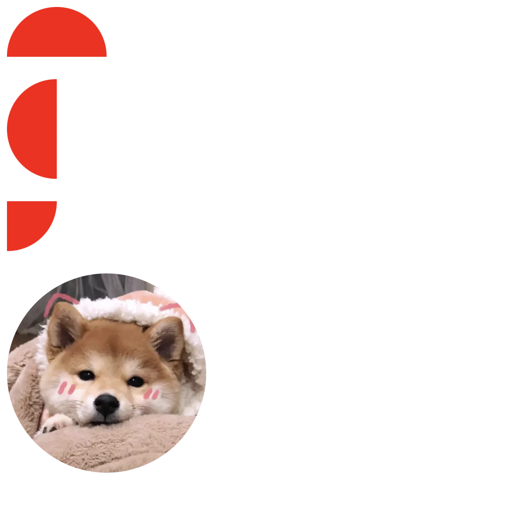
扇形
<!DOCTYPE html>
<html lang="en">
<head>
    <meta charset="UTF-8">
    <title>Title</title>

    <style>
        .Semicircle{
            width: 100px;
            height: 50px;
            background: red;
            border-radius: 50px 50px 0 0;
        }
        .sector{
            width: 50px;
            height: 100px;
            background: red;
            border-radius: 50px 0 0 50px;
        }
        .sector2{
            width: 50px;
            height: 50px;
            background: red;
            border-radius: 0 0 50px 0;
        }
        img{
            width: 200px;
            height: 200px;
            background: red;
            border-radius: 100px;
        }
    </style>
</head>
<body>

<div class="Semicircle"></div>
<br>
<div class="sector"></div>
<br>
<div class="sector2"></div>
<br>
<!--头像-->
<img src="https://gimg2.baidu.com/image_search/src=http%3A%2F%2Fimg2.doubanio.com%2Fview%2Frichtext%2Flarge%2Fpublic%2Fp201881481.jpg&refer=http%3A%2F%2Fimg2.doubanio.com&app=2002&size=f9999,10000&q=a80&n=0&g=0n&fmt=auto?sec=1661844821&t=be735f2a90dd330d3bb2c5b0801f741f" alt="">
</body>
</html>
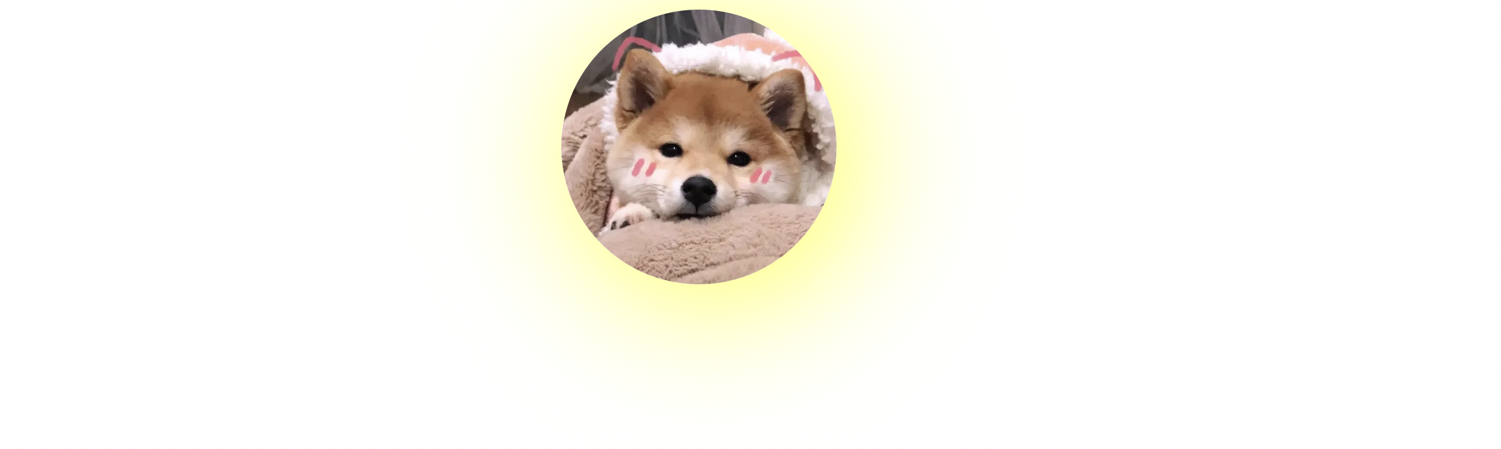
阴影
<!DOCTYPE html>
<html lang="en">
<head>
    <meta charset="UTF-8">
    <title>Title</title>

    <style>
        .box{
            width: 1000px;
            display: block;
            text-align: center;
        }
        img{
            width: 200px;
            height: 200px;
            border-radius: 100px;
            box-shadow: 10px 10px 100px yellow;
        }
    </style>
</head>
<body>

<div class="box">
    <div>
        <img src="https://gimg2.baidu.com/image_search/src=http%3A%2F%2Fimg2.doubanio.com%2Fview%2Frichtext%2Flarge%2Fpublic%2Fp201881481.jpg&refer=http%3A%2F%2Fimg2.doubanio.com&app=2002&size=f9999,10000&q=a80&n=0&g=0n&fmt=auto?sec=1661844821&t=be735f2a90dd330d3bb2c5b0801f741f" alt="">
    </div>
</div>

</body>
</html>
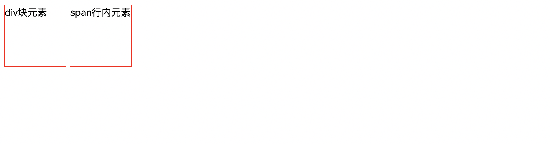
display
标准文档流
块级元素 独占一行
h1 ~ h6 p div
行内元素 不独占一行
span a img strong...
行内元素,可以被包含在块级元素中,反之,则不可以
<!DOCTYPE html>
<html lang="en">
<head>
    <meta charset="UTF-8">
    <title>Title</title>

    <!--
    block 块元素
    inline 行内元素
    inline-block 是块元素,但是可以内联,在一行!
    none 消失
    -->
    <style>
        div{
            width: 100px;
            height: 100px;
            border: 1px solid red;
            display: inline-block;
        }
        span{
            width: 100px;
            height: 100px;
            border: 1px solid red;
            display: inline-block;
            /*display: block;*/
        }
    </style>
</head>
<body>

<div>
    div块元素
</div>
<span>
    span行内元素
</span>
</body>
</html>
这也是一种实现行内元素排列的方式,但是我们更多使用float
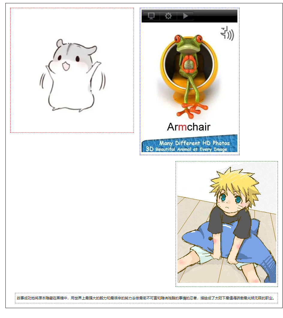
浮动
左右浮动 float
div{
    margin: 10px;
    padding: 5px;
}
#father{
    border: 1px #000 solid;
}
.layer01{
    border: 1px #F00 dashed;
    display: inline-block;
    float: right;
}
.layer02{
    border: 1px #00F dashed;
    display: inline-block;
    float: right;
}
.layer03{
    border: 1px #060 dashed;
    display: inline-block;
    float: right;
}
.layer04{
    border: 1px #666 dashed;
    font-size: 12px;
    line-height: 23px;
    display: inline-block;
    float: right;
}
父级边框塌陷的
/*
clear: right; 右侧不允许有浮动元素
clear: left; 左侧不允许有浮动元素
clear: both; 两侧不允许有浮动元素
clear: none;
*/
解决父级边框塌陷
- 1、增加父级元素高度
#father{
    border: 1px #000 solid;
    height: 800px;
}
- 2、增加一个空的div标签,清除浮动
<!DOCTYPE html>
<html lang="en">
<head>
    <meta charset="UTF-8">
    <title>浮动</title>
  <link rel="stylesheet" href="css/style.css" rel="stylesheet">
</head>
<body>
<div id="father">
    <div class="layer01"><img src="https://gimg2.baidu.com/image_search/src=http%3A%2F%2Flmg.jj20.com%2Fup%2Fallimg%2Ftx06%2F0713201915911.jpg&refer=http%3A%2F%2Flmg.jj20.com&app=2002&size=f9999,10000&q=a80&n=0&g=0n&fmt=auto?sec=1661955171&t=b7d1d4df8583d94ccaf3e12e98fded64" alt=""/></div>
    <div class="layer02"><img src="https://img2.baidu.com/it/u=2261212359,2910829214&fm=253&fmt=auto?w=320&h=475" alt=""/></div>
    <div class="layer03"><img src="https://img1.baidu.com/it/u=1981094663,2149149953&fm=253&fmt=auto&app=138&f=PNG?w=329&h=403" alt=""/></div>
    <div class="layer04">
        故事成功地将原本隐藏在黑暗中,用世界上最强大的毅力和最艰辛的努力去做最密不可宣和隐讳残酷的事情的忍者,描绘成了太阳下最值得骄傲最光明无限的职业。
    </div>
    <div class="clear"></div>
</div>

</body>
</html>
style.css
div{
    margin: 10px;
    padding: 5px;
}
#father{
    border: 1px #000 solid;
}
.layer01{
    border: 1px #F00 dashed;
    display: inline-block;
    float: left;
}
.layer02{
    border: 1px #00F dashed;
    display: inline-block;
    float: left;
}
.layer03{
    border: 1px #060 dashed;
    display: inline-block;
    float: right;
}
/*
clear: right; 右侧不允许有浮动元素
clear: left; 左侧不允许有浮动元素
clear: both; 两侧不允许有浮动元素
clear: none;
*/
.layer04{
    border: 1px #666 dashed;
    font-size: 12px;
    line-height: 23px;
    display: inline-block;
    float: right;
    clear: both;
}
.clear{
    clear: both;
    margin: 0;
    padding: 0;
}
- 3、用overflow
在父级元素增加一个overflow: hidden
<!DOCTYPE html>
<html lang="en">
<head>
    <meta charset="UTF-8">
    <title>浮动</title>
  <link rel="stylesheet" href="css/style.css" rel="stylesheet">
</head>
<body>
<div id="father">
    <div class="layer01"><img src="https://gimg2.baidu.com/image_search/src=http%3A%2F%2Flmg.jj20.com%2Fup%2Fallimg%2Ftx06%2F0713201915911.jpg&refer=http%3A%2F%2Flmg.jj20.com&app=2002&size=f9999,10000&q=a80&n=0&g=0n&fmt=auto?sec=1661955171&t=b7d1d4df8583d94ccaf3e12e98fded64" alt=""/></div>
    <div class="layer02"><img src="https://img2.baidu.com/it/u=2261212359,2910829214&fm=253&fmt=auto?w=320&h=475" alt=""/></div>
    <div class="layer03"><img src="https://img1.baidu.com/it/u=1981094663,2149149953&fm=253&fmt=auto&app=138&f=PNG?w=329&h=403" alt=""/></div>
    <div class="layer04">
        故事成功地将原本隐藏在黑暗中,用世界上最强大的毅力和最艰辛的努力去做最密不可宣和隐讳残酷的事情的忍者,描绘成了太阳下最值得骄傲最光明无限的职业。
    </div>
</div>

</body>
</html>
style.css
div{
    margin: 10px;
    padding: 5px;
}
#father{
    border: 1px #000 solid;
    overflow: hidden;
}
.layer01{
    border: 1px #F00 dashed;
    display: inline-block;
    float: left;
}
.layer02{
    border: 1px #00F dashed;
    display: inline-block;
    float: left;
}
.layer03{
    border: 1px #060 dashed;
    display: inline-block;
    float: right;
}
/*
clear: right; 右侧不允许有浮动元素
clear: left; 左侧不允许有浮动元素
clear: both; 两侧不允许有浮动元素
clear: none;
*/
.layer04{
    border: 1px #666 dashed;
    font-size: 12px;
    line-height: 23px;
    display: inline-block;
    float: right;
    clear: both;
}
.clear{
    clear: both;
    margin: 0;
    padding: 0;
}
- 4、父类添加一个伪类:after
#father:after{
    content: "";
    display: block;
    clear: both;
}
对比float和display
- display
- 方向不可控制
- float
- 浮动起来的话会脱离标准文档流,所以要解决父级塌陷的
定位
相对定位
<!DOCTYPE html>
<html lang="en">
<head>
<meta charset="UTF-8">
<title>Title</title>
<style>
body{
padding: 20px;
}
div{
margin: 10px;
padding: 5px;
font-size: 12px;
line-height: 25px;
}
#father{
border: 1px solid #666;
}
.first{
background-color: #3cbda6;
border: 1px dashed #d47777;
position: relative; /*相对定位:上下左右*/
top: -20px;
left: 20px;
}
.second{
background-color: #00fd3f;
border: 1px dashed #69d7c6;
}
.third{
background-color: #006600;
border: 1px dashed #aa65ba;
position: relative;
bottom: -10px;
right: 10px;
}
</style>
</head>
<body>
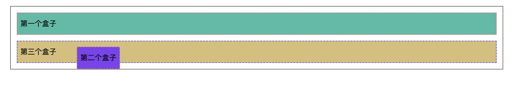
<div id="father">
<div class="first">第一个盒子</div>
<div class="second">第二个盒子</div>
<div class="third">第三个盒子</div>
</div>
</body>
</html>
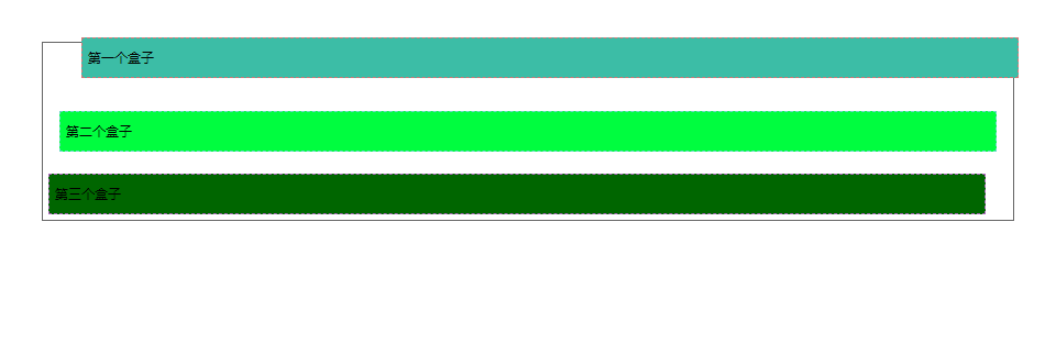
相对定位: position: relative
相对于原来的位置,进行指定的偏移,相对定位的话,它任然在标准文档流中,原来的位置会被保留
top: -20px;
left: 20px;
bottom: -10px;
right: 10px
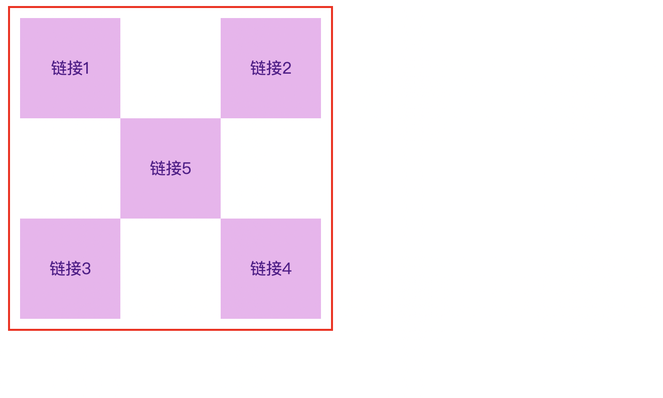
方块定位练习
- 使用div和超链接a布局页面
- 每个超链接宽度和高度都是100px,背景颜色是粉色,鼠标指针移上去时变为蓝色
- 使用相对定位改变每个超链接的位置
<!DOCTYPE html>
<html lang="en">
<head>
<meta charset="UTF-8">
<title>方块定位</title>
<style>
#box {
width: 300px;
height: 300px;
padding: 10px;
border: 2px solid red;
}
a {
width: 100px;
height: 100px;
text-decoration: none; /*去下划线*/
background: #efb3ef;
line-height: 100px;
text-align: center;
display: block;
}
a:hover {
background: #7ac2e8;
}
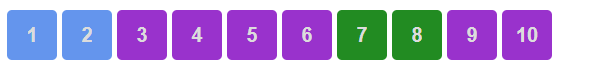
.a2,.a4 {
position: relative;
left: 200px;
top: -100px;
}
.a5 {
position: relative;
left: 100px;
top: -300px;
}
</style>
</head>
<body>
<div id="box">
<a class="a1" href="#">链接1</a>
<a class="a2" href="#">链接2</a>
<a class="a3" href="#">链接3</a>
<a class="a4" href="#">链接4</a>
<a class="a5" href="#">链接5</a>
</div>
</body>
</html>
绝对定位
- 没有父级元素定位的前提下,相对于浏览器定位
- 假设父级元素存在定位,我们通常会相对于父级元素进行偏移
- 在父级元素范围内移动
相对于父级或浏览器的位置,进行指定的偏移,相对定位的话,它仍然在标准文档流中,原来的位置不会被保留
<!DOCTYPE html>
<html lang="en">
<head>
    <meta charset="UTF-8">
    <title>Title</title>
    <style>
        div{
          margin: 10px;
          padding: 5px;
          font-size: 12px;
          line-height: 25px;
        }
        #father{
            border: 1px solid #666;
            padding: 0;
            position: relative;
        }
        #first{
            background-color: #3cbda6;
            border: 1px dashed #d47777;
        }
        #second{
            background-color: #7f41f1;
            border: 1px dashed #d274a7;
            position: absolute;
            left: 100px;
        }
        #third{
            background-color: #d7bf76;
            border: 1px dashed #594bdb;
        }
    </style>
</head>
<body>
<div id="father">
    <div id="first">第一个盒子</div>
    <div id="second">第二个盒子</div>
    <div id="third">第三个盒子</div>
</div>
</body>
</html>
固定定位
<!DOCTYPE html>
<html lang="en">
<head>
<meta charset="UTF-8">
<title>Title</title>
<style>
body{
height: 1000px;
}
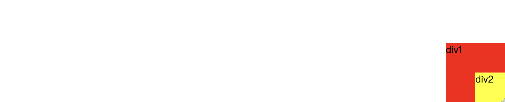
div:nth-of-type(1){ /*绝对定位:相对于浏览器*/
width: 100px;
height: 100px;
background: red;
position: absolute;
right: 0;
bottom: 0;
}
div:nth-of-type(2){ /*固定定位:fixed*/
width: 50px;
height: 50px;
background: yellow;
position: fixed;
right: 0;
bottom: 0;
}
</style>
</head>
<body>
<div>div1</div>
<div>div2</div>
</body>
</html>
图层
<!DOCTYPE html>
<html lang="en">
<head>
<meta charset="UTF-8">
<title>Title</title>
<link rel="stylesheet" href="./css/style.css">
</head>
<body>
<div id="content">
<ul>
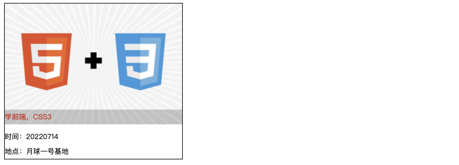
<li><img
src="https://gimg2.baidu.com/image_search/src=http%3A%2F%2Fqingyuanma.com%2Fdata%2Fattachment%2Fforum%2F201802%2F25%2F231102bz6y87676v4k96bv.gif&refer=http%3A%2F%2Fqingyuanma.com&app=2002&size=f9999,10000&q=a80&n=0&g=0n&fmt=auto?sec=1662023027&t=62aef65a2afbc2d6aa4bbf3640d1deca"
alt=""></li>
<li class="tipText">学前端,CSS3</li>
<li class="tipBg"></li>
<li>时间:20220714</li>
<li>地点:月球一号基地</li>
</ul>
</div>
</body>
</html>
style.css
#content {
    width: 300px;
    padding: 0;
    margin: 0;
    overflow: hidden;
    font-size: 12px;
    line-height: 25px;
    border: 1px #000 solid;
}
ul,li {
    padding: 0;
    margin: 0;
    list-style: none;
}
#content ul {
    position: relative;
}
.tipText,.tipBg{
    position: absolute;
    width: 300px;
    height: 25px;
    top: 180px;
}
.tipText {
    color: red;
    /*z-index: 20;*/
}
.tipBg {
    background: #000;
    opacity: 0.2; /*背景透明度*/
}