
 码云
码云 纯css创建网页加载动画
有时候我们网页由于数据量大或者是网络速度原因导致请求速度慢,会出现一些空白的页面,使得用户体验不是很好,所以网站都会设置一个预加载效果,即加载之前先让他加载一个动画,二后台继续加载未加载出来的内容,当页面加载完数据后动画消失内容显示,这样就是的我们用户体验很好。
接下来给大家分享的是 9 个纯 css 加载动画效果,废话不多说直接上代码。
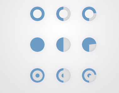
先看一下效果图:
HTML 代码
<div class="block">
<h1>OuroboroCSS</h1>
<p class="circle"><span class="ouro">
</span></p>
<span class="ouro ouro2">
</span>
<span class="ouro ouro3">
</span>
<p class="round"><span class="ouro">
</span></p>
<span class="ouro ouro2">
</span>
<span class="ouro ouro3">
</span>
<p class="double"><span class="ouro">
</span></p>
<span class="ouro ouro2">
</span>
<span class="ouro ouro3">
</span>
</div>
csss 代码
.ouro {
position: relative;
display: inline-block;
height: 46px;
width: 46px;
margin: 1em;
border-radius: 50%;
background: none repeat scroll 0 0 #DDDDDD;
overflow: hidden;
box-shadow: 0 0 10px rgba(0, 0, 0, .1) inset, 0 0 25px rgba(0, 0, 255, 0.075);
}

.ouro:after {
content: "";
position: absolute;
top: 9px;
left: 9px;
display: block;
height: 28px;
width: 28px;
background: none repeat scroll 0 0 #F2F2F2;
border-radius: 50%;
box-shadow: 0 0 10px rgba(0, 0, 0, .1);
}

.ouro>span {
position: absolute;
height: 100%;
width: 50%;
overflow: hidden;
}

.left {
left: 0
}

.right {
left: 50%
}

.anim {
position: absolute;
left: 100%;
top: 0;
height: 100%;
width: 100%;
border-radius: 999px;
background: none repeat scroll 0 0 #508EC3;
opacity: 0.8;
-webkit-animation: ui-spinner-rotate-left 3s infinite;
animation: ui-spinner-rotate-left 3s infinite;
-webkit-transform-origin: 0 50% 0;
transform-origin: 0 50% 0;
}

.left .anim {
border-bottom-left-radius: 0;
border-top-left-radius: 0;
}

.right .anim {
border-bottom-right-radius: 0;
border-top-right-radius: 0;
left: -100%;
-webkit-transform-origin: 100% 50% 0;
transform-origin: 100% 50% 0;
}
/* v2 */

.ouro2 .anim {
-webkit-animation-delay: 0;
animation-delay: 0;
}

.ouro2 .right .anim {
-webkit-animation-delay: 1.5s;
animation-delay: 1.5s;
}
/* v3 */

.ouro3 .anim {
-webkit-animation-delay: 0s;
-webkit-animation-duration: 3s;
-webkit-animation-timing-function: linear;
animation-delay: 0s;
animation-duration: 3s;
animation-timing-function: linear;
}

.ouro3 .right .anim {
-webkit-animation-name: ui-spinner-rotate-right;
-webkit-animation-delay: 0;
-webkit-animation-delay: 1.5s;
animation-name: ui-spinner-rotate-right;
animation-delay: 0;
animation-delay: 1.5s;
}
/* round variation */

.round .ouro:after {
display: none
}
/* double variation */

.double .ouro:after {
height: 13px;
width: 13px;
left: 7px;
top: 7px;
border: 10px solid #ddd;
background: transparent;
box-shadow: none;
}

@keyframes ui-spinner-rotate-right {
0% {
transform: rotate(0deg)
}
25% {
transform: rotate(180deg)
}
50% {
transform: rotate(180deg)
}
75% {
transform: rotate(360deg)
}
100% {
transform: rotate(360deg)
}
}

@keyframes ui-spinner-rotate-left {
0% {
transform: rotate(0deg)
}
25% {
transform: rotate(0deg)
}
50% {
transform: rotate(180deg)
}
75% {
transform: rotate(180deg)
}
100% {
transform: rotate(360deg)
}
}

@-webkit-keyframes ui-spinner-rotate-right {
0% {
-webkit-transform: rotate(0deg)
}
25% {
-webkit-transform: rotate(180deg)
}
50% {
-webkit-transform: rotate(180deg)
}
75% {
-webkit-transform: rotate(360deg)
}
100% {
-webkit-transform: rotate(360deg)
}
}

@-webkit-keyframes ui-spinner-rotate-left {
0% {
-webkit-transform: rotate(0deg)
}
25% {
-webkit-transform: rotate(0deg)
}
50% {
-webkit-transform: rotate(180deg)
}
75% {
-webkit-transform: rotate(180deg)
}
100% {
-webkit-transform: rotate(360deg)
}
}

html {
height: 100%
}

body {
text-align: center;
background: radial-gradient(circle, #fff 0%, #bbb 85%) no-repeat;
background: -webkit-radial-gradient(circle, #fff 0%, #bbb 85%) no-repeat;
height: 100%;
display: table;
width: 100%
}

.block {
display: table-cell;
vertical-align: middle
}

h1,
a {
margin-top: 1em;
font-family: "Open Sans Light", "Open Sans", "Segoe UI", Helvetica, Arial;
color: #888;
font-weight: lighter;
}

.info {
margin-top: 25px
}

.info a {
font-size: 12px;
color: #999
}

.info br+a {
text-decoration: none
}
以上就是今天码云笔记为大家带来的纯 css 实现的加载动画效果,希望大家喜欢,赶紧收藏一下,对你会有帮助的。
 微信
微信 支付宝
支付宝声明:本站所有文章,如无特殊说明或标注,均为本站原创发布。任何个人或组织,在未征得本站同意时,禁止复制、盗用、采集、发布本站内容到任何网站、书籍等各类媒体平台。如若本站内容侵犯了原著者的合法权益,可联系我们进行处理。
码云笔记 » 纯css创建网页加载动画
码云笔记 » 纯css创建网页加载动画


