React Native之TextInput的介绍与使用(富文本封装与使用实例,常用输入框封装与使用实例)
TextInput组件介绍
TextInput是一个允许用户在应用中通过键盘输入文本的基本组件。本组件的属性提供了多种特性的配置,譬如自动完成、自动大小写、占位文字,以及多种不同的键盘类型(如纯数字键盘)等等。最简单的用法就是丢一个TextInput到应用里,然后订阅它的onChangeText事件来读取用户的输入。
组件的常用属性
(1)autoCapitalize:控制TextInput是否要自动将特定字符切换为大写。可选值有:none、sentences、words、characters。
- characters: 所有的字符。
- words: 每个单词的第一个字符。
- sentences: 每句话的第一个字符(默认)。
- none: 不自动切换任何字符为大写。
(2)placeholder:占位符,在输入前显示的文本内容。
(3)value:文本输入框的默认值。
(4)placeholderTextColor:占位符文本的颜色。
(5)secureTextEntry:如果为 true,表示密码输入框。文本显示为“*”,默认值为false。
(6)multiline:如果为 true,表示多行输入。
(7)editable:默认为 true。如果设置为 false 表示不可编辑。
(8)autoFocus:如果为 true,则自动获取焦点。
(9)clearButtonMode:表示什么时候会显示清除按钮。可选值有:never、while-editing、unless-editing、always。
(10)maxLength:能够输入的最长字符数。
(11)enablesReturnKeyAutomatically:默认为 false。设置为 true 表示没有输入文本时返回键无法使用。
(12)returnKeyType:表示软键盘返回键显示的字符串。可选值为:default、go、google、join、next、route、search、send、yahoo、done、emergency-call。
(13)secureTextEntry:默认为 false。如果为 true,则像密码框一样隐藏输入内容。
(14)autoCorrect:如果为false,会关闭拼写自动修正。默认值是true。
(15)blurOnSubmit:如果为true,文本框会在提交的时候失焦。对于单行输入框默认值为true,多行则为false。注意:对于多行输入框来说,如果将blurOnSubmit设为true,则在按下回车键时就会失去焦点同时触发onSubmitEditing事件,而不会换行。
(16)caretHidden:如果为true,则隐藏光标。默认值为false。
(17)keyboardType:keyboardType enum("default", 'numeric', 'email-address', "ascii-capable", 'numbers-and-punctuation', 'url', 'number-pad', 'phone-pad', 'name-phone-pad', 'decimal-pad', 'twitter', 'web-search') ,决定弹出的何种软键盘的,譬如
numeric(纯数字键盘)。
这些值在所有平台都可用:
- default
- numeric
- email-address
- phone-pad
(18)iosreturnKeyType:iosreturnKeyType enum('done', 'go', 'next', 'search', 'send', 'none', 'previous', 'default', 'emergency-call', 'google', 'join', 'route', 'yahoo') 决定“确定”按钮显示的内容。在Android上你还可以使用returnKeyLabel来自定义文本。
跨平台
下列这些选项是跨平台可用的:
donegonextsearchsend
限Android
下列这些选项仅限Android使用:
noneprevious
限iOS
下列这些选项仅限iOS使用:
defaultemergency-callgooglejoinrouteyahoo
(19)selectTextOnFocus:如果为true,当获得焦点的时候,所有的文字都会被选中。
(20)selection:selection {start: number, end: number} 设置选中文字的范围(指定首尾的索引值)。如果首尾为同一索引位置,则相当于指定光标的位置。
(21)selectionColor:设置输入框高亮时的颜色(在iOS上还包括光标)
组件的常用方法
(1)onChange:当文本发生变化时,调用该函数。
(2)onEndEditing:当结束编辑时,调用该函数。
(3)onBlur:失去焦点时触发。
(4)onFocus:获得焦点时触发。
(5)onSubmitEditing:当结束编辑后,点击键盘的提交按钮触发该事件。
(6)onChangeText:当文本框内容变化时调用此回调函数。改变后的文字内容会作为参数传递。
(7)onLayout:当组件挂载或者布局变化的时候调用,参数为
{x, y, width, height}。(8)onScroll:在内容滚动时持续调用,传回参数的格式形如
{ nativeEvent: { contentOffset: { x, y } } }。 也可能包含其他和滚动事件相关的参数,但是在Android上,出于性能考虑,不会提供contentSize参数。(9)onSelectionChange:长按选择文本时,选择范围变化时调用此函数,传回参数的格式形如
{ nativeEvent: { selection: { start, end } } }。(10)iosonKeyPress:当一个键被按下的时候调用此回调。传递给回调函数的参数为
{ nativeEvent: { key: keyValue } },其中keyValue即为被按下的键。会在onChange之前调用。组件的使用实例
1,文本加输入框(封装组件 iOS Android)

封装组件InputView.js的使用实例,如有需要完整的代码,请留言评论
 1                     <View >
 2                         <Text>请认真填写资料</Text>
 3                         <View style={{ marginTop: 12 }}>
 4                             <InputView name={'账号'}
 5                                 hintText={''}
 6                                 editableV={false}
 7                                 value={String(this.state.telephone)}
 8                             />
 9                             <InputView name={'支付密码'}
10                                 isPassword={true}
11                                 hintText={'请输入数字+字母的组合'}
12                                 onChangeText={(inputData) => { this.setState({ password: inputData }) }}
13                             />
14                             <InputView name={'再次确认'}
15                                 isPassword={true}
16                                 //value={this.state.nickname}
17                                 hintText={'请再次输入'}
18                                 onChangeText={(inputData) => { this.setState({ confirmPass: inputData }) }}
19                             />
20
21                         </View>
22                     </View>
2,富文本编辑(封装组件 iOS Android)
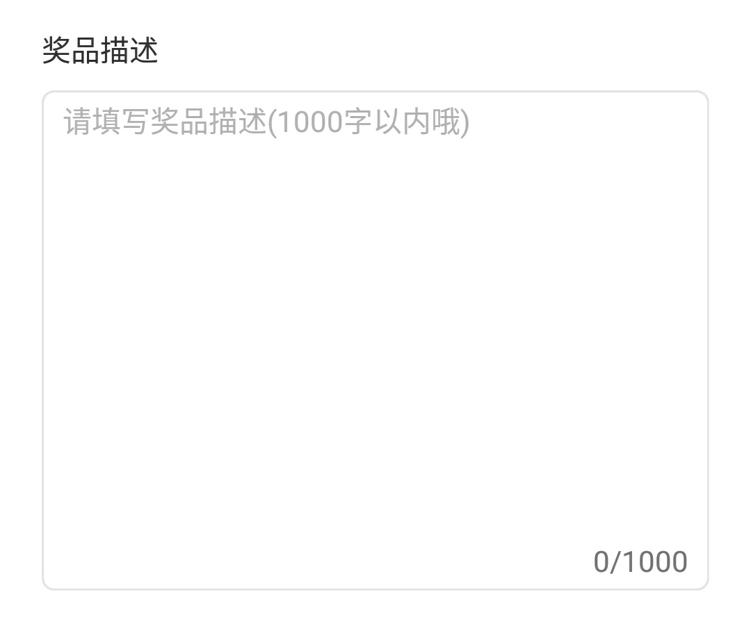
富文本RichTextView的使用实例,如有需要完整的代码,请留言评论
 1             <View style={{ marginTop: 20 }}>
 2                         <Text
 3                             style={{
 4                                 fontSize: 14,
 5                                 color: AppSetting.BLACK,
 6                                 paddingLeft: 20,
 7                                 marginBottom: 10
 8                             }}>奖品描述</Text>
 9                         <RichTextView
10                             inputStyle={styles.inputStyle}
11                             placeholder="请填写奖品描述(1000字以内哦)"
12                             minHeight={240} // 最小高度,默认为100
13                             maxLength={1000} // 最大长度,默认为100
14                             onChangeText={(inputValue) => {
15                                 let desPrizes = CommonMethod.filteremoji(inputValue, 1)//表情过滤机制
16                                 this.setState({ desPrizes: desPrizes })
17                             }}
18                             showCount={true} // 展示剩余文字, 默认为true
19                         />
20
21                     </View>
RichTextView.js富文本编辑组件
  1 /**
  2  * Created by jackson on 2018/08/13.
  3  * 富文本
  4  */
  5 import React, {Component} from 'react';
  6 import PropTypes from 'prop-types'
  7 import {
  8     StyleSheet,
  9     View,
 10     TextInput,
 11     Text,
 12     Dimensions
 13 } from 'react-native';
 14 const ScreenHeight = Dimensions.get('window').height;
 15 const ScreenWidth = Dimensions.get('window').width;
 16 const defaultMinHeight = 100
 17 //模块声名并导出
 18 export default class RichTextView extends Component {
 19     //属性声名
 20     static propTypes = {
 21         style:PropTypes.object,
 22         inputStyle:PropTypes.any,
 23         maxLength:PropTypes.number, // 限制文字长度
 24         placeholder:PropTypes.string,  // 占位文字
 25         minHeight:PropTypes.number,   // 最小高度
 26         showCount:PropTypes.bool,
 27         onChangeText:PropTypes.func,//获取编辑的文本
 28     };
 29
 30     //默认属性
 31     static defaultProps = {
 32         maxLength: 100,
 33         showCount: true,
 34         minHeight: defaultMinHeight
 35     };
 36
 37     //构造函数
 38     constructor(props) {
 39         super(props);
 40         //状态机变量声明
 41         this.state = {
 42             text: '',
 43         };
 44     }
 45
 46     //渲染
 47     render() {
 48         return (
 49             <View style={styles.container}>
 50                 <View style={[styles.inputViewStyle,this.props.style,{minHeight:this.props.minHeight}]}>
 51                     <TextInput
 52                         style={[styles.inputTextStyle,this.props.inputStyle,{minHeight:this.props.minHeight}]}
 53                         placeholder={this.props.placeholder ? this.props.placeholder :'请输入'}
 54                         multiline={true}
 55                         paddingVertical={0}
 56                         selectionColor = {'#b2b2b2'}
 57                         textAlignVertical={'top'}
 58                         placeholderTextColor={'#b2b2b2'}
 59                         underlineColorAndroid={'transparent'}
 60                         maxLength={this.props.maxLength}
 61                         defaultValue = {this.state.text}
 62                         onChangeText={
 63                                 (text) => {
 64                                     this.props.onChangeText(text)
 65                                     this.setState({
 66                                         text: text
 67                                     })
 68                                 }
 69                         }
 70                     />
 71                     {
 72                         this.props.showCount ?
 73                             <Text style={{position: 'absolute', bottom: 5, right: 10, fontSize: 14}}>
 74                                 {this.state.text.length}/{this.props.maxLength}
 75                             </Text>
 76                             :
 77                             null
 78                     }
 79                 </View>
 80             </View>
 81         );
 82     }
 83 };
 84
 85 const styles = StyleSheet.create({
 86     container: {
 87         flex: 1,
 88         alignItems: 'center',
 89         backgroundColor: '#FFFFFF',
 90     },
 91     inputViewStyle: {
 92         ScreenWidth - 40,
 93         minHeight: defaultMinHeight,
 94     },
 95     inputTextStyle: {
 96         fontSize: 14,
 97         color: '#666666',
 98          '100%',
 99         minHeight: defaultMinHeight,
100         padding: 10,
101         paddingBottom: 30,
102         paddingTop: 10
103     }
104 });