CSS 3.0
CSS3.0
思维脑图
1. 初识CSS
1.1 CSS概念
CSS ---> Cascading Style Sheet 层叠级联样式表
用来美化网页,如字体、颜色、边距、高度、背景图片、网页定位、页面浮动......
1.2 发展史
- CSS 1.0
- CSS 2.0 DIV(块) + CSS, HTML 与 CSS结构分离的思想,网页变得简单,SEO(搜索引擎优化)
- CSS 2.1 浮动,定位
- CSS 3.0 圆角,阴影,动画....浏览器兼容性
1.3 简单实例
<!DOCTYPE html>
<html lang="en">
<head>
    <meta charset="UTF-8">
    <title>Title</title>

<!--规范<style>可以编写css的代码,每一个声明最好用分号结尾
    语法:
        选择器{
            声明1;
            声明2;
            声明3;
        }
-->
    <link rel="stylesheet" href="css/style.css">

</head>
<body>
<h1>Jay</h1>
</body>
</html>
h1{
    color: red;
}
1.4 CSS的优势
- 内容与表现分离
- 网页的表现统一,容易修改
- 丰富的样式,使得页面布局更加灵活
- 减少网页的代码量,增加网页的浏览速度,节省网络带宽
- 运用独立于页面的CSS,有利于网页被搜索引擎收录
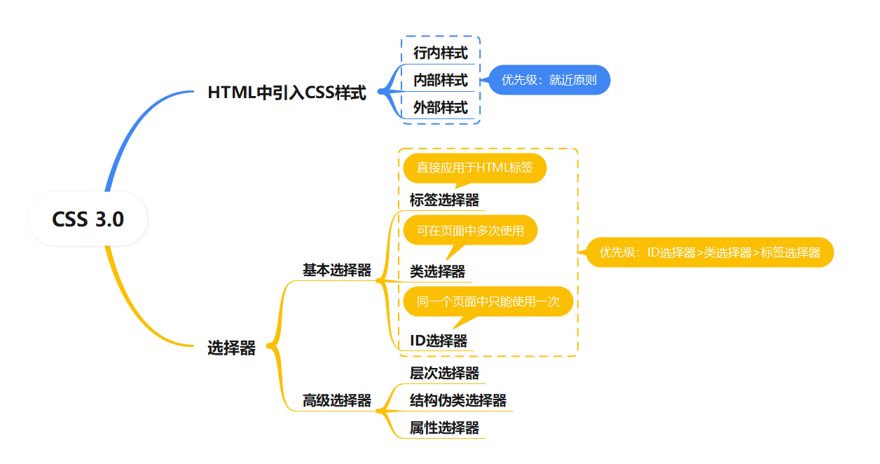
1.5 CSS导入的方式
1.5.1 行内样式
<!--行内样式:在标签元素中,编写一个style属性-->
<h1 style="color: red">Jay</h1>
- 使用style属性引入CSS样式
- 使用style属性设置CSS样式仅对当前的HTML标签起作为,并且是写在HTML标签中的这种方式不能起到内容与表现相分离,本质上没有体现出CSS的优势,因此不推荐使用。
1.5.2 内部样式表
<!--内部样式-->
    <style>
      h1{
        color: green;
      }
    </style>
- CSS代码写在
<head>的<style>标签中 - 优点:方便在同页面中修改样式
- 缺点:不利于在多页面间共享复用代码及维护,对内容与样式的分离也不够彻底引出外部样式表
1.5.3 外部样式表
<!--链接式-->
  <link rel="stylesheet" href="css/style.css">
<!--导入式-->
  <style>
    @import "css/style.css";
  </style>
- CSS代码保存在扩展名为.css的样式表中
- HTML文件引用扩展名为.css的样式表,有两种方式
- 链接式(使用的最多)
- 使用
<link>标签链接外部样式表,并讲解各参数的含义,<link>标签必须放在<head>标签中
- 使用
- 导入式
- 使用
@import导入外部样式表
- 使用
- 链接式(使用的最多)
链接式与导入式的区别
<link/>标签是属于XHTML范畴的,@import是属于CSS2.1中特有的。- 使用
<link/>链接的CSS是客户端浏览网页时先将外部CSS文件加载到网页当中,然后再进行编译显示,所以这种情况下显示出来的网页与用户预期的效果一样,即使网速再慢也一样的效果。 - 使用
@import导入的CSS文件,客户端在浏览网页时是先将HTML结构呈现出来,再把外部CSS文件加载到网页当中,当然最终的效果也与使用<link/>链接文件效果一样,只是当网速较慢时会先显示没有CSS统一布局的HTML网页,这样就会给用户很不好的感觉。这个也是现在目前大多少网站采用链接外部样式表的主要原因。 - 由于
@import是属于CSS2.1中特有的,因此对于不兼容CSS2.1的浏览器来说就是无效的。
2. 选择器
作用:选择页面上的某一个或者某一类元素
2.1 标签选择器
<!DOCTYPE html>
<html lang="en">
<head>
    <meta charset="UTF-8">
    <title>Title</title>
    <style>
      /*标签选择器,会选择到页面上所有的这个标签的元素*/
      h1{
        color: red;
      }
      p{
        font-size: 80px;
      }
    </style>
</head>
<body>

<h1>学Java</h1>
<p>Jay</p>
</body>
</html>
2.2 类选择器
<!DOCTYPE html>
<html lang="en">
<head>
    <meta charset="UTF-8">
    <title>Title</title>
    <style>
      /*类选择器的格式  .class的名称{}
      可以复用*/
      .jay{
        color: green;
      }
      .soul{
        color: aqua;
      }
    </style>
</head>
<body>
<h1 class="jay">标题1</h1>
<h1 class="soul">标题2</h1>
</body>
</html>
2.3 ID选择器
<!DOCTYPE html>
<html lang="en">
<head>
    <meta charset="UTF-8">
    <title>Title</title>
    <style>
      /*id选择器格式,不可复用,id全局唯一*/
      /*  #id名称{}*/
      #jay{
        color:red;
      }
    </style>
</head>
<body>
<h1 id = jay>标题1</h1>

</body>
</html>
2.4 基本选择器的优先级
ID选择器>类选择器>标签选择器
- 标签选择器直接应用于HTML标签
- 类选择器可在页面中多次使用
- ID选择器在同一个页面中只能使用一次
2.5 层次选择器
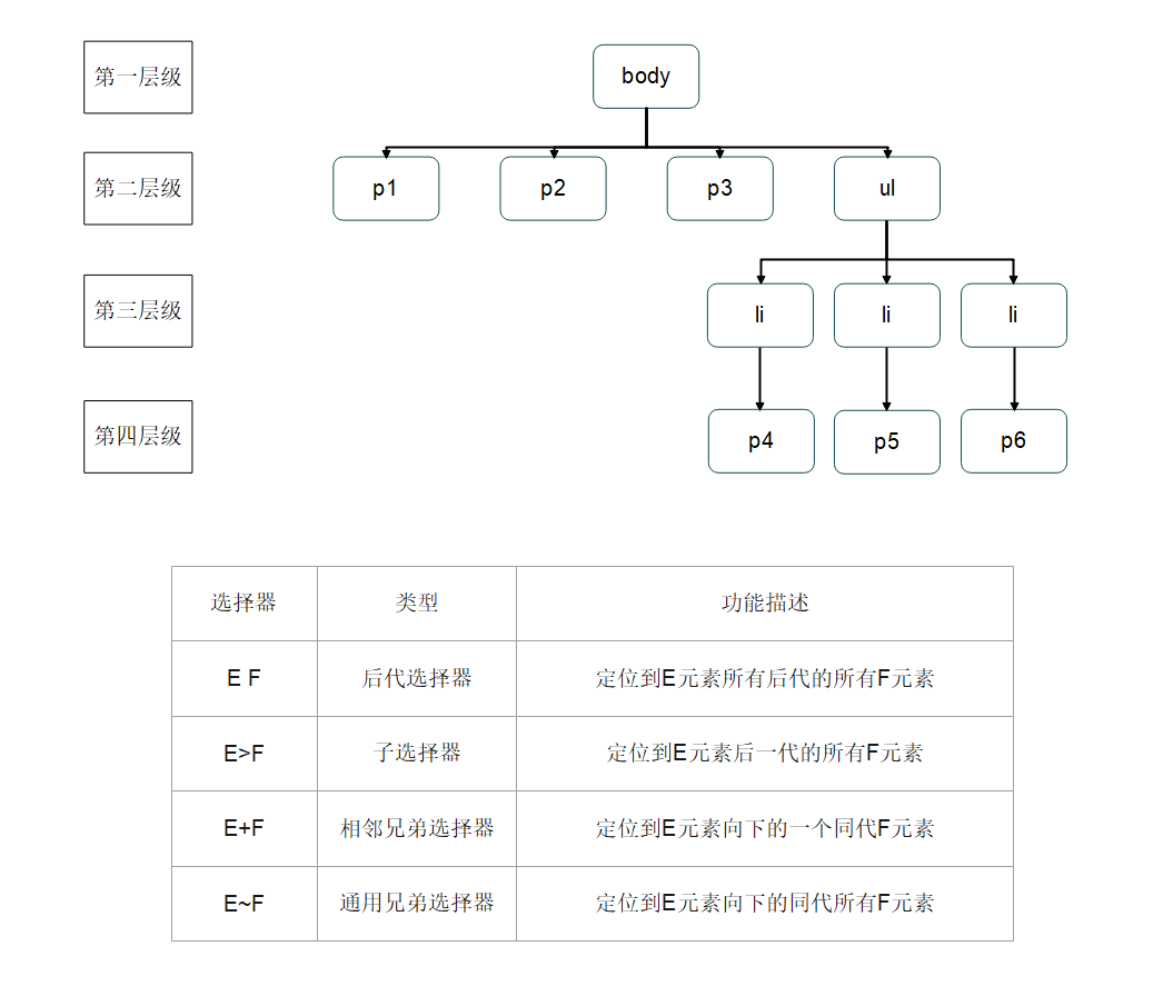
就近原则
<!DOCTYPE html>
<html lang="en">
<head>
    <meta charset="UTF-8">
    <title>Title</title>
  <style>
    /*后代选择器*/
    /*在body后面的所有p元素*/
    body p{
      background: red;
    }
    /*子选择器*/
    /*在body后的一代p元素*/
    body>p{
      background: green;
    }
    /*相邻兄弟选择器*/
    /*.active向下的一个同级p元素*/

    .active + p{
      background: yellow;
    }
    /*通用兄弟选择器*/
    /* .active向下的所有同代p元素*/
    .active~p{
      background: blue;
    }
  </style>
</head>
<body>
	<p class = "active">p1</p>
	<p>p2</p>
	<p>p3</p>

	<ul>
	  <li>
	    <p>p4</p>
	  </li>
	  <li>
	    <p>p5</p>
	  </li>
	  <li>
	    <p>p6</p>
	  </li>
	</ul>

</body>
</html>
2.6 结构伪类选择器
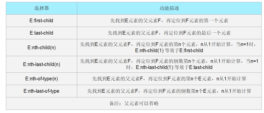
就近原则
<!DOCTYPE html>
<html lang="en">
<head>
  <meta charset="UTF-8">
  <title>Title</title>
  <style>
    /**ul的第一个子元素*/
    ul li:first-child{
      background: red;
    }
    /**ul的最后一个元素*/
    ul li:last-child{
      background: green;
    }
    /*只选中p1:*/
    /*定位到父元素,选择当前的第2个元素(按顺序)*/
    p:nth-child(2){
      background: yellow;
    }
    /*选中父元素,第1个属于p元素的类型(按类型)*/
    p:nth-of-type(1){
      background: blue;
    }
    /*伪类:鼠标定位特效*/
    h1:hover{
      background: orange ;
    }
  </style>
</head>
<body>
  <h1>Jay</h1>
  <p>p1</p>
  <p>p2</p>
  <p>p3</p>

  <ul>
    <li>li1</li>
    <li>li2</li>
    <li>li3</li>
  </ul>

</body>
</html>
2.7 属性选择器(常用)
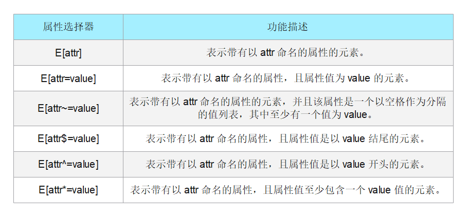
就近原则
/* 所有链接 */
a {
  color: blue;
}

/* 以 "#" 开头的页面本地链接 */
a[href^="#"] {
  background-color: yellow;
}

/* 包含 "example" 的链接 */
a[href*="example"] {
  background-color: orange;
}

/* 包含 "insensitive" 的链接,不区分大小写 */
a[href*="insensitive" i] {
 background-color: green;
}

/* 包含 "cAsE" 的链接,区分大小写 */
a[href*="cAsE" s] {
  background-color: pink;
}

/* 以 ".org" 结尾的链接 */
a[href$=".org"] {
  background-color: red;
}
<ul>
  <li><a href="#internal">Internal link</a></li>
  <li><a href="http://example.com">Example link</a></li>
  <li><a href="#InSensitive">Insensitive internal link</a></li>
  <li><a href="http://example.org">Example org link</a></li>
</ul>
2.8 小结
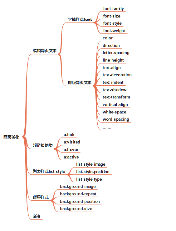
3. 页面美化
作用
- 有效的传递页面信息
- 使用CSS美化过的页面文本,使页面漂亮、美观,吸引用户
- 可以很好的突出页面的主题内容,使用户第一眼可以看到页面主要内容
- 具有良好的用户体验
< span>标签:能让某几个文字或者某个词语凸显出来,从而添加对应的样式!
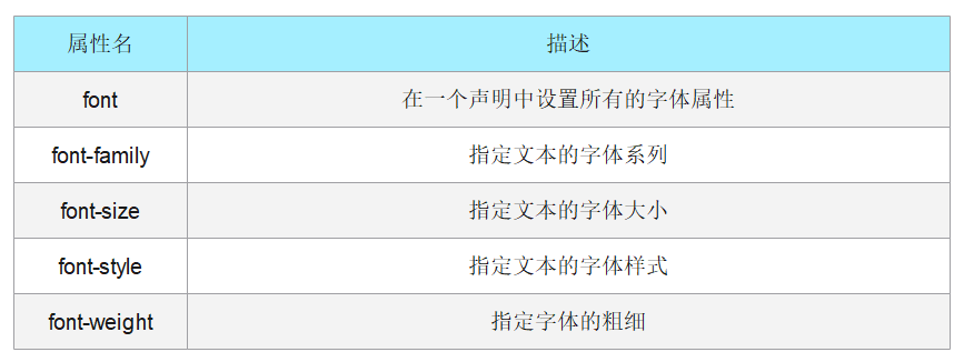
3.1 字体样式
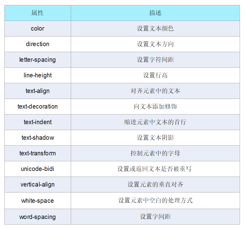
3.2 文本样式
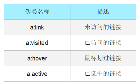
3.3 超链接伪类
3.4 列表样式
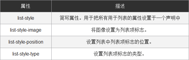
3.5 背景样式
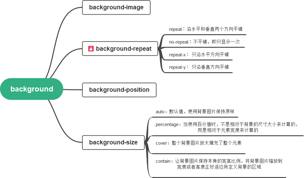
3.6 渐变
background-color: #F4D03F;
background-image: linear-gradient(132deg, #F4D03F 0%, #16A085 100%);
3.7 小结
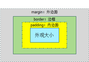
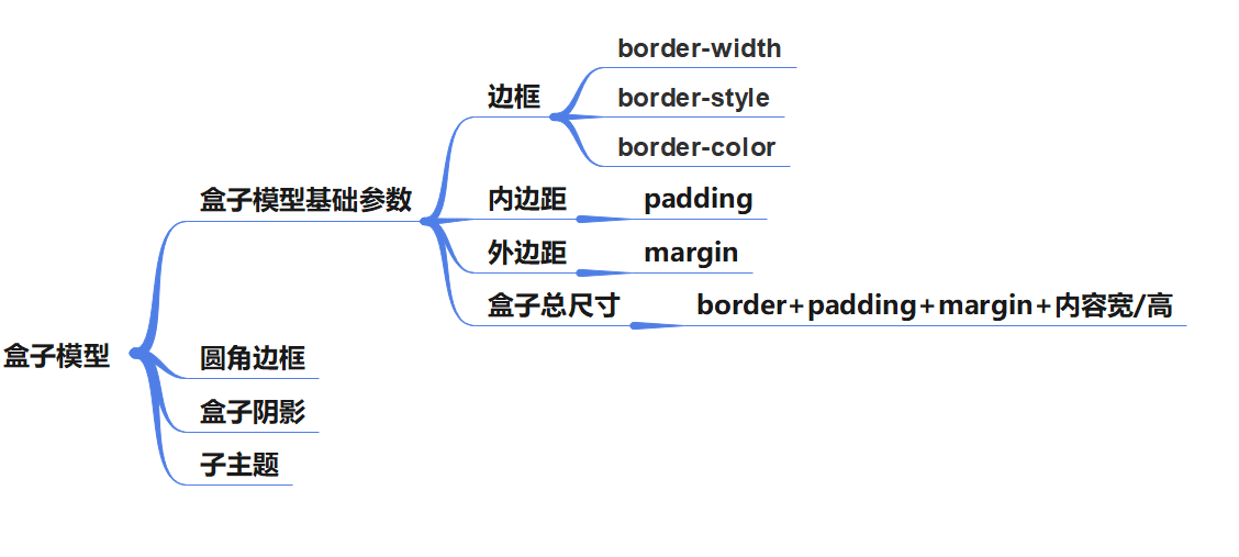
4. 盒子模型
4.1 简介
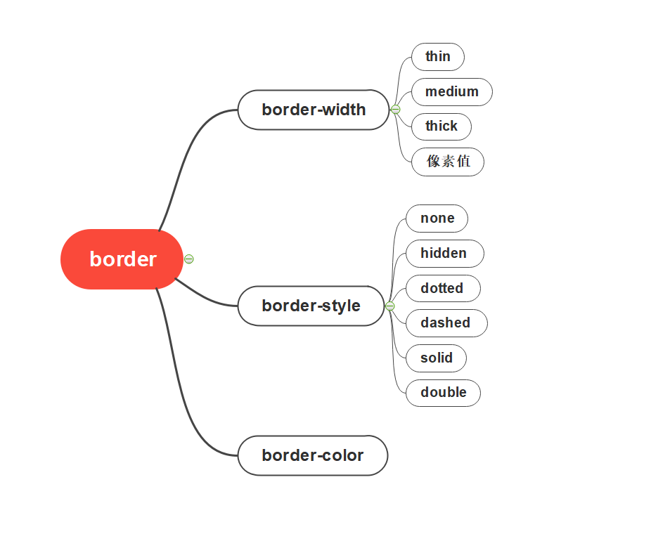
4.2 边框
div
{
	border:2px solid #a1a1a1;
	padding:10px 40px;
	background:#dddddd;
	width:300px;
	border-radius:25px;
}
4.3 内外边距
顺时针
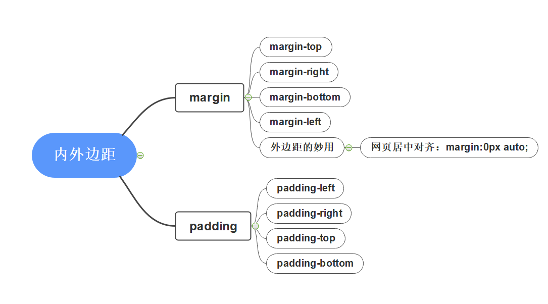
- 网页居中对齐的必要条件
- 块元素
- 固定宽度
4.4 圆角边框
顺时针
border-radius:20px10px50px30px;
圆
<!DOCTYPE html>
<html>
<head lang="en">
	<meta charset="UTF-8">
	<title>border-radius制作圆形</title>
	<style>
	div{
		width:100px;
		height:100px;
		border:4px solid red;
		border-radius:50%;
	}
	</style>
</head>
<body>
	<div>
	</div>
</body>
</html>
半圆
<!DOCTYPE html>
<html>
<head lang="en">
	<meta charset="UTF-8">
	<title>border-radius制作半圆形</title>
	<style>
		div{
			background: red;
			margin: 30px;
		}
		div:nth-of-type(1){
			width: 100px;
			height: 50px;
			border-radius: 50px 50px 0 0;
		}
		div:nth-of-type(2){
			width: 100px;
			height: 50px;
			border-radius:0 0 50px 50px;
		}
		div:nth-of-type(3){
			width: 50px;
			height: 100px;
			border-radius:0 50px 50px 0;
		}
		div:nth-of-type(4){
			width: 50px;
			height: 100px;
			border-radius: 50px 0 0 50px;
		}
	</style>
</head>
<body>
	<div></div>
	<div></div>
	<div></div>
	<div></div>
</body>
</html>
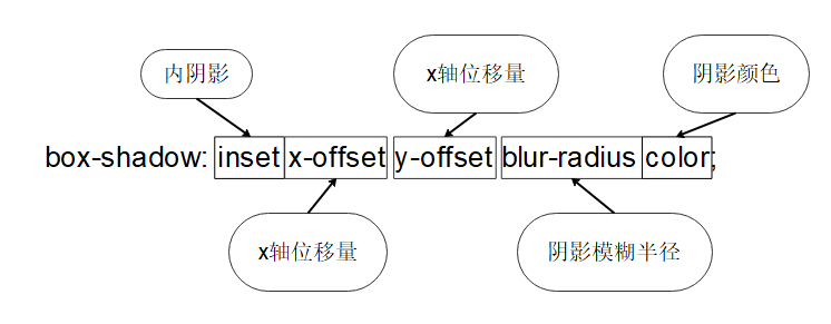
4.5 阴影
<!DOCTYPE html>
<html>
<head lang="en">
<meta charset="UTF-8">
<title>box-shadow的使用</title>
<style>
	div{
		width: 100px;
		height: 100px;
		border: 1px solid red;
		border-radius: 8px;
		margin: 20px;
		/*box-shadow: 20px 10px 10px #06c; /!*内阴影*!/*/
		/*box-shadow: 0px 0px 20px #06c; /!*只设置模糊半径的阴影 *!/*/
		box-shadow: inset 3px 3px 10px #06c; /*内阴影*/
	}
</style>
</head>
<body>
	<div></div>
</body>
</html>
4.6 小结
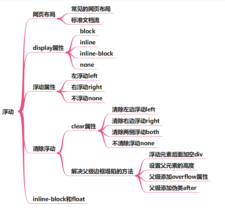
5. 浮动
5.1 标准文档流
* 标准文档流组成
	* 块级元素(block)<h1>…<h6>、<p>、<div>、列表
	* 内联元素(inline)<span>、<a>、<img/>、<strong>...
内联标签可以包含于块级标签中,成为它的子元素,而反过来则不成立
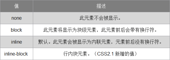
5.2 display
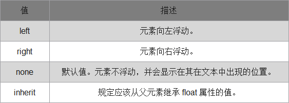
5.3 float
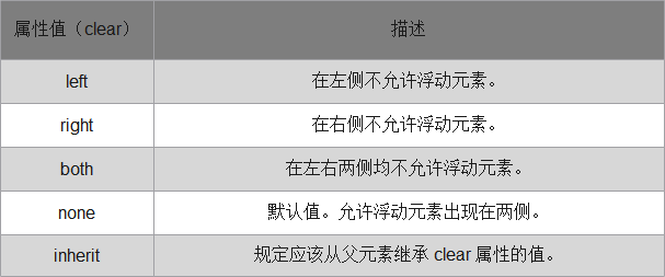
5.4 边框塌陷
clear
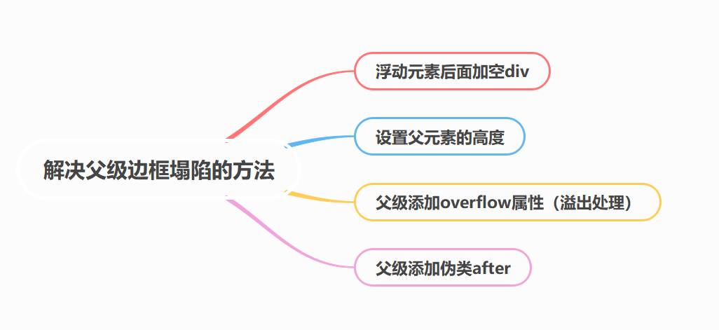
添加空div
<div id="father">
	<div class="layer01"><img src="image/photo-1.jpg" alt="日用品" /></div>
	<div class="layer02"><img src="image/photo-2.jpg" alt="图书" /></div>
	<div class="layer03"><img src="image/photo-3.jpg" alt="鞋子" /></div>
	<div class="layer04">浮动的盒子……</div>
	<div class="clear"></div>
</div>
.clear{ clear: both; margin: 0; padding: 0;}
设置父元素的高度
<div id="father">
	<div class="layer01"><img src="image/photo-1.jpg" alt="日用品" /></div>
	<div class="layer02"><img src="image/photo-2.jpg" alt="图书" /></div>
	<div class="layer03"><img src="image/photo-3.jpg" alt="鞋子" /></div>
	<div class="layer04">浮动的盒子……</div>
</div>
#father {height: 400px; border:1px #000 solid; }
父级添加overflow属性(溢出处理)
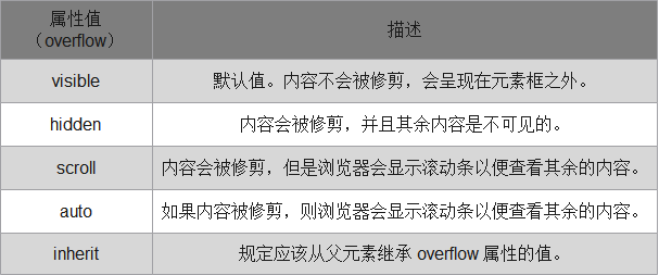
hidden属性值,这个值在网页中经常使用.
<div id="father">
	<div class="layer01"><img src="image/photo-1.jpg" alt="日用品" /></div>
	<div class="layer02"><img src="image/photo-2.jpg" alt="图书" /></div>
	<div class="layer03"><img src="image/photo-3.jpg" alt="鞋子" /></div>
	<div class="layer04">浮动的盒子……</div>
</div>
#father {overflow: hidden;border:1px #000 solid; }
父级添加伪类after(常用)
<div id="father">
	<div class="layer01"><img src="image/photo-1.jpg" alt="日用品" /></div>
	<div class="layer02"><img src="image/photo-2.jpg" alt="图书" /></div>
	<div class="layer03"><img src="image/photo-3.jpg" alt="鞋子" /></div>
	<div class="layer04">浮动的盒子……</div>
</div>
.clear:after{
	content: ''; /*在clear类后面添加内容为空*/
	display: block; /*把添加的内容转化为块元素*/
	clear: both; /*清除这个元素两边的浮动*/
}
小结
* 【清除浮动,防止父级边框塌陷的四种方法】
	*  浮动元素后面加空div
		* 简单,空div会造成HTML代码冗余
	* 设置父元素的高度
		* 简单,元素固定高会降低扩展性
	* 父级添加overflow属性
		* 简单,下拉列表框的场景不能用
	* 父级添加伪类after
		* 写法比上面稍微复杂一点,但是没有副作用,推荐使用
5.5 inline-block和float区别
* display:inline-block
	* 可以让元素排在一行,并且支持宽度和高度,代码实现起来方便
	* 位置方向不可控制,会解析空格
	* IE 6、IE 7上不支持
* float
	* 可以让元素排在一行并且支持宽度和高度,可以决定排列方向
	* float 浮动以后元素脱离文档流,会对周围元素产生影响,必须在它的父级上添加清除浮动的样式
5.6 小结
6. 定位
6.1 相对定位
#first {
	background-color:#FC9;
	border:1px #B55A00 dashed;
	position:relative;
	right:20px;
	bottom:20px;
}
#second {
	background-color:#CCF;
	border:1px #0000A8 dashed;
	float:right;
	position:relative;
	left:20px;
	top:-20px;
}
<!DOCTYPE html>
<html lang="en">
<head>
<meta charset="UTF-8">
<title>Title</title>
<style>
#box{
width: 300px;
height: 300px;
padding: 10px;
border: 2px solid red;
}
a{
width:100px;
height: 100px;
text-decoration: none;
background: #ff24cf;
line-height: 100px;
text-align: center;
color: white;
display: block;
}
a:hover{
background: #47a4ff;
}
.a2,.a4{
position: relative;
left: 200px;
top: -100px;
}
.a5{
position: relative;
left:100px;
top:-300px;
}
</style>
</head>
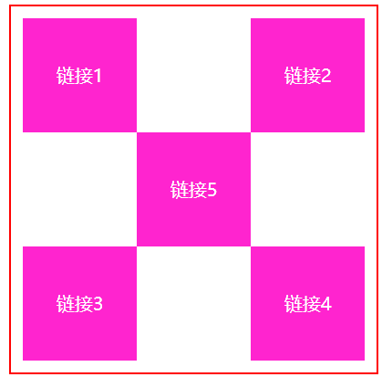
<body>
<div id = "box">
<a class="a1" href="#"> 链接1</a>
<a class="a2" href="#"> 链接2</a>
<a class="a3" href="#"> 链接3</a>
<a class="a4" href="#"> 链接4</a>
<a class="a5" href="#"> 链接5</a>
</div>
</body>
</html>
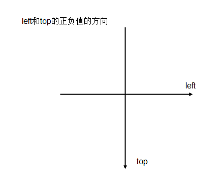
* 相对定位元素的规律
	* 设置相对定位的盒子会相对它原来的位置,通过指定偏移,到达新的位置
	* 设置相对定位的盒子仍在标准文档流中,它对父级盒子和相邻的盒子都没有任何影响
	* 设置相对定位的盒子原来的位置会被保留下来
6.2 绝对定位
#second {
	background-color:#CCF;
	border:1px#000A8 dashed
	position:absolute;
	right:30px;
}
* 绝对定位:
	* 使用了绝对定位的元素以它最近的一个“已经定位”的“祖先元素” 为基准进行偏移
	* 如果没有已经定位的祖先元素,会以浏览器窗口为基准进行定位
	* 绝对定位的元素从标准文档流中脱离,这意味着它们对其他元素的定位不会造成影响
	* 元素位置发生偏移后,它原来的位置不会被保留下来
设置了绝对定位但没有设置偏移量的元素将保持在原来的位置。
在网页制作中可以用于需要使某个元素脱离标准流,而仍然希望它保持在原来的位置的情况
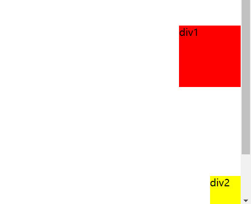
6.3 固定定位
类似绝对定位,不过区别在于定位的基准不是祖先元素,而是浏览器窗口
<!DOCTYPE html>
<html lang="en">
<head>
    <meta charset="UTF-8">
    <title>Title</title>
    <style>
        body{
            height: 1000px;
        }
        div:nth-of-type(1){/*第一个div设置绝对定位*/
            width: 100px;
            height: 100px;
            background: red;
            position: absolute;
            right: 0;
            bottom: 0;
        }
        div:nth-of-type(2){/*第二个div设置固定定位*/
            width: 50px;
            height: 50px;
            background: yellow;
            position: fixed;
            right: 0;
            bottom: 0;
        }
    </style>
</head>
<body>
    <div>div1</div>
    <div>div2</div>
</body>
</html>
6.4 z-index及透明度
<!DOCTYPE html>
<html lang="en">
<head>
<meta charset="UTF-8">
<title>Demo08</title>
<link rel = stylesheet href="1.css">
</head>
<body>
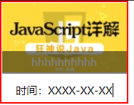
<div id="content">
<ul>
<li><img src = images/bk.webp alt="图片加载失败"></li>
<li class = "tipText">hhhhhhhhhh</li>
<li class = "tipBG"></li>
<li>时间:XXXX-XX-XX</li>
</ul>
</div>
</body>
</html>
#content, ul, li, body, div{
    padding: 0px;
    margin: 0px;
}
ul,li{
    list-style: none;
    text-align: center;
}
#content{
    width: 140px;
    overflow: hidden;
    font-size:12px;
    line-height: 25px;
    border: 2px red solid;
}
ul{
    position: relative;
}
.tipText, .tipBG{
    position: absolute;
    width:140px;
    height:25px;
    top: 55px;
}
.tipText{
    color: white;
    text-align: center;
    z-index = 3;//图层优先级
}
.tipBG{
    background: black;
    opacity: 0.5;//透明度
}