


HTML的div居中
一、margin:0px auto;
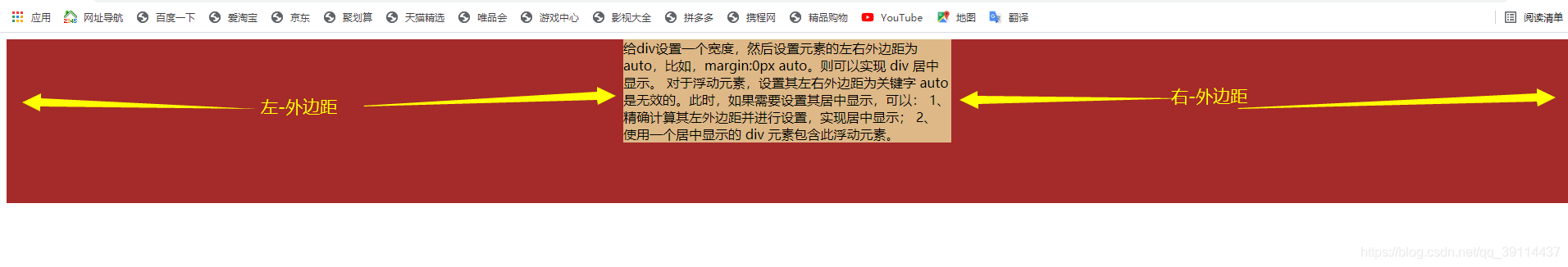
给需要居中的div设置一个宽度,然后设置元素的上下外边距为 相等 左右外边距为 auto,比如,margin:0px auto。
则可以实现 div 居中显示。
对于浮动元素,设置其左右外边距为关键字 auto 是无效的。此时,如果需要设置其居中显示,
可以:
1、 精确计算其左外边距并进行设置,实现居中显示;
2、 使用一个居中显示的 div 元素包含此浮动元素。
代码:
<!DOCTYPE html>
<html lang="en">

<head>
    <meta charset="UTF-8">

    <title>实验</title>
</head>

<body>
    <div style="background-color: brown;height: 200px;">
        <div style="width: 400px;background-color: burlywood;margin: 0px auto;">
            给div设置一个宽度,然后设置元素的左右外边距为 auto,比如,margin:0px auto。则可以实现 div 居中显示。 对于浮动元素,设置其左右外边距为关键字 auto 是无效的。此时,如果需要设置其居中显示,可以: 1、 精确计算其左外边距并进行设置,实现居中显示; 2、 使用一个居中显示的 div 元素包含此浮动元素。
        </div>
    </div>
</body>

</html>
结果图:
二、position: absolute;left: 50%;right: 50%;transform: translateX(-50%);
position: absolute;是相对于父容器的,ransform: translateX(-50%);是以元素自身为参照的, translateX(-50%);表示沿着X轴向左移动50%的距离。
代码:
<!DOCTYPE html>
<html lang="en">

<head>
    <meta charset="UTF-8">

    <title>实验</title>
      <style>
        #t {
            margin-top: 10px;
            height: 200px;
            background-color: darkgoldenrod;
            text-align: center;
        }

        #tt {
            width: 150px;
            height: 150px;
            background-color: darkolivegreen;
            position: absolute;
            left: 50%;
            right: 50%;
            transform: translateX(-50%);
        }
    </style>
</head>

<body>


    <div id="t">
        <p>文字居中text-align: center;</p>
        <div id="tt">
            position: absolute;left: 50%;right: 50%;transform: translateX(-50%);
        </div>
    </div>

</body>

</html>
结果图:

三、浮动的居中
在浮动的div外,嵌套一个居中的div。即可实现浮动的居中
代码:
```html
<!DOCTYPE html>
<html lang="en">

<head>
    <meta charset="UTF-8">

    <title>实验</title>
    <style>
        #k {
            background-color: coral;
            height: 300px;
            margin-top: 10px;
        }

        #kk {
            width: 400px;
            background-color: rgb(94, 55, 4);
            margin: 0px auto;
        }

        #left {
            width: 200px;
            height: 200px;
            background-color: rgb(20, 247, 96);
            float: left;
        }

        #right {
            width: 200px;
            height: 200px;
            background-color: rgb(3, 75, 27);
            float: left;
        }
    </style>
</head>

<body>

    <div id="k">
        <p style="text-align: center;">浮动的居中:在div外嵌套一个居中div,然后再在居中的div里添加两个浮动的div</p>
        <div id="kk">
            <div id="left"></div>
            <div id="right"></div>
        </div>
    </div>

</body>

</html>```
结果图:

四、 ransform设置居中
ransform属性即可让div居中 如代码所示 先设置子元素的margin-top和margin-left为50% 接着用transform的translate来移动子元素为-50% translate相对的是元素本身进行移动,这样移动-50%(元素宽度的一半)即可居中
代码:
<!DOCTYPE html>
<html lang="en">

<head>
    <meta charset="UTF-8">

    <title>实验</title>
 <style>
        #l {
            background-color: darkslateblue;
            height: 200px;
            margin-top: 10px;
        }

        #ll {
            background-color: rgb(104, 204, 204);
            width: 500px;
            height: 200px;
            position: relative;
            margin-left: 50%;
            transform: translateX(-50%);
        }
    </style>style>
        #l {
            background-color: darkslateblue;
            height: 200px;
            margin-top: 10px;
        }

        #ll {
            background-color: rgb(104, 204, 204);
            width: 500px;
            height: 200px;
            position: relative;
            margin-left: 50%;
            transform: translateX(-50%);
        }
    </style>
</head>

<body>
    <div id="l">
        <div id="ll">
            ransform属性即可让div居中 如代码所示 先设置子元素的margin-top和margin-left为50% 接着用transform的translate来移动子元素为-50% translate相对的是元素本身进行移动,这样移动-50%(元素宽度的一半)即可居中了 不过因为新特性,所以兼容性不好,如果考虑IE的话,慎重使用
        </div>
    </div>

</body>

</html>
结果图:

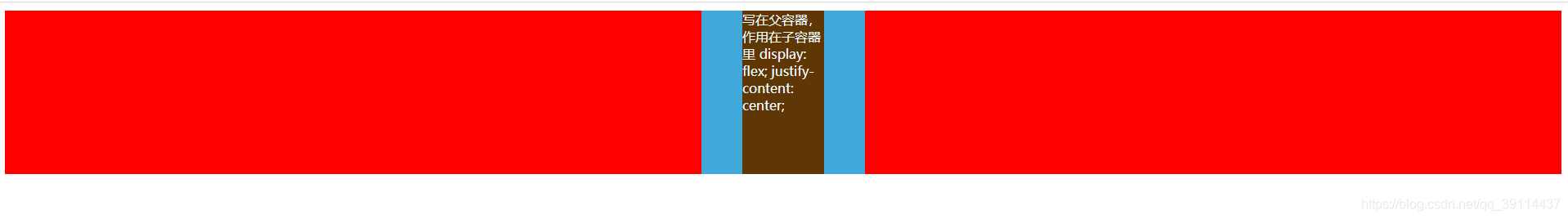
五、 display: flex; justify-content: center
写在父容器,作用在子容器里
代码:
<!DOCTYPE html>
<html lang="en">

<head>
    <meta charset="UTF-8">

    <title>实验</title>
     <style>
        #z {
            height: 200px;
            background-color: red;
            margin-top: 10px;
            display: flex;
            justify-content: center;
        }

        #zz {
            width: 200px;
            height: 200px;
            background-color: rgb(65, 169, 218);
            display: flex;
            justify-content: center;
        }

        #zzz {
            background-color: rgb(94, 55, 4);
            color: aliceblue;
            width: 100px;
            height: 200px;
        }
    </style>
</head>

<body>


    <div id="z">
        <div id="zz">
            <div id="zzz">写在父容器,作用在子容器里 display: flex; justify-content: center;
            </div>
        </div>
    </div>
</body>

</html>
结果图:


 7万+
7万+


 被折叠的 条评论
为什么被折叠?
被折叠的 条评论
为什么被折叠?
 到【灌水乐园】发言


