


目录
1、CSS介绍
层叠样式表其实就是对静态页面进行装饰,但是,特别要注意的点是:通常建议表现形式与页面内容分离(例如:人就是内容,穿着打扮就是表现形式)。
2、CSS引入方式
2.1、行内样式
行内样式(将样式直接写在标签上),需要使用style属性。
<!-- 行内样式 -->
<div style="color: green; border: 1px solid red;">每天叫醒我的不是闹钟,是梦想!!!</div>
<div style="color: green; border: 1px solid red;">每天叫醒我的不是闹钟,是梦想!!!</div>
<div style="color: green; border: 1px solid red;">每天叫醒我的不是闹钟,是梦想!!!</div>
该方式可用于提高样式的优先级,多次使用会导致代码臃肿,不利于后期维护 。
2.2、内联样式
讲页面内容与表现形式进行分离,方便对样式进行统一管理。
<!DOCTYPE html>
<html>
	<head>
		<meta charset="utf-8">
		<title></title>
        <!--使用style标签写在head标签内-->
		<style>
           /*元素选择器*/
			div {
				color: red;
				font-size: 18px;
			}
			p{
				color: pink;
				font-size: 20px;
			}
		</style>
	</head>
	<body>
		<div>每天叫醒我的不是闹钟,是梦想!!!</div>
		<div>每天叫醒我的不是闹钟,是梦想!!!</div>
		<div>每天叫醒我的不是闹钟,是梦想!!!</div>
		<p>钢铁侠</p>
		<p>蝙蝠侠</p>
		<p>蜘蛛侠</p>
	</body>
</html>
2.3、外联样式
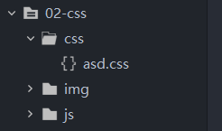
对内联样式进行进一步的抽离,方便多个页面共用同一个样式,创建一个css文件,需要该样式的HTML直接引用样式即可。在项目下创建css包,创建css文件
外联样式引入方式有两种:
link引入
<link rel="stylesheet" href="css/asd.css">@import引入
<style>
	@import url(css/asd.css);
</style>
asd.css
div {
	color: antiquewhite;
}
p{
	color: blue;
}
html文件
<!DOCTYPE html>
<html>
	<head>
		<meta charset="utf-8">
		<title></title>
		<!-- link引入 -->
		<!-- <link rel="stylesheet" href="css/asd.css"> -->
		<!-- @import引入 -->
		<style>
			@import url(css/asd.css);
		</style>
	</head>
	<body>
		<div>每天叫醒我的不是闹钟,是梦想!!!</div>
		<div>每天叫醒我的不是闹钟,是梦想!!!</div>
		<div>每天叫醒我的不是闹钟,是梦想!!!</div>
		<p>钢铁侠</p>
		<p>蝙蝠侠</p>
		<p>蜘蛛侠</p>
	</body>
</html>
2.4、样式的优先级
就近原则: 行内样式 > 内联样式 == 外联样式 (后面覆盖前面) 。
注意事项: 今后尽量不要对同个html进行多个样式书写。
如何选择三种样式写法?
1、如果样式是固定并且不修改并且很少情况,行内样式。
2、如果样式针对当前html页面做的样式,并且量比较大的情况下, 内联样式。
3、如果你的样式是通用,如果你的css代码很多,外联样式,需要创建一个css文件,引入。
2.5、样式选择
三种样式引入方式,在实际开发过程中该如何选择?
1.如果是通用样式,就选择外联样式。
2.当样式内容过多时,也会将样式单独抽离成一个.css文件,方便管理。
3.当某个标签有特殊样式实现,且在页面中是不重复的,出现次数唯一的,就使用行内样式。
4.除了上面的几种情况,通常使用的都是内联样式。
3、CSS选择器
3.1、基本选择器
选择器可以快速、方便的选择所需要使用的页面元素。
基本选择器分三种:标签选择器、类选择器、id选择器。
标签选择器
语法:标签名{}
例如:div{color:red;font-size:20px;}
<!DOCTYPE html>
<html>
	<head>
		<meta charset="utf-8">
		<title></title>
		<style>
			/* 标签选择器 */
			div{
				color: bisque;
			}
			/* 类选择器 */
			.div-cls{
				color: aqua;
			}
			.p-cls{
				color: yellow;
			}
			/* id选择器 */
			#p-id{
				color: green;
			}

		</style>
	</head>
	<body>
		<div class="div-cls">我是div1,我用的是class选择器</div>
		<div class="p-cls" id="p-id">我是div2,我用的是class选择器和id选择器</div>
		<div class="div-cls">我是div3,我用的是class选择器</div>
		<p class="p-cls">我是p,我用的是class选择器</p>
		<h4 class="h4-cls">我是h4,我用的是class选择器</h4>
	</body>
</html>
类选择器
类选择器是通过class属性进行元素的获取,可用于对多个元素进行相同的样式设置。
语法:.类名{}
例如:.div-cls{color:red;}
.div-cls{
	color: red;
}
.p-cls{
	color: green;
}
.h4-cls{
	color: blue;
}
id选择器
id选择器是通过id属性给元素一个唯一标识(设置多个id相同不会报错,会影响后期js的学习,建议id值要唯一)。
语法:#id名{}
例如:#div-id{color:red;}
/*id选择器:在标签上添加了一个id属性,作为唯一标识,通常不允许重复*/
#p-id{
	color: #483D8B;
}
3.2、属性选择器
属性选择器是根据元素上已有的属性标识进行选择
语法:[属性名='']{}
<!DOCTYPE html>
<html>
	<head>
		<meta charset="utf-8">
		<title></title>
		<style>
			/* 具有title属性的元素 */
			[title]{
				font-size: 18px;
				color: red;
			}
			/* 以http开头的元素 */
			[href^="http"]{
			  color: #008B8B;
			}
			/* 以...结束 */
			[href$="cn"]{
			  color: #483D8B;
			}
			/*href中包含有i*/
			[href*='i']{
			  color: #808080;
			}
		</style>
	</head>
	<body>
		<button title="普通按钮">普通按钮</button>
		<a href="http://www.baidu.com">百度链接</a>
		<a href="www.sina.cn">新浪博客</a>
		<a href="http://www.yunhe.cn">云和数据</a>
	</body>
</html>
3.3、层级选择器
后代选择器是根据元素在页面中的相对(嵌套)位置进行按区域选择元素。
<!DOCTYPE html>
<html>
	<head>
		<meta charset="utf-8">
		<title></title>
	</head>
	<style>
		/* 祖宗后代 */
		div span{
			font-size: 18px;
			color:red;
		}
		/* 父子选择器 */
		div p{
			color: blue;
		}
		/* 兄弟选择器 */
		div~p{
			color: pink;
		}
		/* 跟班选择器 */
		p+span{
			background-color: deeppink;
		}
	</style>
	<body>
		<div>
			 <p>嘻嘻嘻</p>
			 <a href="#">
				 <span>
				   点我点我!
				 </span>
			 </a>

		</div>
		<p>我是div的兄弟</p>

		<p>
			<span>我是p标签中的span标签</span>
		</p>
		<span>跟班选择器</span>
	</body>
</html>
3.4、组合选择器
组合选择器是根据元素在页面中的同级关系进行选择。
<!DOCTYPE html>
<html>
	<head>
		<meta charset="utf-8">
		<title></title>
		<style>
			div span,p span {
				color: green;
			}
			p span,h4 span{
				color: yellow;
			}
		</style>
	</head>
	<body>
		<div>
		    div中的不带标签的内容
		    <span>组合选择器,注意很常用</span>
		</div>
		<p>
		    <span>p标签中的span标签</span>
		</p>

		<h4>
		    <span>h4标签中的span标签</span>
		</h4>
	</body>
</html>
3.5、伪类选择器
伪类选择器是css3中提供的用于快速查找元素的便捷选择器,开发中常用nth-of-type选择器。
<!DOCTYPE html>
<html>
	<head>
		<meta charset="utf-8">
		<title></title>
		<style>
            //第一个
			p:nth-of-type(1) {
				color: red;
			}
            //奇数项
			p span:nth-of-type(2n+1) {
				background-color: aqua;
			}
            //偶数项
			p span:nth-of-type(2n) {
				background-color: blue;
			}

			/* 默认被点击的状态 */
			a:link {
				color: red;
			}

			/* 访问之后的状态 */
			a:visited {
				color: yellow;
			}

			/* 处在活动状态 */
			a:active {
				color: brown;
			}

			/* 鼠标悬浮状态 */
			a:hover {
				color: blueviolet;
			}
		</style>
	</head>
	<body>
		<p>
			<span>百度新闻</span>
			<span>新浪官网</span>
			<span>云和官网</span>
			<span>腾讯官网</span>
			<span>人人编程官网</span>
		</p>

		<a href="#">百度一下</a>
	</body>
</html>
3.6、通配符
*通配符,作用在页面中的所有标签上,开发不建议使用,影响网页的渲染性能。
*{
  color:red;
  font-size:20px;
}
开发不建议使用通配符,通配符相当于是作用在了所有的标签上,某些属性并不是所有的标签都能识别,只要加了属性不论是否生效,浏览器都会对属性进行解析然后渲染,这样比较消耗性能
3.7、选择器优先级
网页中的选择器多种多样,可以组合使用,当同一个元素有多个样式时,最终生效的样式与优先级有关。
可以假设行内样式的优先级为1000,那么id选择器、类选择器、标签选择器的优先级大小如下所示
!important>行内样式>id选择器>类选择器>标签选择器
无穷大 1000 100 10 1
4、CSS盒子模型
4.1、基础样式
| 样式名 | 描述 |
|---|---|
| text-align | 设置内容位置 |
| text-decoration | 控制下划线 none没有 underline有 |
| line-hight | 行高 |
| font-size | 设置字体大小 |
| font-weight | 设置字体粗细的 |
| font-famliy | 设置字体样式 |
| letter-spacing | 设置中文字体之间的间距 |
| word-spacing | 设置英文单词之间的间距 |
行高:设置单行文字所占据的高度,实际位置是文字的大小+上下的空白间距
<!DOCTYPE html>
<html>
	<head>
		<meta charset="utf-8">
		<title></title>
		<style>
			*{
				margin: 0;
				padding: 0;
			}
			div{
				width: 400px;
				height: 400px;
				background-color: pink;
				color: aquamarine;
				text-align: center;
				line-height: 100px;
				font-size: 18px;
				font-weight: bold;
				font-family: '宋体';
				letter-spacing: 20px;

			}
			#p1{
				word-spacing: 60px;
			}
			#p2{
				letter-spacing: 20px;
			}
		</style>
	</head>
	<body>
		<div>
			轻轻的我走了,正如你轻轻来了<br>
			轻轻的我走了,正如你轻轻来了<br>
		</div>
		<p id="p1">hello world java</p>
		<p id="p2">我爱你中国</p>
	</body>
</html>
4.2、盒子模型
页面中的每个元素都可以称为盒子,主要目的是为了计算元素在网页中的实际占位,通过F12可以直观的查看到盒子模型。
4.2.1、边框颜色
border-color
<!DOCTYPE html>
<html>
	<head>
		<meta charset="utf-8">
		<title></title>
		<style>
			#box {
				width: 400px;
				height: 400px;
				border: 1px solid red;
				background-color: antiquewhite;
				/*上下 左右*/
				border-color: red blue;

				/*red上 blue左右  blueviolet下*/
				border-color: red blue blueviolet;

				/*上右下左*/
				/* border-color: red blue pink lawngreen; */

				/*border-top-color: yellow;
				border-left-color: orange;
				border-bottom-color: green;
				border-right-color: red;*/
			}
		</style>
	</head>
	<body>
		<div id="box">我是盒子!</div>
	</body>
</html>
4.2.2、边框粗细
整体粗细:
border-width:20px; 整体边框
指定方位调整粗细:
border-top-width 上
border-left-width 左
border-right-width 右
border-bottom-width 下
<!DOCTYPE html>
<html>
	<head>
		<meta charset="utf-8">
		<title></title>
		<style>
			.box{
				width: 300px;
				height: 300px;
				background-color: aqua;
				/* border: solid;
				border-width:20px;
				border-color: red; */
				border:solid;
				border-color: pink;
				border-top-width: 10px;
				border-left-width: 20px;
				border-right-width: 30px;
				border-bottom-width: 40px;
			}
		</style>
	</head>
	<body>
		<div class="box">hello  world!</div>
	</body>
</html>
4.2.3、边框样式
<!DOCTYPE html>
<html>
	<head>
		<meta charset="utf-8">
		<title></title>
		<style>
			.box{
				width: 300px;
				height: 300px;
                background-color: #D7D7D7;
				border-left-style:solid;//边框样式为实线
			    border-top-style: dashed;/*边框样式为虚线*/
				border-bottom-style: double;/*边框样式为双线*/
                border-bottom-style: solid;/*边框样式为实线*/
			}
		</style>
	</head>
	<body>
		<div class="box">hello  world!</div>
	</body>
</html>
4.2.4、边框的简写
	<head>
    <style>
			.box{
				width: 251px;
				height: 251px;
				background-color: #D7D7D7;
				border:1px solid #3a6587
			}
	</style>
	</head>
	<body>
		<div class="box">hello world</div>
	</body>
4.2.5、外边设置
margin可以设置块元素的水平对齐方式
div{
  margin:0 auto;//让块元素在水平方向居中
}
<style>
*{
margin: 0px;
}
.box{
width: 251px;
height: 251px;
background-color: #D7D7D7;
border:1px solid #3a6587;
margin-top: 30px;
margin-left:60px ;
/*margin: 0px auto;居中*/
}
#h2id{
margin-top: 20px;
margin-left: 500px;
}
</style>
</head>
<body>
<h2 id="h2id">学生列表</h2>
<div class="box">你好!同学</div>
</body>4.2.6、内边设置
padding-left调用文本与左边间距
padding-top调用文本与上边间距
padding-bottom调用文本与底部间距
padding-right调用文本与右边间距
.input{
    font-size:16px;
    background-color:#3a6587;
    height:35px;
    line-height:35px;
    color:#FFF;
    padding-left: 110px;
    padding-top:10px ;   /* 让标题左边留点空隙*/
}
4.2.7、背景
| 属性名 | 说明 |
|---|---|
| background-color | 设置背景颜色 |
| background-image | 设置背景图片 |
| background-position | 设置背景图片的位置 |
| background-size | 设置背景图片的大小 |
| background-repeat | 设置背景图片是否重复 |
| background-attachment | 设置背景图片相对浏览器的定位位置 |
div{
  width: 1000px;
  height: 1000px;
  /* background-color: #008B8B;
  background-image: url(./timg.jpg);
  background-size: 50px 50px;
  background-repeat: no-repeat;
  background-position: center;
  background-attachment: fixed; */
  background: #008B8B url(./timg.jpg) no-repeat;
}
4.2.8、display属性
| 属性名 | 描述 |
|---|---|
| display:none; | 隐藏元素 |
| display:block; | 将元素变为块元素 |
| display:inline; | 将元素变为行元素 |
| display:inline-block; | 将元素变为行内块元素 |
<style>
			img{
				width: 200px;
			}
			ul li{
				display: inline-block;  /*转为行内块元素*/
				list-style: none;       /*消除列表前面的小圆圈*/
				margin-left: 120px;
			}
			ul li:hover img{
			    border: 2px solid yellow;
			}

</style>
4.3、浮动
浮动是改变元素在文档流(元素默认从上往下布局的方式就叫文档流)中的规则,让元素可以在水平方向上进行排版。
float:left或者right
4.3.1、清除浮动
<!DOCTYPE html>
<html>
	<head>
		<meta charset="utf-8">
		<title></title>
		<style>
			.wrapper{
				width: 260px;
			    height: 260px;
				background-color: pink;
			}
			.content{
				float: left;/* 会按照从左向右浮动  */
				border: 1px solid #ccc;
				width: 50px;
				height: 50px;
				background-color: wheat;
			}
			#id8,#id9{
       /*清除浮动,因为content浮动后面的div都会根着浮动,清楚 id8,id9不能左浮动(标准的从上往下显示)*/
				clear: left;
			}
		</style>
	</head>
	<body>
			<div class="wrapper">
					<div class="content">1</div>
					<div class="content">2</div>
					<div class="content">3</div>
					<div class="content">4</div>
					<div class="content">5</div>
					<div class="content">6</div>
					<div class="content">7</div>
					<div id="id8" class="content">8</div>
					<div id="id9" class="content">9</div>
				</div>
	</body>
</html>
4.3.2、解决浮动塌陷问题
<!DOCTYPE html>
<html>
	<head>
		<meta charset="utf-8">
		<title></title>
		<style>
			#box1{
		       width: 400px;
			   background-color: aquamarine;

			   /* 方案一  设置固定高度*/
			  /* height: 400px; */
			   /* 方案二  使用overflow属性 */
			   /* overflow: hidden; */
			}
			#box2{
				float: left;
				background-color: pink;
			}
			.divclass{
				/* 方案三 在浮动的下面清除浮动 */
				clear: both;
			}
		</style>
	</head>
	<body>
		<div id="box1">
					<div>
						我是天空的一片云,偶尔投影在你的波心, 不必讶异,我是天空的一片云
						我是天空的一片云,偶尔投影在你的波心, 不必讶异,我是天空的一片云
						我是天空的一片云,偶尔投影在你的波心, 不必讶异,我是天空的一片云
						我是天空的一片云,偶尔投影在你的波心, 不必讶异,我是天空的一片云
						我是天空的一片云,偶尔投影在你的波心, 不必讶异,我是天空的一片云
						我是天空的一片云,偶尔投影在你的波心, 不必讶异,我是天空的一片云
					</div>
					<div id="box2"   style="width: 200px;height: 200px;"></div>

					<div class="divclass"></div>

				</div>
	</body>
</html>
4.4、定位
浮动更多的用于对模块化(无具体像素值要求)区域进行整体排版,对于精确到像素值的页面调整需要使用定位,例如:购物车上的数量、消息通知等。
| 属性名 | 描述 |
|---|---|
| position:relative; | 相对定位(相对默认位置进行定位,不脱离文档流,仍占据页面位置) |
| position:absolute; | 绝对定位(相对第一个带有定位属性的父元素进行定位,默认是浏览器) |
| position:fixed; | 相对浏览器进行固定定位 |
4.4.1、相对、 绝对定位
<head>
		<meta charset="UTF-8">
		<title></title>
		<style>
			*{
				margin: 0px;
				padding: 0px;
			}
			.box1{
				width: 100px;
				height: 100px;
				background-color: black;
				opacity: 0.5; /*透明度*/
				/*绝对定位 不会保留原来的位*/
			     position: absolute;
			     left: 150px;
			     top: 150px;
/*绝对定位:会脱离原来的层,box1这一层被腾空了,别的层就可以上去了,只是不同的层而已,每个absolute都是一层,可以自由动*/

			 	/*相对定位 会保留原来的位置*/
				/*position: relative;
				left: 150px;
				top: 150px;*/
			}
			.box2{
				width: 200px;
				height: 200px;
				background-color: red;
			}

		</style>
	</head>
	<body>
		<div class="box1"></div>
		<div class="box2"></div>
	</body>
4.4.2、固定定位
	<head>
		<meta charset="UTF-8">
		<title></title>
		<style>
			.divid{
				width: 150px;
				height: 30px;
				background-color: #ff4200;
				border-radius:32px ;
				text-align: center;
				line-height: 31px;
				color: white;
				position: fixed;/* 固定定位*/
				top: 220px;
				right: 10px;
			}
		</style>
	</head>
	<body>
		<p>内容内容内容内容内容内容</p>
		<p>内容内容内容内容内容内容</p>
		<p>内容内容内容内容内容内容</p>
		<p>内容内容内容内容内容内容</p>
		<p>内容内容内容内容内容内容</p>
		<div class="divid">固定定位</div>
		<p>内容内容内容内容内容内容</p>
		<p>内容内容内容内容内容内容</p>
		<p>内容内容内容内容内容内容</p>
		<p>内容内容内容内容内容内容</p>
		<p>内容内容内容内容内容内容</p>
		<p>内容内容内容内容内容内容</p>
		<p>内容内容内容内容内容内容</p>
	    <p>内容内容内容内容内容内容</p>
		<p>内容内容内容内容内容内容</p>
		<p>内容内容内容内容内容内容</p>
4.4.3、堆叠顺序
元素在进行定位时,会出现位置相同的情况,可以通过设置其堆叠顺序决定显示的优先级。
z-index 数值越大越靠前
	<style>

			img{
				position: absolute;
				left: 0px;
				top: 0px;
				z-index: -1;  /* 图片就在文字下方*/
			}
			p{
				color: #E91917;
			}
	</style>
	</head>
	<body>

		<img src="xxx.jpg" width="200px" />
		<P>This is some text. This is some text. This is some text.</P>
		<P>This is some text. This is some text. This is some text.</P>
		<P>This is some text. This is some text. This is some text.</P>
		<P>This is some text. This is some text. This is some text.</P>

	</body>
5、CSS3常见效果
5.1、圆角效果
控制盒子的四个角的弧度,语法:border-radius,控制的是元素的四个角的弧度,当弧度值大于或等于元素宽高的一半时,元素会变成一个圆。border-radius的值可以是百分比或者px像素。
<!DOCTYPE html>
<html>
	<head>
		<meta charset="utf-8">
		<title></title>
		<style>

			#big{
				position: relative;
				margin: 200px auto;
				width: 300px;
				height: 300px;
				background-color: black;
				border-radius: 50%;
			}
			#min{
				position: absolute;
				width: 250px;
				height: 250px;
				margin: 25px;
				background-color: white;
				border-radius: 50%;
			}
		</style>
	</head>
	<body>
		<div id="big">
			<div id="min"></div>
		</div>
	</body>
</html>
5.2、透明效果
5.2.1、背景透明
背景透明只针对背景颜色进行透明。background-color:rgba(x,x,x,x) 透明度在0~1之间
<style>

    div{
        width: 200px;
        height: 200px;

        background-color:rgba(255,0,0,0.5); /*红色*/

        background-color:rgba(0,255,0,0.5); /*绿色*/

        background-color:rgba(0,0,255,0.5); /*蓝色*/

        background-color: rgba(255, 255, 255, 0); /*则表示完全透明的白色*/

        background-color: rgba(0, 0, 0, 1); /*则表示完全不透明度的黑色*/
    }

</style>
	</head>
	<body>
			<div></div>
	</body>
5.2.2、整体透明
针对整个元素进行透明,包括该元素的所有子元素。opacity 透明度在0~1之间
<style>
			div{

			  width:100px;
			  height:35px;
			  background-color: #FF0000;
			  color: white;
			  line-height: 35px;
			  text-align: center;
			  border-radius: 10px;

			  opacity: 0.2;
			}
</style>

<body>
		<div>百度一下</div>
</body>
5.3、盒子阴影
box-shadow
对块元素添加阴影效果从而达到视觉效果上的立体感。
		<style>
			div{
				width: 200px;
				height: 200px;
				margin: 50px auto;
				box-shadow: 3px 3px 9px 100px gray ;
	            /*
					参数一 X轴偏移量
					参数二 Y轴偏移量
					参数三 阴影模糊程度
					参数四 阴影扩展半径
					参数五 阴影颜色
					参数六 inset内阴影
				*/
			}
		</style>
	<body>
			<div></div>
	</body>
5.3.1、文本阴影
text-shadow
对文本添加阴影从而达到视觉效果上的立体感。
	<style>
			p{
			    text-align: center;
			    text-shadow: 3px 3px 9px grey;
			}
	</style>
	<body>
			<p>轻轻的我走了,正好我轻轻的来了</p>
	</body>
5.4、响应式效果
早期页面的开发,需要有前端人员、Android工程师和IOS工程师,因为PC端和移动端的屏幕大小差别比较大,需要针对PC端和移动端分别开发整套项目;从H5出现之后,前端人员在开发PC端可以通过技术将PC端的页面在IPAD和移动端上都进行自适应,因此前端就变得更加重要了。 自适应方式两种:响应式、弹性盒子;目前基本上所有用于前端页面开发的流行框架中都封装了响应式或弹性盒子的操作。
5.4.1、手机屏幕的适应
H5的出现可以让PC端的应用直接在手机端进行等比例使用,需要设置其视图模式。
<meta name="viewport" content="width=device-width, initial-scale=1">5.4.2、页面自适应
对网页中的元素的大小,根据电脑屏幕的大小进行动态设置,从而达到一种响应式的效果。
<!DOCTYPE html>
<html>
	<head>
		<meta charset="utf-8">

		<!-- width = device-width:宽度等于当前设备的宽度
			 initial-sacle=1:初始的缩放比例为1(默认是1)
		-->
		<meta name="viewport" content="width=device-width, initial-scale=1">

		<title></title>
		<style>

			/* 设置初始样式 */
			*{
			    margin: 0px;
			    padding: 0px;
			}
			.heading,.container,.footing{
			    margin: 10px auto;
			}
			.heading{
			    height: 100px;
			    background-color: cadetblue;
			}
			.left,.right,.main{
			    background-color: green;
			}
			.footing{
			    height: 100px;
			    background-color: orange;

			}

			/* 设置宽度大于960px的页面布局 */
			@media screen  and (min-width: 960px){
			    .heading,.container,.footing{
			        width:960px;
			    }
			    .left,.main,.right{
			      float: left;
			        height: 500px;
			    }
			    .left,.right{
			        width: 200px;
			    }
			    .main{
			       margin-left: 5px;
			        margin-right: 5px;
			        width: 550px;
			    }
			    .container{
			        height: 500px;
			    }

			}

			/* 设置处于600px-900px之间的页面布局 */
			@media screen and (min-width: 600px) and (max-width:960px){
			    .heading,.container,.footing{
			        width: 600px;
			    }
			    .left,.main{
			        float: left;
			        height: 400px;
			    }
			    .right{
			        display: none;
			    }
			    .left{
			        width: 160px;
			    }
			    .main{
			        width: 435px;
			        margin-left: 5px;
			    }
			    .container{
			        height: 400px;
			    }

			}

			/* 设置小于600px的页面布局 */
			@media screen and (max-width: 600px) {
			    .heading,.container.footing{
			        width: 400px;
			    }
			    .left,.right{
			        width: 400px;
			        height: 100px;
			    }
			    .main{
			        margin-top: 10px;
			        width: 400px;
			        height: 200px;
			    }
			    .right{
			        margin-top: 10px;
			    }
			    .container{
			        height: 400px;
			    }


		</style>


	</style>
	</head>
	<body>
			<div class="heading"></div>
			<div class="container">
			    <div class="left"></div>
			    <div class="main"></div>
			    <div class="right"></div>
			</div>
			<div class="footing"></div>
	</body>
</html>


 516
516


 被折叠的 条评论
为什么被折叠?
被折叠的 条评论
为什么被折叠?
 到【灌水乐园】发言


