


flex-grow 属性定义项目的放大比例,解决的问题是:在空间有多余时把多余空间分配给各个子元素。
flex-grow 的值默认为 0,也就是说,如果存在剩余空间,也不放大。
flex-grow 取值为非负数(如果取值为负数那么和0的取值效果相同)。
语法
.item {
  flex-grow: <number>; /* default 0 */
}
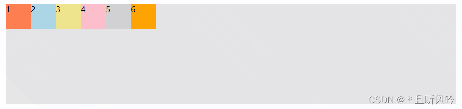
flex-grow 默认为0
flex-grow 默认为 0 时:
<!DOCTYPE html>
<html lang="en">
<head>
  <meta charset="UTF-8">
  <title>Title</title>
  <style>
    .container {
      display: flex;
      margin: 0px auto;
      width: 900px;
      height: 200px;
      background-color: #e6e6e6;
    }
    .item {
      width: 50px;
      height: 50px;
    }
    .container div:nth-of-type(1) {background-color:coral;}
    .container div:nth-of-type(2) {background-color:lightblue;}
    .container div:nth-of-type(3) {background-color:khaki;}
    .container div:nth-of-type(4) {background-color:pink;}
    .container div:nth-of-type(5) {background-color:lightgrey;}
    .container div:nth-of-type(6) {background-color:orange;}
  </style>
</head>
<body>
  <div class="container">
    <div class="item">1</div>
    <div class="item">2</div>
    <div class="item">3</div>
    <div class="item">4</div>
    <div class="item">5</div>
    <div class="item">6</div>
  </div>
</body>
</html>
可以看到,flex-grow 默认值为 0 时,并不会占用剩余的空白间隙扩展自己的宽度,页面效果如下:
flex-grow 值为正整数
如果flex-grow大于0,则flex容器剩余空间的分配就会发生。
概念:将所有正整数相加得到分母 sum,每个属性的数值作为分子,然后乘以剩余空间。
公式:分子/分母*剩余空间
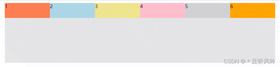
平均分配空间
如果所有项目的 flex-grow 属性都为1,则它们将等分剩余空间(如果有的话)。
实例:
<!DOCTYPE html>
<html lang="en">
<head>
  <meta charset="UTF-8">
  <title>Title</title>
  <style>
    .container {
      display: flex;
      margin: 0px auto;
      width: 900px;
      height: 200px;
      background-color: #e6e6e6;
    }
    .item {
      height: 50px;
      flex:1;
    }
    .container div:nth-of-type(1) {background-color:coral;}
    .container div:nth-of-type(2) {background-color:lightblue;}
    .container div:nth-of-type(3) {background-color:khaki;}
    .container div:nth-of-type(4) {background-color:pink;}
    .container div:nth-of-type(5) {background-color:lightgrey;}
    .container div:nth-of-type(6) {background-color:orange;}
  </style>
</head>
<body>
  <div class="container">
    <div class="item">1</div>
    <div class="item">2</div>
    <div class="item">3</div>
    <div class="item">4</div>
    <div class="item">5</div>
    <div class="item">6</div>
  </div>
</body>
</html>
页面效果:
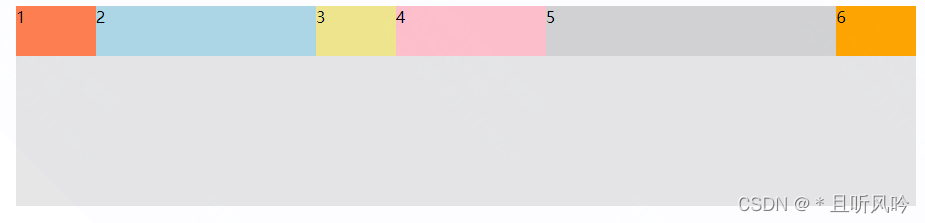
不平均分配空间
如果一个项目的 flex-grow属性不为1,则按照公式来计算每个元素占有的空间。
实例:
<!DOCTYPE html>
<html lang="en">
<head>
  <meta charset="UTF-8">
  <title>Title</title>
  <style>
    .container {
      display: flex;
      margin: 0px auto;
      width: 900px;
      height: 200px;
      background-color: #e6e6e6;
    }
    .item {
      height: 50px;
    }
    .container div:nth-of-type(1) {flex-grow: 1;background-color:coral;}
    .container div:nth-of-type(2) {flex-grow: 3;background-color:lightblue;}
    .container div:nth-of-type(3) {flex-grow: 1;background-color:khaki;}
    .container div:nth-of-type(4) {flex-grow: 2;background-color:pink;}
    .container div:nth-of-type(5) {flex-grow: 4;background-color:lightgrey;}
    .container div:nth-of-type(6) {flex-grow: 1;background-color:orange;}
  </style>
</head>
<body>
  <div class="container">
    <div class="item">1</div>
    <div class="item">2</div>
    <div class="item">3</div>
    <div class="item">4</div>
    <div class="item">5</div>
    <div class="item">6</div>
  </div>
</body>
</html>
页面效果:
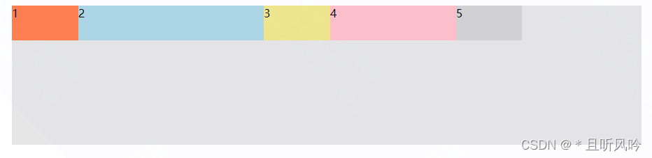
flex-grow 值为小数
flex-grow 属性值为小数,分两种情况:
1)所有 flex 项的 flex-gorw 属性值之和大于1,仍然按照上面正整数方式进行计算;
2)所有 flex 项的 flex-gorw 属性值之和小于1,基值按照1来进行计算。
例子:项目1为 0.1, 项目2为 0.3,项目3为 0.1, 项目4为 0.2,项目5为 0.1,则它们分配到的剩余空间分别为:
项目1: 900px * (0.1 / 1) = 94.7px;
项目2: 900px * (0.3 / 1) = 265.31px;
项目3: 900px * (0.1 / 1) = 94.7px;
项目4: 900px * (0.2 / 1) = 180px;
项目5: 900px * (0.1 / 1) = 94.7px;
实例:
<!DOCTYPE html>
<html lang="en">
<head>
  <meta charset="UTF-8">
  <title>Title</title>
  <style>
    .container {
      display: flex;
      margin: 0px auto;
      width: 900px;
      height: 200px;
      background-color: #e6e6e6;
    }
    .item {
      height: 50px;
    }
    .container div:nth-of-type(1) {flex-grow: 0.1;background-color:coral;}
    .container div:nth-of-type(2) {flex-grow: 0.3;background-color:lightblue;}
    .container div:nth-of-type(3) {flex-grow: 0.1;background-color:khaki;}
    .container div:nth-of-type(4) {flex-grow: 0.2;background-color:pink;}
    .container div:nth-of-type(5) {flex-grow: 0.1;background-color:lightgrey;}
  </style>
</head>
<body>
  <div class="container">
    <div class="item">1</div>
    <div class="item">2</div>
    <div class="item">3</div>
    <div class="item">4</div>
    <div class="item">5</div>
  </div>
</body>
</html>
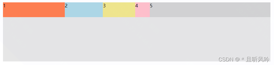
页面效果:
flex-grow 值为小数+正整数
flex-grow 值为小数+正整数时,计算方式与正整数一样,如分母取值:sum=1+0.6+0.5+0.2+2=4.3,分子分别为:1/4.3、0.6/4.3、0.5/4.3、0.2/4.3、2/4.3
实例:
<!DOCTYPE html>
<html lang="en">
<head>
  <meta charset="UTF-8">
  <title>Title</title>
  <style>
    .container {
      display: flex;
      margin: 0px auto;
      width: 900px;
      height: 200px;
      background-color: #e6e6e6;
    }
    .item {
      height: 50px;
    }
    .container div:nth-of-type(1) {flex-grow: 1;background-color:coral;}
    .container div:nth-of-type(2) {flex-grow: 0.6;background-color:lightblue;}
    .container div:nth-of-type(3) {flex-grow: 0.5;background-color:khaki;}
    .container div:nth-of-type(4) {flex-grow: 0.2;background-color:pink;}
    .container div:nth-of-type(5) {flex-grow: 2;background-color:lightgrey;}
  </style>
</head>
<body>
  <div class="container">
    <div class="item">1</div>
    <div class="item">2</div>
    <div class="item">3</div>
    <div class="item">4</div>
    <div class="item">5</div>
  </div>
</body>
</html>
页面效果:


 1504
1504


 被折叠的 条评论
为什么被折叠?
被折叠的 条评论
为什么被折叠?
 到【灌水乐园】发言


