在日常开发过程中,我们会经常使用到div居中来处理布局,今天我就把我在开发过程中,遇到的div居中处理方法总结一下,方便日后查看!
1、 水平居中:给div设置一个宽度,然后添加margin:0 auto属性
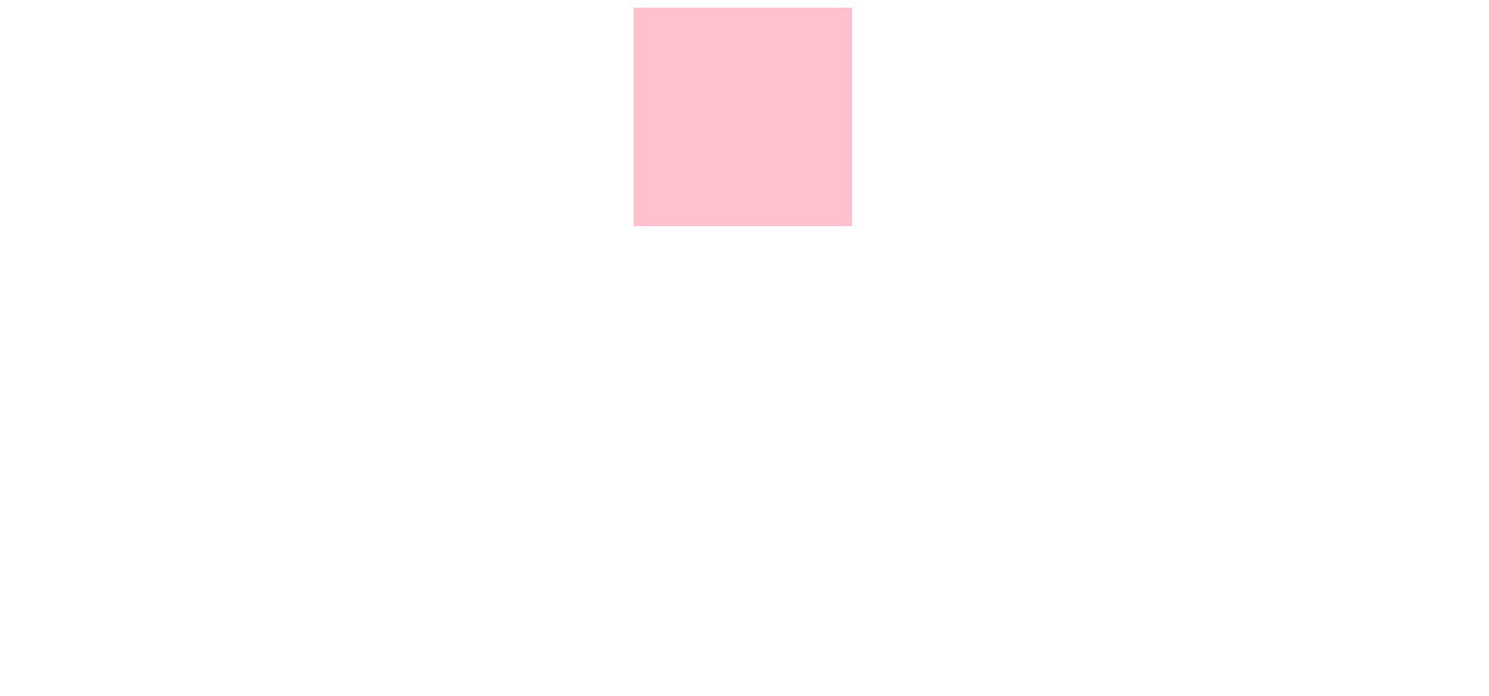
 div{
            margin:0 auto;
            width:200px;
            height:200px;
            background-color: pink;
        }

2、水平垂直居中之让绝对定位的div居中
    div {
            position: absolute;
            width: 300px;
            height: 300px;
            margin: auto;
            top: 0;
            left: 0;
            bottom: 0;
            right: 0;
            background-color: pink;
        }
3、水平垂直居中之确定容器的宽高
div {
            position: absolute;
            width:300px;
            height:300px;
            top: 50%;
            left: 50%;
            margin: -150px 0 0 -150px;  /* 外边距为自身宽高的一半 */
            background-color: pink;
        }
4、水平垂直居中之未知容器的宽高,利用 `transform` 属性
  div {
            position: absolute;
            width:300px;
            height:300px;
            top: 50%;
            left: 50%;
            transform: translate(-50%, -50%);
            background-color: pink;
        }
5、水平垂直居中之利用 flex 布局
.container {
            display: flex;
            align-items: center;         /* 垂直居中 */
            justify-content: center;    /* 水平居中 */
            height:600px;

           }
.container div {
                width: 300px;
                height: 300px;
                background-color: pink;
              }
6、div撑满整屏

<!DOCTYPE html>
<html lang="en">
<head>
  <meta charset="UTF-8">
  <title>div撑满整屏</title>
  <style>
    .page{
      background:pink;
      top: 0;
      bottom: 0;
      left: 0;
      right: 0;
      position: absolute;
      text-align: center;
    }
  </style>
</head>
<body>
   <div class="page"></div>
</body>
</html>