


块元素对齐
块元素是一个元素,占用了全宽,前后都是换行符。
块元素的例子:
<h1><p><div>
中心对齐,使用margin属性
块元素可以把左,右页边距设置为”自动”对齐。
Note: 在IE8中使用margin:auto属性无法正常工作,除非声明 !DOCTYPE
margin属性可任意拆分为左,右页边距设置自动指定,结果都是出现居中元素:
<!DOCTYPE html>
<html>
<head>
<meta charset="utf-8">
<title>www.baidu.com</title>
<style>
.center
{
margin:auto;
width:70%;
background-color:#b0e0e6;
}
</style>
</head>
<body>
<div class="center">
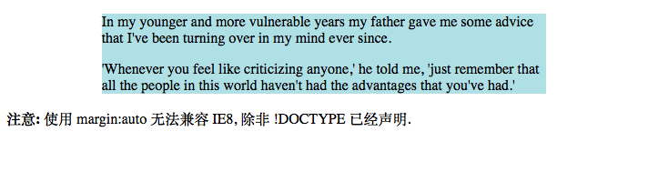
<p>In my younger and more vulnerable years my father gave me some advice that I've been turning over in my mind ever since.</p>
<p>'Whenever you feel like criticizing anyone,' he told me, 'just remember that all the people in this world haven't had the advantages that you've had.'</p>
</div>
<p><b>注意: </b>使用 margin:auto 无法兼容 IE8, 除非 !DOCTYPE 已经声明.</p>
</body>
</html>运行结果:
提示: 如果宽度是100%,对齐是没有效果的。
注意:IE5中块元素有一个margin处理BUG。为了使上述例子能工作,在IE5中,需要添加一些额外的代码。
使用position属性设置左,右对齐
元素对齐的方法之一是使用绝对定位:
<!DOCTYPE html>
<html>
<head>
<meta charset="utf-8">
<title>www.baidu.com</title>
<style>
.right
{
position:absolute;
right:0px;
width:300px;
background-color:#b0e0e6;
}
</style>
</head>
<body>
<div class="right">
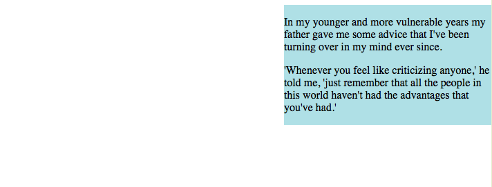
<p>In my younger and more vulnerable years my father gave me some advice that I've been turning over in my mind ever since.</p>
<p>'Whenever you feel like criticizing anyone,' he told me, 'just remember that all the people in this world haven't had the advantages that you've had.'</p>
</div>
</body>
</html>运行结果:
注意:绝对定位与文档流无关,所以它们可以覆盖页面上的其它元素。
Crossbrowser 兼容性问题
<p类似这样的元素对齐时,预先确定margin和元素的填充,始终是一个好主意。这是为了避免在不同的浏览器中的可视化差异。
IE8和早期有一个问题,当使用position属性时。如果一个容器元素(在本例中<div class="container">)指定的宽度,!DOCTYPE声明是缺失,IE8和早期版本会在右边增添17px的margin。这似乎是一个滚动的预留空间。使用position属性时始终设置在DOCTYPE声明中!
实例:
<!DOCTYPE html>
<html>
<head>
<meta charset="utf-8">
<title>www.baidu.com</title>
<style>
body
{
margin:0;
padding:0;
}
.container
{
position:relative;
width:100%;
}
.right
{
position:absolute;
right:0px;
width:300px;
background-color:#b0e0e6;
}
</style>
</head>
<body>
<div class="container">
<div class="right">
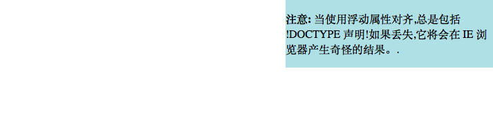
<p><b>注意: </b>当使用浮动属性对齐,总是包括 !DOCTYPE 声明!如果丢失,它将会在 IE 浏览器产生奇怪的结果。.</p>
</div>
</div>
</body>
</html>运行结果:
使用float属性设置左,右对齐
使用float属性是对齐元素的方法之一:
<!DOCTYPE html>
<html>
<head>
<meta charset="utf-8">
<title>www.baidu.com</title>
<style>
.right
{
float:right;
width:300px;
background-color:#b0e0e6;
}
</style>
</head>
<body>
<div class="right">
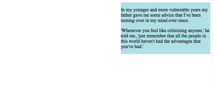
<p>In my younger and more vulnerable years my father gave me some advice that I've been turning over in my mind ever since.</p>
<p>'Whenever you feel like criticizing anyone,' he told me, 'just remember that all the people in this world haven't had the advantages that you've had.'</p>
</div>
</body>
</html>运行结果:


 3084
3084


 被折叠的 条评论
为什么被折叠?
被折叠的 条评论
为什么被折叠?
 到【灌水乐园】发言


