【实例】详解 CSS3 animation 6个动画属性
作者:admin 时间:2022-3-16 13:26:29 浏览:CSS3 animation 有6个动画属性:
- animation-name
- animation-duration
- animation-timing-function
- animation-delay
- animation-iteration-count
- animation-direction
其语法是
animation: name duration timing-function delay iteration-count direction;
关于各属性的描述如下表所示
| 值 | 描述 |
|---|---|
| animation-name | 规定需要绑定到选择器的 keyframe 名称 |
| animation-duration | 规定完成动画所花费的时间,以秒或毫秒计。 |
| animation-timing-function | 规定动画的速度曲线。 |
| animation-delay | 规定在动画开始之前的延迟。 |
| animation-iteration-count | 规定动画应该播放的次数。 |
| animation-direction | 规定是否应该轮流反向播放动画。 |
实例介绍
例如animation的语句如下:
animation: box_move 1s linear 2s alternate forwards;
那么各属性值的解释如下:
/* 1. 通过动画集名称调用动画 */
animation-name: box_move;

/* 2.设置动画执行时间 */
animation-duration: 1s;

/* 3. 设置动画的速度类型 */
animation-timing-function: linear;

/* 4. 设置延时执行时间 */
animation-delay: 2s;

/* 5. 动画默认执行次数是1次, infinite: 无限次 */
animation-iteration-count: infinite;

/* 6. 设置动画逆播【动画怎么正着播放,倒着播放的时候也是一样的效果】 normal*/
animation-direction: alternate;

/* 7. 设置动画执行完后的一个状态: 让动画停在结束时候的状态 */
animation-fill-mode: forwards;
需要明白的是,box_move 是动画名称,即是动画集名称,通过动画名称调用动画集,如下代码:
@keyframes box_move {
  from {}
  to {}
}通过以上书写,一个完整的animation才算完整,也即是一个animation需包含两部分,一部分是animation复合属性语句,另一部分是动画集代码。
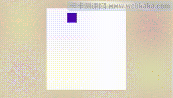
案例1:移动的盒子
案例效果:
1、盒子先水平向右移动100px,接下来向下移动100px。
2、然后向左移动100px,最后向上移动100px又回到原点。
3、其中每次改变方向都要变化背景颜色,循环往复执行。
完整HTML代码
<!DOCTYPE html>
<html>
  <head>
    <meta charset="UTF-8" />
    <meta name="viewport" content="width=device-width, initial-scale=1.0" />
    <meta http-equiv="X-UA-Compatible" content="ie=edge" />
    <title>Document</title>
    <style>
      .box {
        width: 30px;
        height: 30px;
        background-color: blue;
        animation: move 8s linear infinite forwards;
      }
      @keyframes move {
        from {
        }
        25% {
          transform: translateX(100px);
          background-color: red;
        }
        50% {
          transform: translateX(100px) translateY(100px);
          background-color: green;
        }
        75% {
          transform: translateX(0px) translateY(100px);
          background-color: yellow;
        }
        to {
          transform: translateY(0px);
          background-color: blue;
        }
      }
    </style>
  </head>
  <body>
    <div class="box"></div>
  </body>
</html>
此案例中,animation语句为:animation: move 8s linear infinite forwards; 其中move是动画集名称,8s为动画执行时间,linear是动画的速度类型(匀速),infinite表示运动无限循环,forwards表示动画结束时保持状态不变。
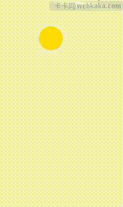
案例2:抛物线
完整HTML代码
<!DOCTYPE html>
<html lang="zh-cn">
  <head>
    <meta charset="UTF-8" />
    <title>Document</title>

    <style>
      body {
        position: relative;
        background:#eee;
      }
      .animation {
        margin:100px 100px;
        position: absolute;
        width: 50px;
        height: 50px;
        border-radius: 25px;
        background-color: #ed3;
        animation: r 1.5s linear 0s infinite forwards,
          l 1.5s cubic-bezier(0, 0, 1, 0) 0s infinite forwards;
      }
      @keyframes r {
        from {
          left: 0;
        }
        to {
          left: 120px;
        }
      }
      @keyframes l {
        from {
          top: 0;
        }
        to {
          top: 340px;
        }
      }
    </style>
  </head>
  <body>
    <div class="animation"></div>
  </body>
</html>
本案例中,animation语句中间出现了一个逗号,说明animation的动画是可以同时由多个动画集组成的,此案例使用了两个动画集,r和l,这里还出现了0s的属性值,说明动画延时执行时间为0s。
总结
通过本文的学习,我们应该了解CSS3 animation动画属性的固有写法模式,应该清楚它是有两部分组成。我们需要另外了解它6个属性值的具体含义,这样才能更准确的作出符合自己预期的动画来。
您可能对以下文章也感兴趣
相关文章
x
- 站长推荐


