RecyclerView 多行多列布局案例,情景分析

背景图来源:成都地标双子塔打卡点
写在前面
今日稍微得空,更新一篇内容:RecyclerView多行多列布局实(GridLayoutManager&&StaggeredGridLayoutManager) ,RecyclerView的使用想必大家都清楚
如果是让你用RecyclerView实现一个N行3列的,或者是2行N列的复合交错布局,那你心中有怎样的思路呢?我的答案是(如本文标题)然后再加一个均分FlexboxLayoutManager;如果我们还要给RecyclerView中的Item加间距,你可以直接在item的布局中加入间距margin,也可给RecyclerView添加ItemDecoration来处理间距,第一种办法表面看起来很简单:第二种方法间距多少直接写多少,看起来也很简单。但是实际使用时呢,会有奇奇怪怪的问题。这些问题循序渐进,我在情景5中进行了详细的分析和论证
当然像ScrollView包裹两个TextView,再包裹两个GridView作为3列数据,这种也能实现,但不在本文讨论之内,且不说还要处理ScrollView和GridView冲突问题.
上面两篇文章写到了kotlin的一些技巧和使用,所以本篇我就现学现卖用kotlin来成文
**版权声明CopyRight:
本内容作者:sunst,转载或引用请标明出处,违者追究法律责任!!!
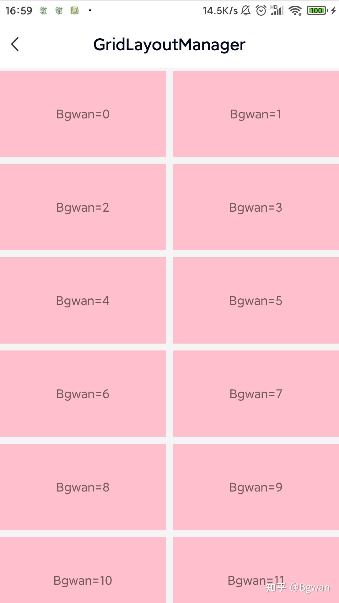
案例1:
先写一个简单的recyclerView,一列多行
1.主要依靠LinearLayoutManager来实现
/**
 * 简单的通用LinearLayoutManager,默认vertical ,建议recyclerView对应:match_parent
 * */
val manager = LinearLayoutManager(mThis)
binding?.recyclerView?.layoutManager = manager
binding?.recyclerView?.adapter = mainAdapter
2.适配器Adapter
inner class TextAdapter(layoutId: Int, data: MutableList<String>?) : BaseQuickAdapter<String, BaseViewHolder>(layoutId, data) {
    override fun convert(holder: BaseViewHolder, item: String) {
        val textView = holder.getView<TextView>(R.id.textView)
        textView.text = "Bgwan=" + holder.layoutPosition
        holder.itemView.setOnClickListener {
        toast("item=" + holder.adapterPosition)
              }
  }
}
3.窗口布局代码:activity_main.xml
<?xml version="1.0" encoding="utf-8"?>
<layout xmlns:android="http://schemas.android.com/apk/res/android"
  xmlns:app="http://schemas.android.com/apk/res-auto">

    <data />

    <LinearLayout
  android:layout_width="match_parent"
  android:layout_height="match_parent"
  android:orientation="vertical">

        <androidx.recyclerview.widget.RecyclerView
            android:id="@+id/recyclerView"
            android:layout_width="match_parent"
            android:layout_height="wrap_content"
            android:orientation="vertical"
            android:overScrollMode="never"
            android:scrollbars="none"
            app:layoutManager="androidx.recyclerview.widget.LinearLayoutManager"
            app:layout_behavior="@string/appbar_scrolling_view_behavior" />
    </LinearLayout>
</layout>
4.item布局代码:item_recyclerview_color.xml
<?xml version="1.0" encoding="utf-8"?>
<TextView xmlns:android="http://schemas.android.com/apk/res/android"
android:id="@+id/textView"
android:layout_width="match_parent"
android:layout_height="100dp"
android:background="@color/ColorPink"
android:contentDescription="@string/app_name"
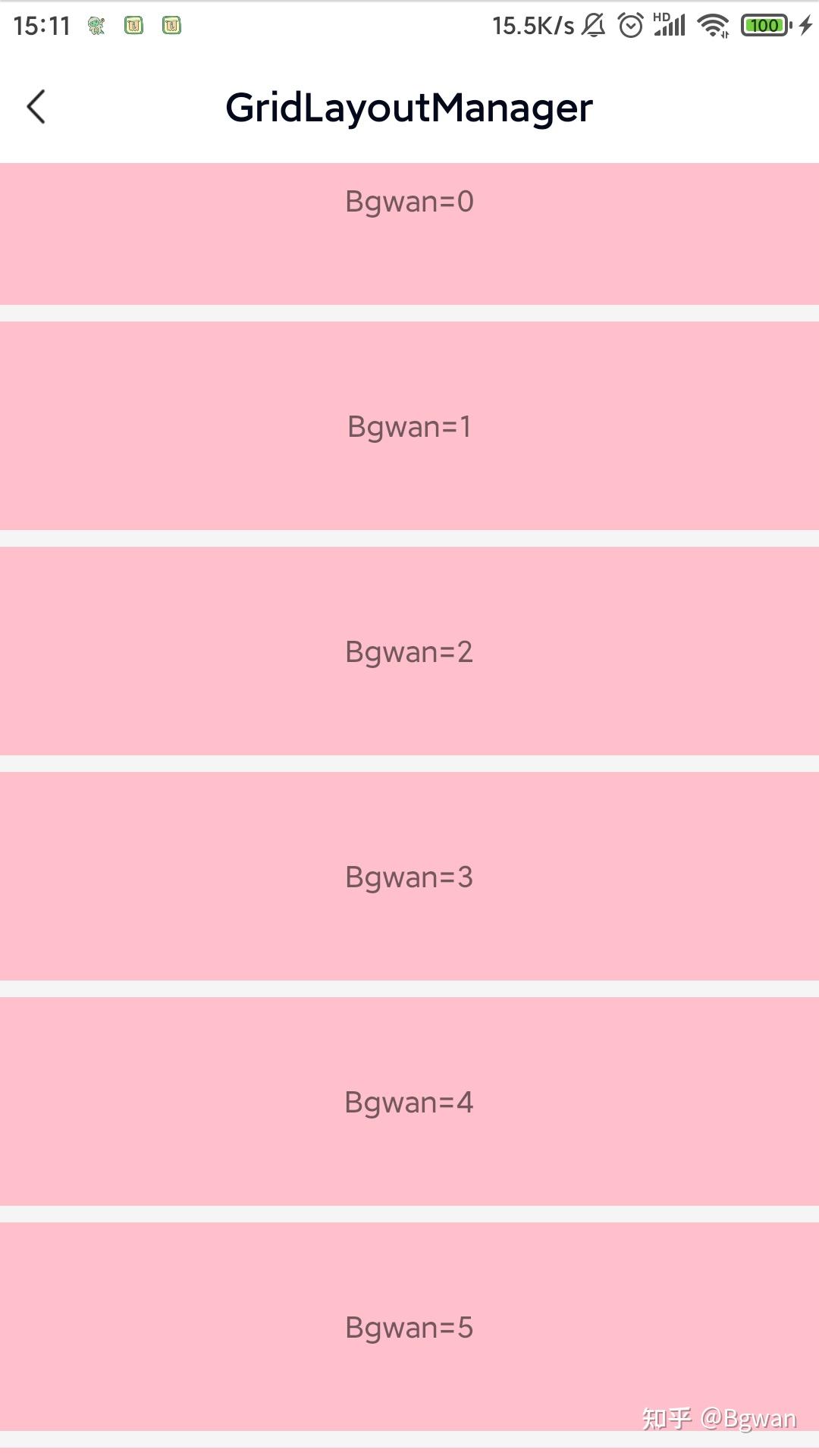
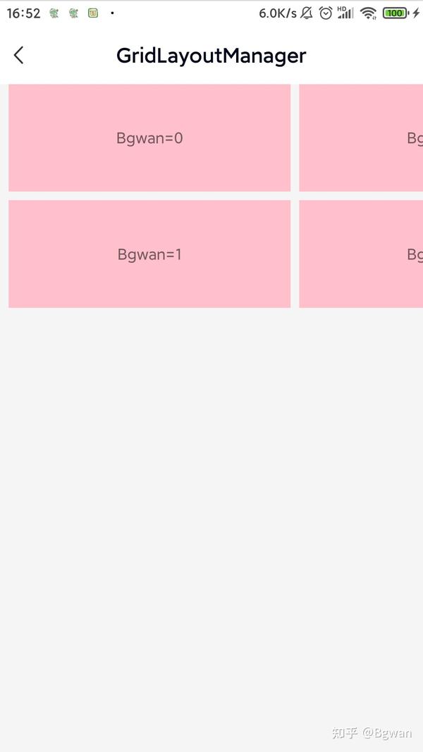
android:gravity="center" />item布局是一个单纯的布局文件,没有任何间距,padding,LinearLayoutManager默认是vertical的,它实现的效果如图1所示
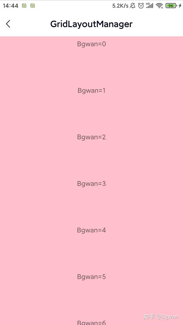
⚠️注意:
这里item指定高度为100,宽度为:match_parent,否则效果不好看 如果item不指定高度,recyclerView的高度在ImageView中建议设置为:match_parent,否则可能出现列表不显示的情况
案例2:
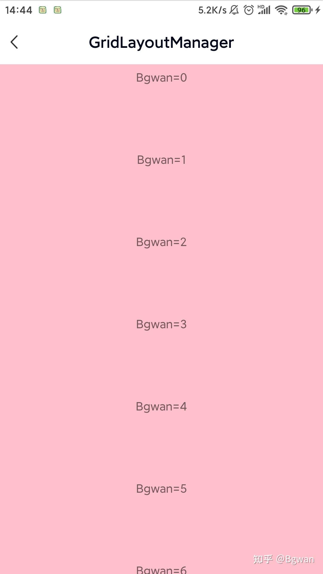
我们看到在案例1中,因为没有间距,整个拼成一片了,那我们现在来给它添加一个均分的间距,修改案例1中第1点添加addItemDecoration
val manager = LinearLayoutManager(mThis)
binding?.recyclerView?.layoutManager = manager
binding?.recyclerView?.adapter = mainAdapter
binding?.recyclerView?.addItemDecoration(object : RecyclerView.ItemDecoration() {
    override fun getItemOffsets(rect: Rect, view: View, recyclerView: RecyclerView, state: RecyclerView.State) {
        rect.bottom = ScreenUtils.dp2px(8)
        rect.left = 0
        rect.right = 0
        rect.top = 0
  }
})其它没有任何改变,我们主要调用了recyclerView的addItemDecoration(),现在来看看它的实现效果,如图2所示

⚠️注意:
如文章开头,你直接在item的布局中加入间距margin也是可以,但不在本文讨论范围,本文主要讲解addItemDecoration
案例3:
在案例1和2的基础上,我们将item布局的宽度,动态设置一下为屏幕的2/3
inner class FixTextAdapter(layoutId: Int, data: MutableList<String>?) : BaseQuickAdapter<String, BaseViewHolder>(layoutId, data) {
    override fun convert(holder: BaseViewHolder, item: String) {
        val textView = holder.getView<TextView>(R.id.textView)
        val layoutParams: ViewGroup.LayoutParams = textView.layoutParams
  val width = ScreenUtils.getDeviceWidth(mThis) / 3
  layoutParams.width = width * 2
  textView.text = "Bgwan=" + holder.layoutPosition
  holder.itemView.setOnClickListener {
  toast("item=" + holder.adapterPosition)
        }
  }
}
就会得到这样的效果,如图3所示

案例4:
将案例1中纯item TextView的布局,换成ImageView的布局试试
item布局代码:item_recyclerview_image.xml
<?xml version="1.0" encoding="utf-8"?>
<ImageView xmlns:android="http://schemas.android.com/apk/res/android"
  android:id="@+id/imageView"
  android:layout_width="wrap_content"
  android:layout_height="wrap_content"
  android:contentDescription="@string/app_name"
  android:scaleType="centerInside" />
可以设置:android:scaleType="centerInside"属性,然后再修改activity_main,xml中height属性值为="match_parent"
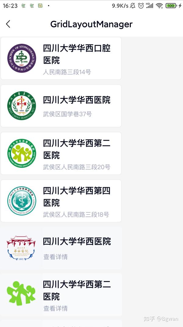
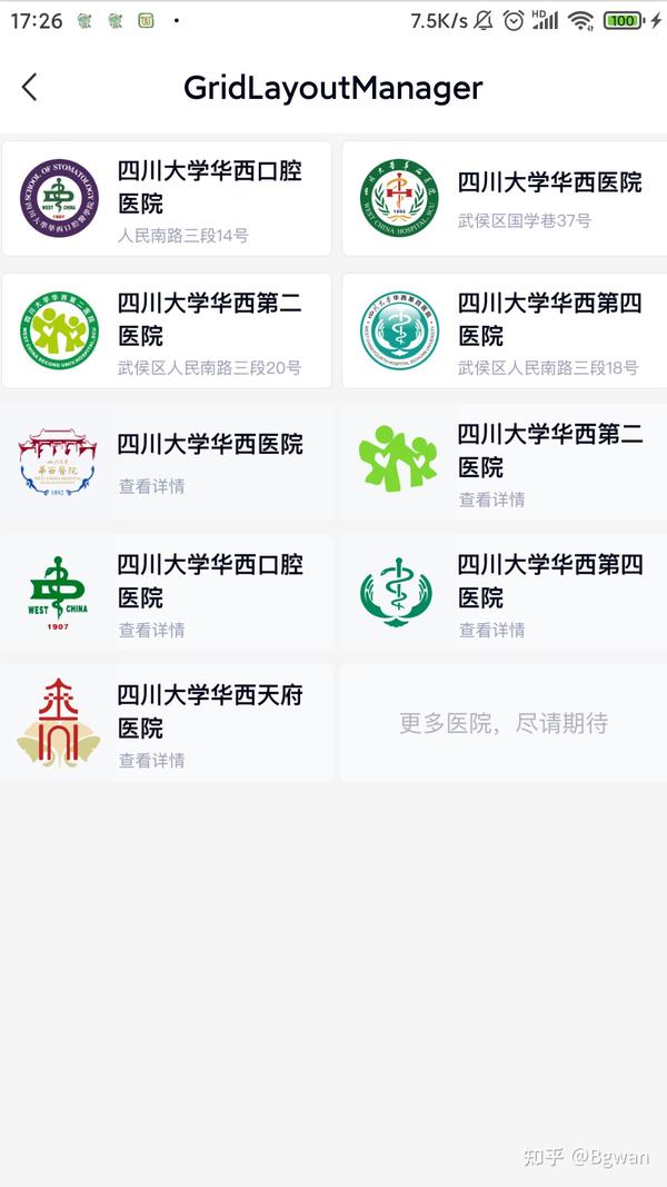
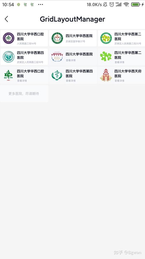
再用Adapter去加载几张图片(为了方便说明,这里用华西医院相关联的几张医院的图片说明,但是信息安全图片的请求这里就带过)
图片适配器Adapter
inner class ImageAdapter(layoutId: Int, data: MutableList<String>?) : BaseQuickAdapter<String, BaseViewHolder>(layoutId, data) {
    override fun convert(holder: BaseViewHolder, item: String) {
        val imageView = holder.getView<ImageView>(R.id.imageView)
        GlideEngine.instance.loadImage(imageView, item)
        holder.itemView.setOnClickListener {
  toast("Bgwan=" + holder.adapterPosition)
        }
  }
}
现在来看看它的实现效果,如图4所示

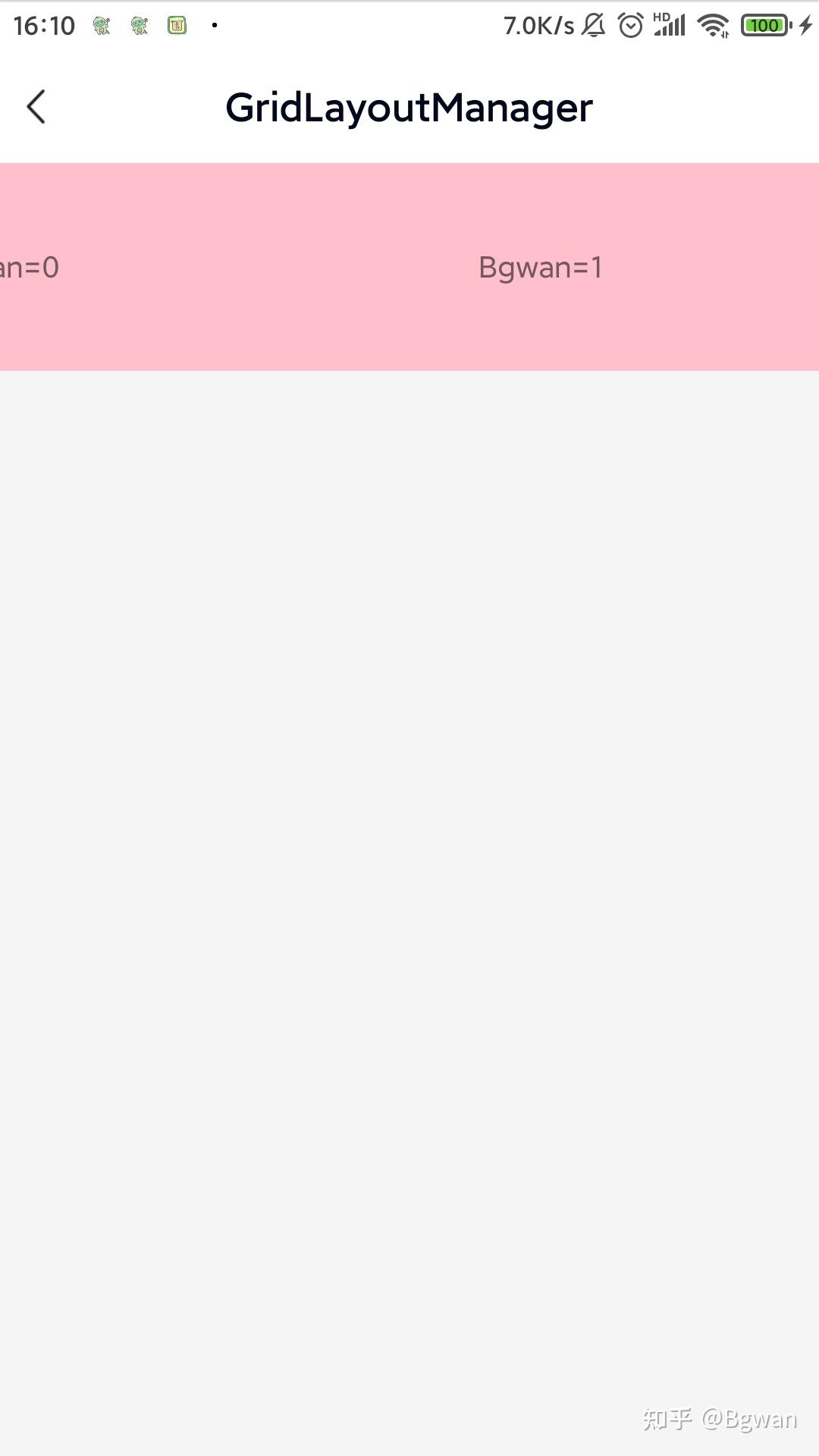
案例5:
我们看到在案例4中,因为没有间距,整个拼成一片了,现在仿照案例2来给它添加一个均分的间距,这里代码和案例2一样就不贴出,直接看图5效果

⚠️注意:
前面4张图看着有间距,其实是图片内的间距
案例6:
在案例5的基础上,我们动态设置设置图片的宽度为屏幕的2/3
图片适配器Adapter 2/3屏幕
inner class FixImageAdapter(layoutId: Int, data: MutableList<String>?) : BaseQuickAdapter<String, BaseViewHolder>(layoutId, data) {
    override fun convert(holder: BaseViewHolder, item: String) {
        val imageView = holder.getView<ImageView>(R.id.imageView)
        val layoutParams: ViewGroup.LayoutParams = imageView.layoutParams
  val width = ScreenUtils.getDeviceWidth(mThis) / 3
  layoutParams.width = width * 2
  GlideEngine.instance.loadImage(imageView, item)
        holder.itemView.setOnClickListener {
  toast("Bgwan=" + holder.adapterPosition)
        }
  }
}
item布局文件为:
去掉:android:scaleType="centerInside"
<?xml version="1.0" encoding="utf-8"?>
<ImageView xmlns:android="http://schemas.android.com/apk/res/android"
  android:id="@+id/imageView"
  android:layout_width="wrap_content"
  android:layout_height="wrap_content"
  android:contentDescription="@string/app_name" />
看下实现后的效果

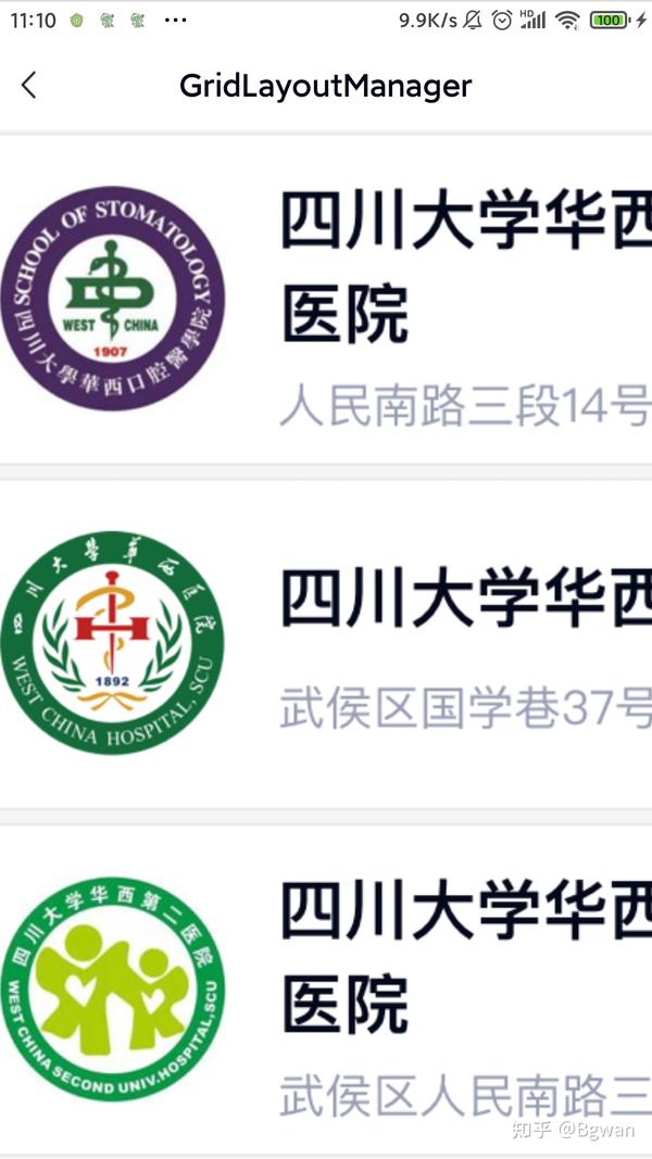
案例7:
案例1-6中,LinearLayoutManager默认为:VERTICAL,这次我们修改为:LinearLayoutManager.HORIZONTAL,在案例3的基础上,也就是宽度为屏幕2/3,看下实现后的效果

可以看到修改为水平方向的后,就会变成一行多列,且item可以滑动到最右边
⚠️注意:
当为水平方向时,recyclerView的height最好设置为:wrap_content
案例8:
在案例6的基础上我们仿照案例7做一个水平滑动的图片,图片宽度为屏幕2/3
看下实现后的效果

在案例1-8中,可以看到我们用LinearLayoutManager实现了最简单的recyclerView横向,纵向布局,以及动态设置item宽的各种显示效果,他们都是单行单列的显示效果,还没有进入主题实现多行多列的交错布局,喏,好戏现在才真正开始
情景1:
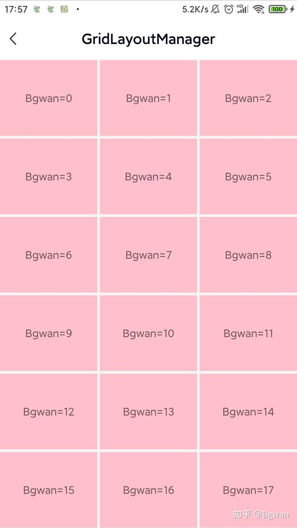
需求:纯文本,2列多行,纵向滑动,均分屏幕;
间距要求:第1列item距离左边的距离为:0,第2列距离右边的距离为:0,左右各个Item之间的间距为:10dp。
布局还是案例1-8中的布局不变,这里开始用GridLayoutManager
主要代码
val manager = GridLayoutManager(mThis, 2, GridLayoutManager.VERTICAL, false)
binding?.recyclerView?.layoutManager = manager
binding?.recyclerView?.adapter = mainAdapter
binding?.recyclerView?.addItemDecoration(object : RecyclerView.ItemDecoration() {
    override fun getItemOffsets(rect: Rect, view: View, parent: RecyclerView, state: RecyclerView.State) {
        val pos = parent.getChildAdapterPosition(view)
        val column = (pos % manager.spanCount)//标准注释:vertical则表示第几列,如第一列,第二列,第三列
  rect.left = ScreenUtils.dp2px(spaceDistance)
        rect.right = ScreenUtils.dp2px(spaceDistance)
        rect.top = ScreenUtils.dp2px(spaceDistance)
        rect.bottom = ScreenUtils.dp2px(spaceDistance)
        if (column == 0) {
            rect.left = 0
  } else if (column == 1) {
            rect.right = 0
  }
    }
})
adapter使用
TextAdapter(R.layout.item_recyclerview_color, data)
⚠️注意:
纵向滑动不要设置宽度为屏幕2/3。 一般情况下recyclerView中height建议设置为:match_parent,当添加了addItemDecoration也可设置为:wrap_content。
情景2:
需求:纯文本,2行多列,横向滑动,宽度为屏幕2/3;
间距要求:第1行item距离顶部的距离为:0,第2行距离底部的距离为:0,左右各个Item之间的间距为:10dp,上下第1行与第2行的距离为:spaceDistance=10dp。
主要代码
val manager = GridLayoutManager(mThis, 2, GridLayoutManager.HORIZONTAL, false)
binding?.recyclerView?.layoutManager = manager
binding?.recyclerView?.adapter = mainAdapter
binding?.recyclerView?.addItemDecoration(object : RecyclerView.ItemDecoration() {
    override fun getItemOffsets(rect: Rect, view: View, recyclerView: RecyclerView, state: RecyclerView.State) {
        val pos = recyclerView.getChildAdapterPosition(view)
        val row = (pos % 2)//标准注释:horizontal则表示第几行,如第一行,第二行,第三行,第四行
  rect.right = ScreenUtils.dp2px(spaceDistance)
        rect.left = ScreenUtils.dp2px(spaceDistance)
        if (pos == 0 || pos == 1) {
            rect.left = ScreenUtils.dp2px(spaceDistance * 2)
            rect.right = ScreenUtils.dp2px(spaceDistance)
        } else if (pos + 1 == data.size || pos + 2 == data.size) {
            rect.left = ScreenUtils.dp2px(spaceDistance)
            rect.right = ScreenUtils.dp2px(spaceDistance * 2)
        }
        if (row == 0) {
            rect.top = 0
  rect.bottom = ScreenUtils.dp2px(spaceDistance)
        }
        if (row == 1) {
            rect.top = ScreenUtils.dp2px(spaceDistance)
            rect.bottom = 0
  }
    }
})
adapter使用
FixTextAdapter(R.layout.item_recyclerview_color, data)效果如下:

⚠️注意:
横向滑动,recyclerView中height应该设置为:wrap_content。
情景3:
对应情景1,换成图片,adapter使用如下:
inner class FixImageAdapter2Width(layoutId: Int, data: MutableList<String>?) : BaseQuickAdapter<String, BaseViewHolder>(layoutId, data) {
    override fun convert(holder: BaseViewHolder, item: String) {
        val imageView = holder.getView<ImageView>(R.id.imageView)
        val layoutParams: ViewGroup.LayoutParams = imageView.layoutParams
  val width = ScreenUtils.getDeviceWidth(mThis) / 2
  layoutParams.width = width
 GlideEngine.instance.loadImage(imageView, item)
        holder.itemView.setOnClickListener {
  toast("Bgwan=" + holder.adapterPosition)
        }
  }
}

⚠️注意:
纵向滑动设置宽度为屏幕1/2。 一般情况下recyclerView中height建议设置为:match_parent,当添加了addItemDecoration也可设置为:wrap_content。
情景4:
对应情景2,换成图片,adapter使用如下:
FixImageAdapter(R.layout.item_recyclerview_image, data)

⚠️注意:
横向滑动,recyclerView中height应该设置为:wrap_content。 item_image.xml不建议添加:scaleType属性值,任何值都不建议。
情景5:
对应情景1,需求改为:纯文本,3列多行,纵向滑动,均分屏幕;3列多行的情况和2列多行的情况有些不同,如果还按照情景1会出现item的间距会走样。这里正对此情景我来着重分析一下
分析: ItemDecoration绘制原理上因为Item首先是均等分布,且Item内部显示的内容部分并不是完全居中,然后绘制计算的这个过程,又是从左向右一一计算的。所以越往后计算,距离会越来越拉大,虽然细微的间距看起来是正常的,但是因为可显示内容部分的宽度被挤压了,所以显得在布局当中中间部分可显示区域会变小,我就是在实际的开发中遇到了这样的问题,查了很多资料
解决的思路: 对于每1行来说,只有两部分间距,即第1列的Item和第2列的Item间有一个间距,第2列Item跟第3列Item之间也有一个间距。而左右两侧距离屏幕距离是0,所以得出这1行中除了可显示内容View之外,剩下的需要留白的宽度是10+10=20,因为1行是3列,所以对于每个Item来说,它所分得的空白宽度就是20/3。 (1).对于第1列Item来说,它的左侧距离是0(靠左侧屏幕),那么推出=>右侧距离就是 20/3-0=20/3。 (2).对于第2列Item来说,他的左侧距离是多少呢?想一下(它的左侧距离再加上第1列Item的右侧距离,刚好就是10,既然已经知道了第1列Item的右侧间距,那么不难推出=>第2列Item的左侧距离就是10-20/3=10/3,那它这个Item当前还剩下的空白距离,也就是第二列右侧的距离=>就是20/3-10/3,也就是10/3。 (3).那第三列Item的左侧边距,同理可得=>10-10/3=20/3,右侧距离=>20/3-20/3,刚好是0,代码如下:
val manager = GridLayoutManager(mThis, 3, GridLayoutManager.VERTICAL, false)
binding?.recyclerView?.layoutManager = manager
binding?.recyclerView?.adapter = mainAdapter
binding?.recyclerView?.addItemDecoration(object : RecyclerView.ItemDecoration() {
    override fun getItemOffsets(rect: Rect, view: View, parent: RecyclerView, state: RecyclerView.State) {
        val pos = parent.getChildAdapterPosition(view)
        val column = (pos % manager.spanCount)
        if (column == 0) { //第一列
  rect.left = 0
  rect.right = 20/3
  } else if (column == 1) { //第二列
  rect.left = 10/3
  rect.right = 10/3
  } else { //第三列
  rect.left = 20/3
  rect.right = 0
  }
        rect.top = 5
  rect.bottom = 5
  }
})

⚠️注意:
纵向滑动不要设置宽度为屏幕2/3。 一般情况下recyclerView中height建议设置为:match_parent,当添加了addItemDecoration也可设置为:wrap_content。
情景6:
和情景5同样的逻辑解决思路,对应情景2,需求改为:纯文本,3行多列,横向滑动,宽度为屏幕2/3;就好实现了
主要代码
val manager = GridLayoutManager(mThis, 3, GridLayoutManager.HORIZONTAL, false)
binding?.recyclerView?.layoutManager = manager
binding?.recyclerView?.adapter = mainAdapter
binding?.recyclerView?.addItemDecoration(object : RecyclerView.ItemDecoration() {
    override fun getItemOffsets(rect: Rect, view: View, recyclerView: RecyclerView, state: RecyclerView.State) {
        val pos = recyclerView.getChildAdapterPosition(view)
        val row = (pos % manager.spanCount)//标准注释:horizontal则表示第几行,如第一行,第二行,第三行,第四行
  if (pos == 0 || pos == 1 || pos == 2) {
            rect.left = 10
  rect.right = 5
  } else if (pos + 1 == data.size || pos + 2 == data.size || pos + 3 == data.size) {
            rect.left = 5
  rect.right = 10
  }
        if (row == 0) { //第一行
  rect.top = 0
  rect.bottom = 20 / 3
  } else if (row == 1) { //第二行
  rect.top = 10 / 3
  rect.bottom = 10 / 3
  } else { //第三行
  rect.top = 20 / 3
  rect.bottom = 0
  }
        rect.left = 5
  rect.right = 5
  }
})
adapter使用
FixTextAdapter(R.layout.item_recyclerview_color, data)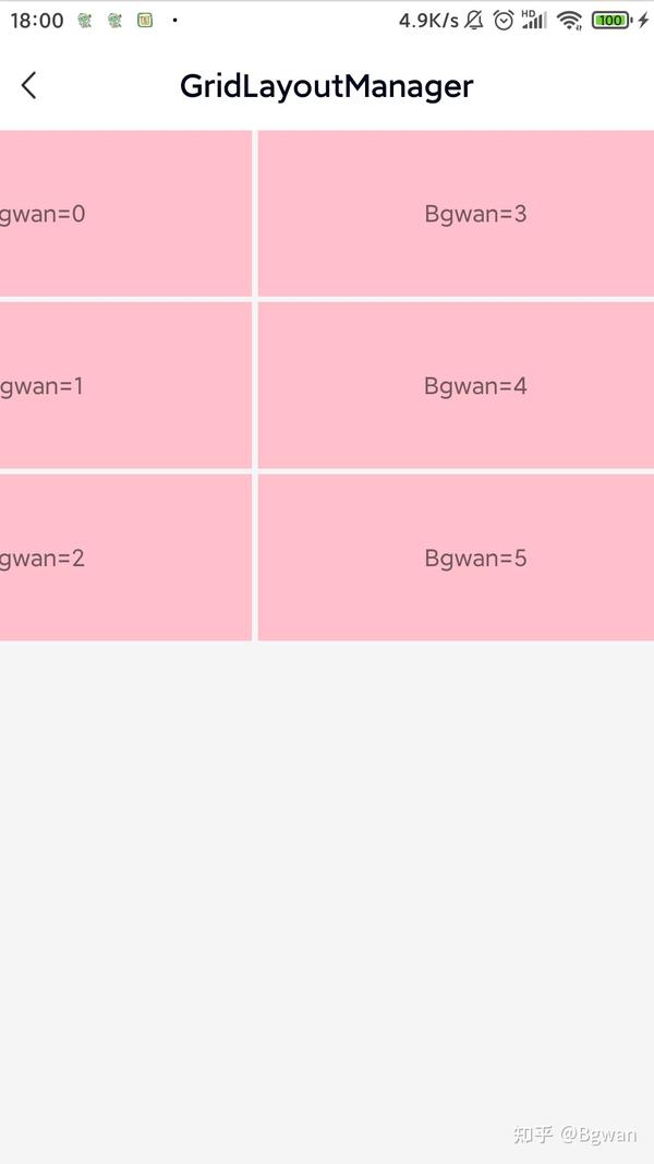

⚠️注意:
横向滑动,recyclerView中height应该设置为:wrap_content。
情景7:
对应情景5,换成图片,adapter使用如下:
inner class FixImageAdapter3Width(layoutId: Int, data: MutableList<String>?) : BaseQuickAdapter<String, BaseViewHolder>(layoutId, data) {
    override fun convert(holder: BaseViewHolder, item: String) {
        val imageView = holder.getView<ImageView>(R.id.imageView)
        val layoutParams: ViewGroup.LayoutParams = imageView.layoutParams
  val width = ScreenUtils.getDeviceWidth(mThis) / 3
  layoutParams.width = width
 GlideEngine.instance.loadImage(imageView, item)
        holder.itemView.setOnClickListener {
  toast("Bgwan=" + holder.adapterPosition)
        }
  }
}

情景8:
对应情景6,换成图片,adapter使用如下:
FixImageAdapter(R.layout.item_recyclerview_image, data)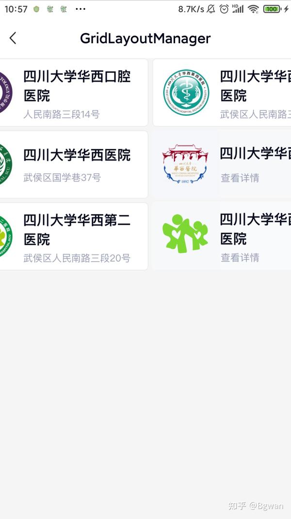

情景9:
对应情景8,只是adapter使用如下:
ImageAdapter(R.layout.item_recyclerview_image, data)在加入:android:scaleType="centerInside"属性
<?xml version="1.0" encoding="utf-8"?>
<ImageView xmlns:android="http://schemas.android.com/apk/res/android"
  android:id="@+id/imageView"
  android:layout_width="wrap_content"
  android:layout_height="wrap_content"
  android:contentDescription="@string/app_name"
  android:scaleType="centerInside" />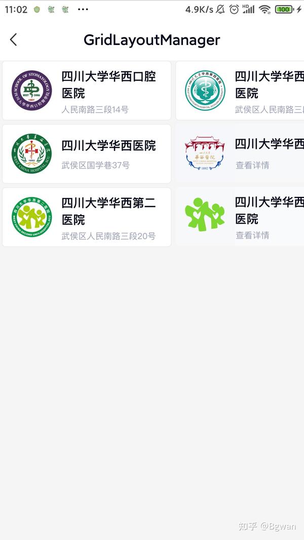

本列图片用了scaleType属性,由于没有动态设置宽度,相对于图18整体会小一点,相信原因大家都知道,因为一个是动态宽度屏幕2/3,另一个是centerInside宽度,如果我们这里不设置:scaleType属性的话,那么它的效果是这样的

可以看到图片不会变形,但是图片超大,这是图片的原始大小。
⚠️注意:
当设置了View的宽高(无论动态还是xml设置),不要加android:scaleType属性,否则图片会变形,而且添加的addItemDecoration设置间距会失效;当没有动态设置宽高,建议添加scaleType="centerInside"。
情景10:
需求:仿一周时间,两行4列,最后一条数据独占2列
初始化:recyclerView
GridLayoutManager gridLayoutManager = new GridLayoutManager(getActivity(), 4, LinearLayoutManager.VERTICAL, false);
gridLayoutManager.setSpanSizeLookup(new GridLayoutManager.SpanSizeLookup() {
    @Override
  public int getSpanSize(int position) {
        if (position == 6) {
            return 2;
        } else {
            return 1;
        }
    }
});
recyclerview.setLayoutManager(gridLayoutManager);
List<String> data = new ArrayList<>();
recyclerview.setAdapter(new TestAdapter2(getActivity(), data));⚠️注意:
getSpanSize 返回值不是表示没行有几列,而是当前这个item占着一行的几列的比,这一点请悉知。
动态设置每个item设置每个item宽度颜色
TextView tvTiltle = itemView.findViewById(R.id.tvTitle);
tvTiltle.setText("st" + position);
itemView.setBackgroundColor(Color.YELLOW);
if (position == 6) {
    itemView.setBackgroundResource(R.drawable.in_selector_shape);
    tvTiltle.setWidth(ScreenUtils.getScreenWidth(getContext()) / 2);
} else {
    if (position == 5) {
        tvTiltle.setWidth(ScreenUtils.getScreenWidth(getContext()) / 4);
        itemView.setBackgroundColor(Color.DKGRAY);
    } else if (position == 4) {
        tvTiltle.setWidth(ScreenUtils.getScreenWidth(getContext()) / 4);
        itemView.setBackgroundColor(Color.MAGENTA);
    } else {
        tvTiltle.setWidth(ScreenUtils.getScreenWidth(getContext()) / 4);
        if (position == 0) {
            itemView.setBackgroundColor(Color.GREEN);
            tvTiltle.setText("仿微信小程序入口");
        } else if (position == 1) {
            itemView.setBackgroundColor(ColorDrawer.getColor(R.color.ColorDarkorange));
        } else if (position == 2) {
            itemView.setBackgroundColor(Color.BLUE);
        } else {
            itemView.setBackgroundColor(Color.LTGRAY);
        }
    }
}
itemView.setOnClickListener(v -> gotoLayoutActivity(position));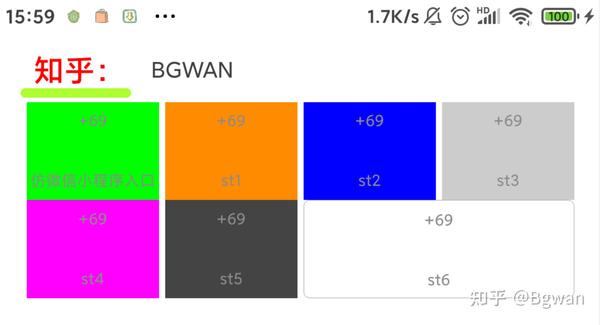

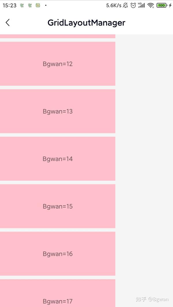
StaggeredGridLayoutManager和GridLayoutManager很像,只不过当你想实现一个交错的瀑布流布局的时候就可以考虑用这个了,不知道瀑布流的可以看看淘宝首页,你手机的相册图册
情景11:
先来看一个简单的实现:
initView初始化
recyclerview.setLayoutManager(new StaggeredGridLayoutManager(3, LinearLayoutManager.VERTICAL));
recyclerview.setAdapter(new TestAdapter());
adapter使用
class TestAdapter extends RecyclerView.Adapter<TestViewHolder> {
        @NonNull
 @Override  public TestViewHolder onCreateViewHolder(@NonNull ViewGroup parent, int viewType) {
            TextView textView = new TextView(getContext());
            StaggeredGridLayoutManager.LayoutParams params = new StaggeredGridLayoutManager.LayoutParams(ScreenUtils.getScreenWidth(mContext) / 3, 180);
            textView.setLayoutParams(params);
            textView.setTextColor(Color.BLACK);
            textView.setGravity(Gravity.CENTER);
            return new TestViewHolder(ViewUtils.getInflaterView(parent.getContext(), R.layout.item_zhihu, parent));
//            return new TestViewHolder(textView);
  }

        @Override
  public void onBindViewHolder(@NonNull TestViewHolder holder, int position) {
            holder.bind(position);
        }

        @Override
  public int getItemCount() {
            return 18;
        }
    }

    class TestViewHolder extends RecyclerView.ViewHolder {

        public TestViewHolder(View itemView) {
            super(itemView);
        }

        public void bind(int pos) {
            TextView tvTiltle = itemView.findViewById(R.id.tvTitle);

            tvTiltle.setText("第" + pos + "个item");
            if (pos % 3 == 0) {
                itemView.setBackgroundColor(Color.RED);
            } else if (pos % 3 == 1) {
                itemView.setBackgroundColor(Color.GREEN);
            } else if (pos % 3 == 2) {
                itemView.setBackgroundColor(Color.BLUE);
            }

            if (pos % 4 == 0) {
                StaggeredGridLayoutManager.LayoutParams clp = (StaggeredGridLayoutManager.LayoutParams) itemView.getLayoutParams();
                clp.setFullSpan(true);
                tvTiltle.setWidth(ScreenUtils.getScreenWidth(mContext));
                itemView.setLayoutParams(clp);
                itemView.setBackgroundColor(Color.YELLOW);
            }
        }
    }
xml布局
<?xml version="1.0" encoding="utf-8"?>
<RelativeLayout xmlns:android="http://schemas.android.com/apk/res/android"
  android:id="@+id/frameLayout"
  android:layout_width="wrap_content"
  android:layout_height="64dp"
  android:layout_marginLeft="4dp"
  android:clickable="true">

    <TextView
  android:id="@+id/tvTitle"
  style="@style/an_match_wrap"
  android:layout_below="@+id/ivGif"
  android:layout_centerHorizontal="true"
  android:ellipsize="end"
  android:gravity="center"
  android:textColor="#8B8B8B"
  android:textSize="10sp" />

    <ImageView
  android:id="@+id/ivGif"
  android:layout_width="25dp"
  android:layout_height="25dp"
  android:layout_below="@+id/tvTips"
  android:layout_centerInParent="true"
  android:scaleType="centerCrop" />

    <TextView
  android:id="@+id/tvTips"
  android:layout_width="wrap_content"
  android:layout_height="wrap_content"
  android:layout_centerHorizontal="true"
  android:layout_marginTop="@dimen/an_dimen_margin_ssmall"
  android:ellipsize="end"
  android:singleLine="true"
  android:text="+69"
  android:textColor="#8B8B8B"
  android:textSize="10sp" />
</RelativeLayout>⚠️注意:
StaggeredGridLayoutManager.LayoutParams中提供了这样一个方法: LayoutParams.setFullSpan(true);
作用是把当前item的宽度设为full(填满),也就是说如果使用StaggeredGridLayoutManager要么不设置,要么就只能填满。
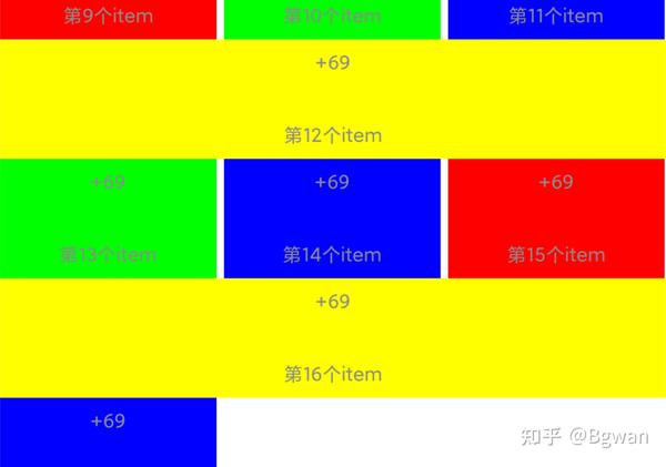

情景12:
RecyclerView瀑布流2列多行交错的瀑布流会出现错位问题,即竖排的瀑布流,网上查了很多解决方案一般正常瀑布流列表解决错位问题,只需要设置以下即可
manager.gapStrategy = StaggeredGridLayoutManager.GAP_HANDLING_NONE横向的列表此方案是无法解决的,如果是横向布局则无需设置setGapStrategy,为了防止item交换位置,只需要滑动监听处notifyDataSetChanged适配器即可,代码如下:
binding?.recyclerView?.addOnScrollListener(object : RecyclerView.OnScrollListener() {
          override fun onScrollStateChanged(recyclerView: RecyclerView, newState: Int) {
              super.onScrollStateChanged(recyclerView, newState)
              //为了连贯性,StaggeredGridLayoutManager会在item间保持间距,加上这个则,防止第一行到顶部有空白区域
manager.invalidateSpanAssignments()//效果ok
                mainAdapter.notifyDataSetChanged()
//                recyclerView.invalidateItemDecorations()
}
      })
让适配器重新计算宽高就能完美解决横向错位的问题
initView初始化
val manager = StaggeredGridLayoutManager(2, StaggeredGridLayoutManager.VERTICAL)
        //1.网上查了很多 一般正常瀑布流 竖向列表(横向的列表此方案是无法解决的),解决错位问题 只需要设置GAP_HANDLING_NONE
 //2.不为隐藏布局边缘差距做任何处理,当指定recyclerView高度为固定值,或者recyclerView为match_parent
   manager.gapStrategy = StaggeredGridLayoutManager.GAP_HANDLING_NONE  //标准注释:纵向
  binding?.recyclerView?.layoutManager = manager
  binding?.recyclerView?.adapter = mainAdapter
  //标准注释:横向
 binding?.recyclerView?.setHasFixedSize(true)
        binding?.recyclerView?.addOnScrollListener(object : RecyclerView.OnScrollListener() {
            override fun onScrollStateChanged(recyclerView: RecyclerView, newState: Int) {
                super.onScrollStateChanged(recyclerView, newState)
                //为了连贯性,StaggeredGridLayoutManager会在item间保持间距,加上这个则,防止第一行到顶部有空白区域
  manager.invalidateSpanAssignments()//效果ok
//                mainAdapter.notifyDataSetChanged()
//                recyclerView.invalidateItemDecorations()
  }
        })
        binding?.recyclerView?.addItemDecoration(object : RecyclerView.ItemDecoration() {
            override fun getItemOffsets(rect: Rect, view: View, parent: RecyclerView, state: RecyclerView.State) {
                val pos = parent.getChildAdapterPosition(view)
                val column = (pos % manager.spanCount)//标准注释:vertical则表示第几列,如第一列,第二列,第三列
  rect.left = ScreenUtils.dp2px(spaceDistance)
                rect.right = ScreenUtils.dp2px(spaceDistance)
                rect.top = ScreenUtils.dp2px(spaceDistance)
                rect.bottom = ScreenUtils.dp2px(spaceDistance)
                if (column == 0) {
                    rect.left = 0
  } else if (column == 1) {
                    rect.right = 0
  }
            }
        })
adapter使用
FixImageAdapter2Width(R.layout.item_recyclerview_image, data)

⚠️注意:
在纵向Vertical时也建议设置recyclerView为match_parent imageview不能设置了scaletype为centerCrop,因为刷新后,同一张图可能会被多次裁剪放大中心部分,图片也会越来越小,如果你使用的是Glide,那么可以加入:Glide.with(mContext).load(url).dontTransform().into(ivImage);也可以放置图片多次裁剪.
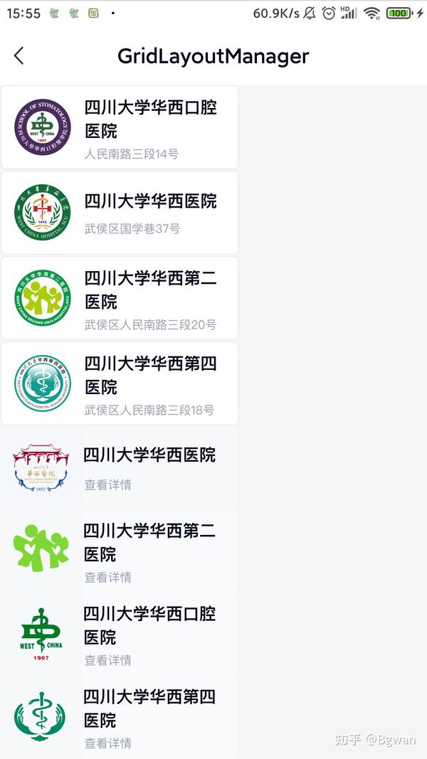
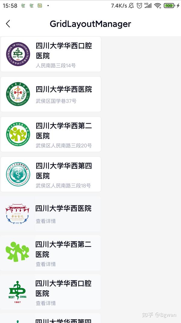
在情景1-12中我们交替使用StaggeredGridLayoutManager与GridLayoutManager,解决了大部分我们使用recyclerView实现多行多列布局中存在的问题,但是没完,给出一个彩蛋,当你理解完本文所有内容,下面的截图的效果相信你也能很好的实现了
1.商城
思路:纵向的StaggeredGridLayoutManager的瀑布流的商城,需保证界面item左右不错乱,滑动上下不抖动。
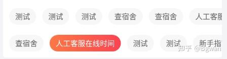
2.小标签
思路:横向StaggeredGridLayoutManager实现

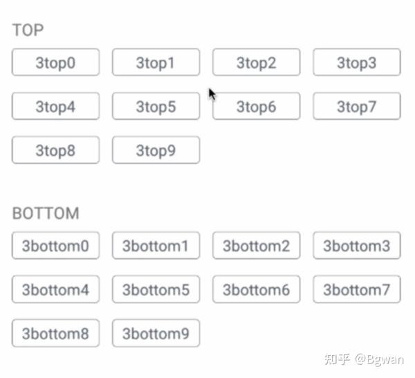
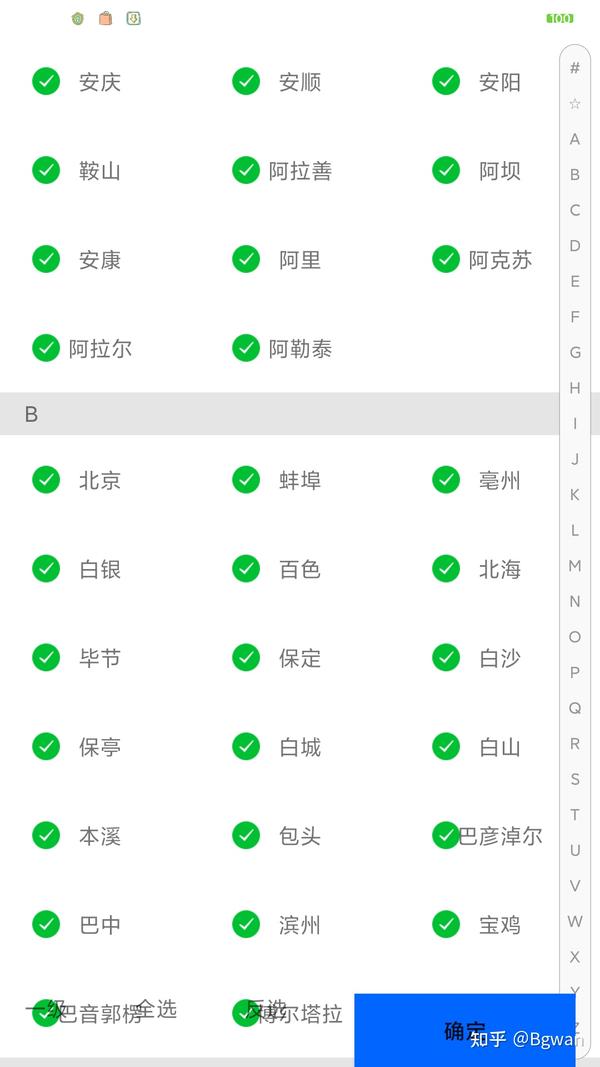
3.城市列表&item筛选界面
思路:两个GridLayoutManager的交错布局,即上面显示一行,下面显示多列数据


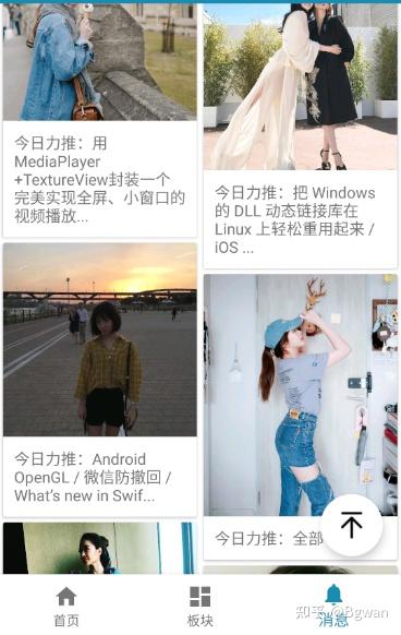
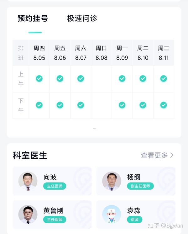
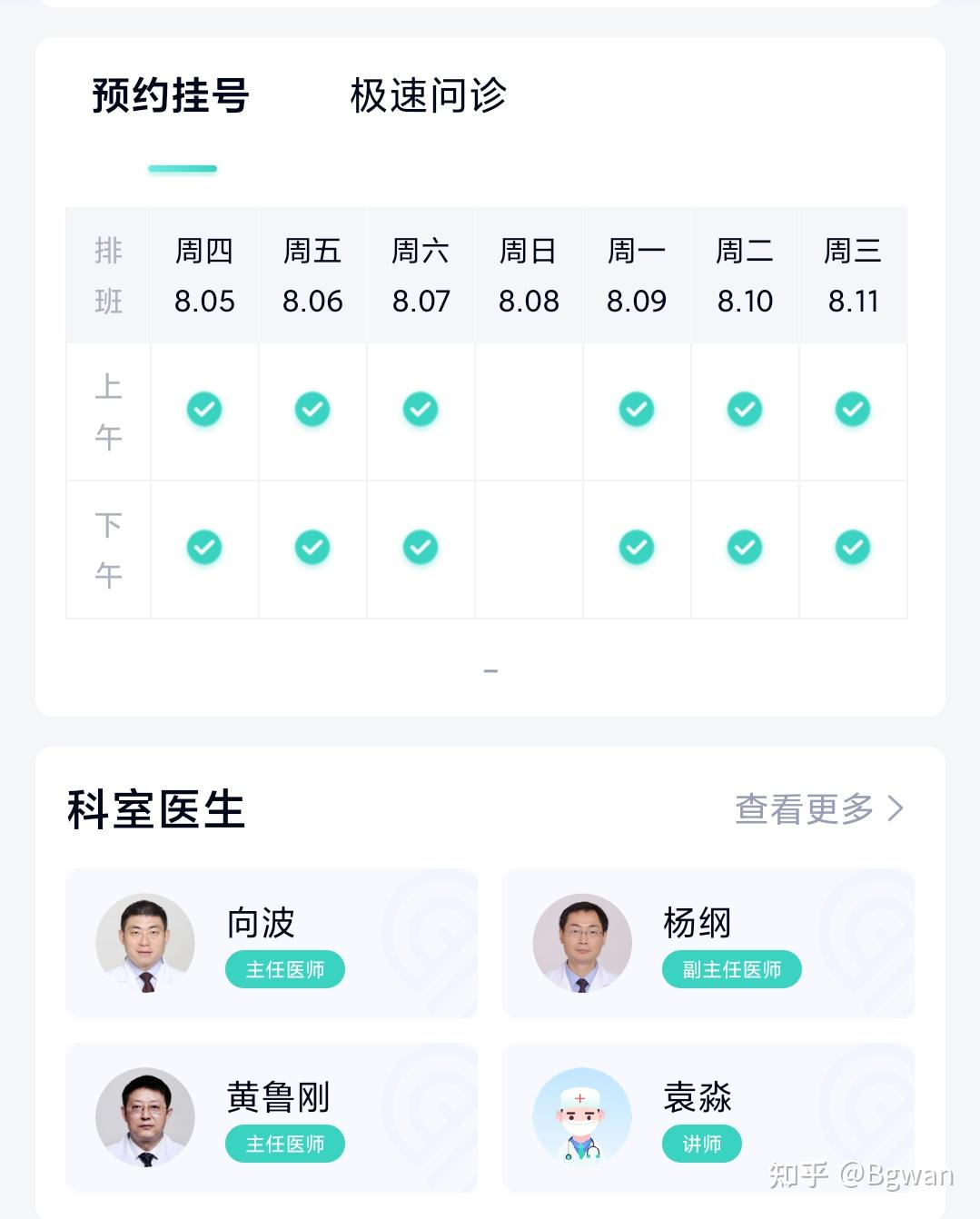
4.华西医院华医通首页
稍微复杂的首页布局,思路:根据ViewType类型,设置不同布局内容,华西力量也可以是recyclerView2行多列滑动


5.一周七天排班界面
一个recyclerView
以上便是RecyclerView 多行多列布局案例,情景分析的全部内容了,本篇基本上涵盖了目前所有应用app都能用recyclerView实现的布局案例,情景,要是本文能够帮助到你,那真是万幸,也请不要吝啬你的关注与点赞。ღ( ´・ᴗ・` )比心,以上便是所有内容,this All
请尊重劳动成果,注意文中版权声明,Android专栏不定时更新,欢迎点击关注我知乎。也可以同时关注人工智能专栏,文艺语录专栏,本内容作者sunst0069,技术上有问题请沟通qyddai@gmail.com
作者:sunst发布于: 2021-08-05 18:00&&修改于:2021-08-06 09:00