


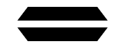
1.横向梯形
<div class="div1"></div>
<div class="div2"></div>

<style>

       .div1{
            width:100px;
            height: 0;
            border-bottom: 20px solid #000;
            border-left: 15px solid transparent;
            border-right: 15px solid transparent;
        }
        .div2{
            width:100px;
            height: 0;
            border-top: 20px solid #000;
            border-left: 15px solid transparent;
            border-right: 15px solid transparent;
        }

</style>
效果图:
2.纵向梯形
<div class="div3"></div>
<div class="div4"></div>

<style>

      .div3{
            width:0;
            height: 100px;
            border-left: 20px solid #000;
            border-top: 15px solid transparent;
            border-bottom: 15px solid transparent;
        }
        .div4{
            width:0;
            height: 100px;
            border-right: 20px solid #000;
            border-top: 15px solid transparent;
            border-bottom: 15px solid transparent;
        }
</style>
效果图

3.总结:
本质上就是设置了3个方向的边框border,其中两个方向的border为透明色。


 826
826


 被折叠的 条评论
为什么被折叠?
被折叠的 条评论
为什么被折叠?
 到【灌水乐园】发言


