
CSS position: sticky

CSSposition属性用于指定一个元素在文档中的定位方式。在这篇文章中,我们不讨论relative, absolute, fixed值,我们来看看一个只有部分浏览器支持的值sticky。
目录如下:
- 简单介绍
- 实现预览
- 特性
- 运用
- oops: (
- 兼容性
- 参考文章
简单介绍
position有个属性叫sticky,称为粘(zhan)性定位元素。从名字上推断,表示把物体A和物体B连接在一起。回到前端的范畴,意思就是,将设置此属性的元素,粘在网页的某个位置上。须指定 top,right,bottom或 left四个阈值其中之一,才可使粘性定位生效。否则其行为与相对定位相同。
实现预览
 https://www.zhihu.com/video/1228364385133019136
 https://www.zhihu.com/video/1228368312771780608
特性
- 粘性定位可以被认为是相对定位和固定定位的混合。元素在跨越特定阈值前为相对定位,之后为固定定位。但是跟固定定位又不太一样的,偏移值不会影响任何其他元素的位置。也就是说,没有脱离文档流。
- 须指定 top right bottom 或 left 四个阈值其中之一,才可使粘性定位生效。否则其行为与相对定位相同。
- 元素根据正常文档流进行定位,然后相对它的最近滚动祖先(nearest scrolling ancestor)和 containing block (最近块级祖先 nearest block-level ancestor),包括table-related元素,基于top, right, bottom, 和 left的值进行偏移。
- 该值总是创建一个新的层叠上下文(stacking context)。
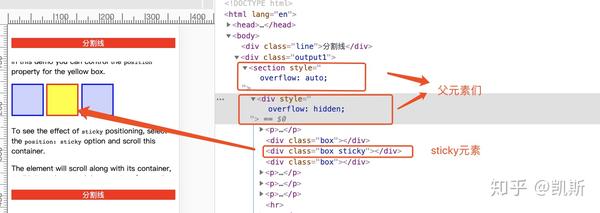
- 一个sticky元素会“固定”在离它最近的一个拥有“滚动机制”的祖先上(当该祖先的overflow 是 hidden, scroll, auto, 或 overlay时),即便这个祖先不是真的滚动祖先。这个阻止了所有“sticky”行为(详情见Github issue on W3C CSSWG)。
- 父级元素overflow属性只能设置visible值,否则没有粘滞效果。
- html结构很重要。
运用
在实际环境中的运用,我们可以来看下。
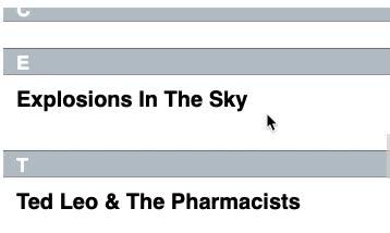
- 粘性定位常用于定位字母列表的头部元素。标示 B 部分开始的头部元素在滚动 A 部分时,始终处于 A 的下方。而在开始滚动 B 部分时,B 的头部会固定在屏幕顶部,直到所有 B 的项均完成滚动后,才被 C 的头部替代
<div class="output3">
        <dl>
          <dt>A</dt>
          <dd>Andrew W.K.</dd>
          <dd>Apparat</dd>
          <dd>Arcade Fire</dd>
          <dd>At The Drive-In</dd>
          <dd>Aziz Ansari</dd>
        </dl>
        <dl>
          <dt>C</dt>
          <dd>Chromeo</dd>
          <dd>Common</dd>
          <dd>Converge</dd>
          <dd>Crystal Castles</dd>
          <dd>Cursive</dd>
        </dl>
        <dl>
          <dt>E</dt>
          <dd>Explosions In The Sky</dd>
        </dl>
        <dl>
          <dt>T</dt>
          <dd>Ted Leo & The Pharmacists</dd>
          <dd>T-Pain</dd>
          <dd>Thrice</dd>
          <dd>TV On The Radio</dd>
          <dd>Two Gallants</dd>
        </dl>
</div>

.output3 {
    height: 200px;
    overflow: auto;
}
 粘性定位常用于定位字母列表的头https://www.zhihu.com/video/1228411433215389696
2. 中间状态的导航栏
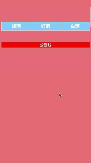
这种交互主要用于商城网站页面下,在页面中间有个tabbar导航,而这个导航是随着页面的滚动,会固定在页面的某个位置上。
<nav>
    <h3>烧酒</h3>
    <h3>红酒</h3>
    <h3>白酒</h3>
</nav>

<div class="line">分割线</div>
nav {
 display: flex;
 position: sticky;
 margin-top: 300px;
 top: 0;
}


nav h3 {
 flex: 1 0 auto;
 outline: 1px solid #fff;
 background-color: lightskyblue;
 color: #fff;
 text-align: center;
 padding: 4px;
}
.line {
 background: red;
 margin: 30px 0;
 text-align: center;
 color: #fff;
}
body {
 background: lightcoral;
 height: 5000px;
} 中间状态的导航栏https://www.zhihu.com/video/1228413887550816256
3. 富有层次的滚动交互
滚动下面这个嵌入页面的滚动条,我们可以看到新闻标题依次推上去,网友评论也会在恰当的时间从背后钻出来。
    <article>
        <section>
            <h4>粘性定位</h4>
            <content>
                <p>粘性定位可以被认为是相对定位和固定定位的混合。元素在跨越特定阈值前为相对定位,之后为固定定位。例如:
                </p>
            </content>
            <footer>须指定 top, right, bottom 或 left 四个阈值其中之一,才可使粘性定位生效。否则其行为与相对定位相同。</footer>
        </section>
        <section>
            <h4>粘性定位</h4>
            <content>
                <p>
                    在 viewport 视口滚动到元素 top 距离小于 10px 之前,元素为相对定位。之后,元素将固定在与顶部距离 10px 的位置,直到 viewport 视口回滚到阈值以下。
                </p>
                <p>
                    粘性定位常用于定位字母列表的头部元素。标示 B 部分开始的头部元素在滚动 A 部分时,始终处于 A 的下方。而在开始滚动 B 部分时,B 的头部会固定在屏幕顶部,直到所有 B 的项均完成滚动后,才被 C 的头部替代。
                </p>

            </content>
            <footer>amazing!!!</footer>
        </section>
        <section>
            <h4>粘性定位</h4>
            <content>
                <p>粘性定位可以被认为是相对定位和固定定位的混合。元素在跨越特定阈值前为相对定位,之后为固定定位。例如:
                </p>
            </content>
            <footer class="last">须指定 top, right, bottom 或 left 四个阈值其中之一,才可使粘性定位生效。否则其行为与相对定位相同。</footer>
        </section>
</article> 富有层次的滚动交互https://www.zhihu.com/video/1228641727793037312
oops: (
- 一个sticky元素会“固定”在离它最近的一个拥有“滚动机制”的祖先上(当该祖先的overflow 是 hidden, scroll, auto, 或 overlay时),即便这个祖先不是真的滚动祖先。这个阻止了所有“sticky”行为(详情见Github issue on W3C CSSWG)。
 父元素设置overflow不为visiblehttps://www.zhihu.com/video/1228645255740157952
2. 设置了position:sticky粘性定位的元素,超过父元素高度时,粘性定位会失效。意思是只能被包含在父元素高度内。
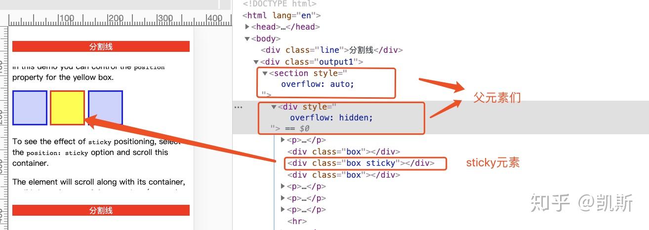
<div>
<section>
<div class="output2">
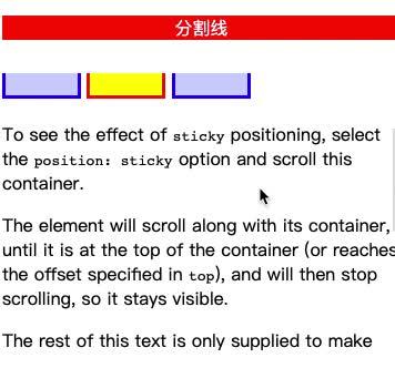
<p>In this demo you can control the <code>position</code> property for the yellow box.</p>
<div class="box"></div>
<div class="wrapper">
<div class="box sticky"></div>
</div>
<div class="box"></div>
<p>To see the effect of <code>sticky</code> positioning, select the <code>position: sticky</code> option
and scroll this container.</p>
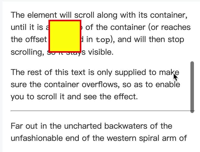
<p>The element will scroll along with its container, until it is at the top of the container (or reaches
the offset specified in <code>top</code>), and will then stop scrolling, so it stays visible.</p>
<p>The rest of this text is only supplied to make sure the container overflows, so as to enable you to
scroll it and see the effect.</p>
<hr>
<p>Far out in the uncharted backwaters of the unfashionable end of the western spiral arm of the Galaxy
lies a small unregarded yellow sun. Orbiting this at a distance of roughly ninety-two million miles
is an utterly insignificant little blue green planet whose ape-descended life forms are so amazingly
primitive that they still think digital watches are a pretty neat idea.</p>
</div>
</section>
</div>
.box {
display: inline-block;
background-color: rgba(0,0,255,.2);
border: 3px solid #00f;
width: 65px;
height: 65px;
}
.wrapper {
display: inline-block;
height: 150px;
background-color: lightgreen;
}
.output2 {
height: 250px;
overflow: auto;
}
.sticky {
position: sticky;
top: 20px;
background-color: #ff0;
border: 3px solid red;
} 父元素高度一致时失效https://www.zhihu.com/video/1228650332772691968
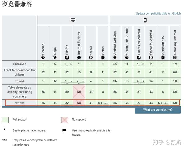
兼容性

参考文章
发布于 2020-04-05 13:09